Hey yall, I’m doing a self-identity branding project for school. Its a Major project course that gets us to create a brand for ourselves and eventually create our web portfolio by the end of the course. (So its a student project but is also a real world project).
We did a few personal survey and classmate/friend surveys to determine what our personal brand would be. I won’t post the research information cause its quite a bit.
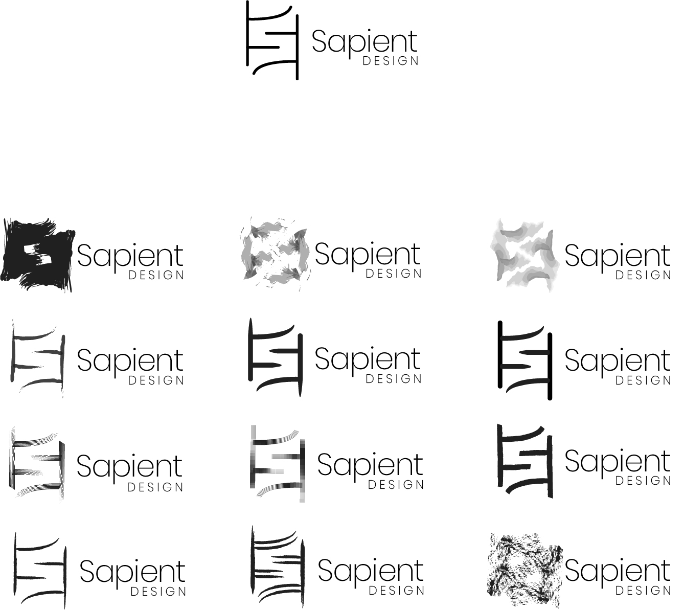
In the end after some brainstorming on names and logo I came up with the logos you see. Made a few iterations(mostly using the vector brush settings).
Name: Sapient Design
Sapient mean intellegent/wise while has a connection to human (homo sapien) so Intellegent user based design is something I wanted my name to say
Logo Concept: 2 pi signs together creating both an “S” and the look of DNA.
I agree with Just-B. They have a strong Asian look to my eye.If that’s intentional or part of the message, great. If not, you might want to consider that at least two people picked up on the same thing.
i agree with all of them in regards that it looks very asian like. the 2 PI signs for me looks like either a chinese character or with with the brushes you used, some of them looks like bamboos.
i wouldn’t see the ‘s’ if i didn’t read your explanation. sorry
what is the reason for using the PI signs?
I didn’t pick up on the Pi symbols until I read this. I’m not sure how many would, but if it’s one of those hidden Easter egg things, like the negative-space S, it can work, I suppose. Even so, it’s a bit more of a cerebral stretch than a hidden arrow in FedEx.
if you wanna add some colours, may i suggest the PI in the top right logo, use it as a background in colours behind the PI of the bottom left one.
Ill try it but honestly think thats a horrible idea. I may add color later but need to perfect the mono-chromatic version and its shape first.
I didn’t pick up on the Pi symbols until I read this. I’m not sure how many would, but if it’s one of those hidden Easter egg things, like the negative-space S, it can work, I suppose. Even so, it’s a bit more of a cerebral stretch than a hidden arrow in FedEx.
I actually really enjoy easter eggs, also think if they’re used well in a logo it makes them better. Thanks for the comment about it looking like an “F”. I didn’t notice that. Ill try and figure a way to make it look less like that.