I’m working on a hard seltzer branding and can design. Client has given me direction but not a lot of copy for what needs to go on the can. They also want to make the design androgynous.
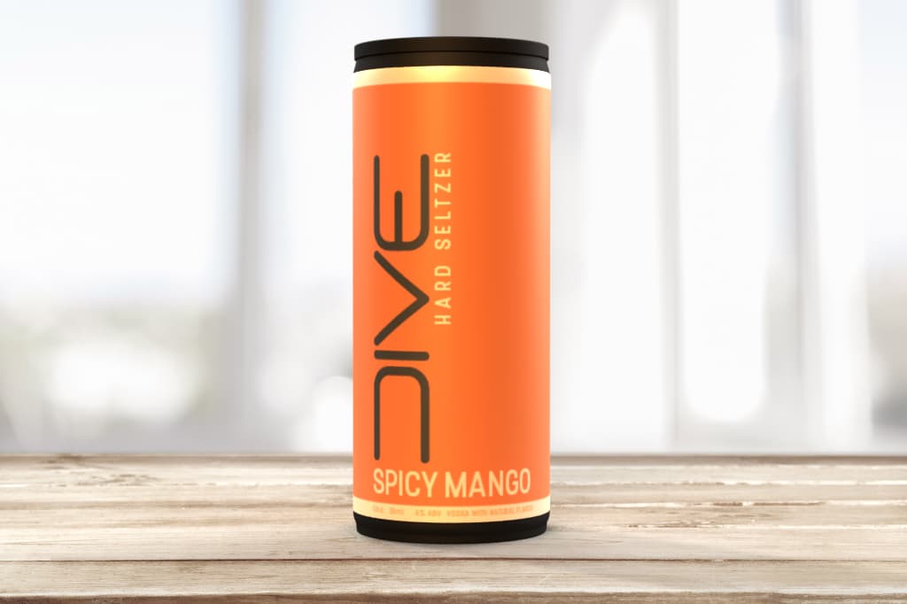
I came up with this design. Text heavy with lots of negative space. Bold color was a high priority with a modern logo as well. The name of the company is ‘DIVE’. I made my own font for this because I wanted a certain aesthetic with the roundness of the letters. Also, it looks like a person.
The color of the can and ‘spicy mango’ will change with new flavors.
They want the can to have black tops and bottoms. I would have to imagine that once they actually go into production they will have blank cans wrapped with a label rather than the whole thing printed. Because of that I am unsure if cans come in black blanks that can be wrapped or if they will only have the option of plain tin; would love some feedback on the production side of things that I should consider. Thank you.
I’m guessing all the cluttered legally required stuff is out of sight on the back, correct?
It’s a very techy-looking, futuristic design. Is that look appropriate for hard seltzer and what the client has in mind? It very well could be appropriate — I’m just asking. The look is striking and attention-getting, but is it the right look? If so, what is your reasoning behind it?
As for androgynous, it seems a little masculine to me, but I suppose that depends on who’s looking at it.
Is it a standard-sized pull-top can? I’m wondering about the black top too. Is it practical and cost-effective to anodize the aluminum or make it black some other way? My guess is that it’ll cost more than it’s worth. They’ll need to pass that cost along to consumers.
You mentioned creating the DIVE logotype as part of the design. Normally, that would be a separate project, but if the client likes it, great. It’s a difficult type treatment to read, however, and running it vertically impairs its legibility even more.
Legal stuff, barcode, ingredients, etc will go on the back, specifically to the left of the logo and around the back.
They gave me a few examples of what they liked and they were all very futuristic in nature. A few of them were for energy drinks actually. I personally think it’s a little too techy design wise, and I even think it’s a little too masculine too. I gave them a concept prior to this one and they felt it was too feminine. I thought it was actually right on the money in terms of ambiguity so I went the opposite direction probably a little too far with this one. I’ll see what they think. The black can doesn’t help.
It’s a narrow sized 12 ounce can like most seltzers are. I’m not the one bankrolling this production so I guess they’ll figure out what’s possible for the can color?
The logo was designed first but it needed to look good on the can as well, so they both went hand in hand. I had designed it to be horizontal but they like it vertical, though I agree it’s difficult to read. Kind of looks more like a symbol than text right?
My overall first impression is favorable — and that’s not something I get to say too often about work posted here for critique. So good job. Personally, I am not a fan of hard seltzers. The reason I say this is to say that I can not judge this design in light of the competition since I am not familiar with the competition. I only have vague pictures in my mind of Bud Light Seltzer packaging.
Having Spicy Mango centered and DIVE aligned on the left seems a bit unorthodox for a can. Most cans and bottles that I can picture have everything centered. I’m not saying this is necessarily wrong or bad, but I would want to make sure you thoroughly fleshed out the layout and considered different placements for the DIVE.
I do have concerns about the black can. Visually, it looks nice next to the gold bands, but black is a color frequently associated with death and decay — not things you want to conjure up in food packaging and for fruit flavors. I think beef jerky and BBQ sauce are the only segments that have been able to consistently pull off black and make it work. Maybe something spicy related, too. There are probably others that I’m missing, but I trust you get the point. I know you said the black was the client’s ask, but I’d be an advocate in this circumstance and make sure they’re aware of the connotation.
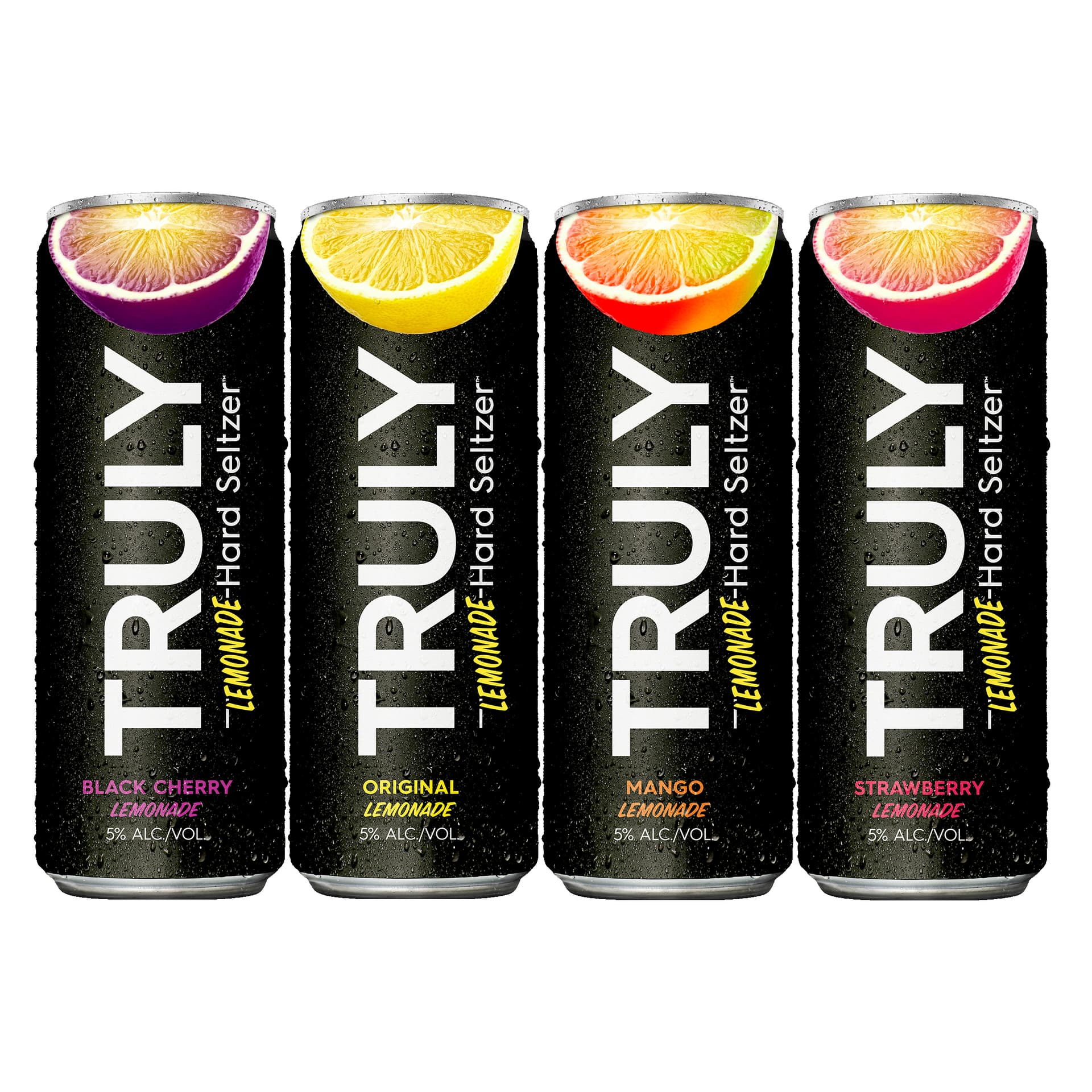
Black isn’t my go to choice for this purpose either. There’s a reason why most seltzers use white, or something light as their negative space. Still, it’s not unheard of. Truly makes a popular lemonade that is mostly black.
They were pretty vague on specifics of their audience other than “people who like seltzers but want to try something different”. At this stage I believe they are trying to get something put together so they can pitch the idea to investors.
That’s a pretty broad mandate. Am more of a beer guy, so forgive my ignorance, but it looks like there’s already plenty options for people that want to try different seltzers:
Gen-Zers typically drink 20% less than their millennial counterparts did at their age. With cost and long-term health effects being cited as the reasons for this decline in drinking, alcohol companies have had to get creative to develop products that appeal to these mindful customers.
To lure back younger customers alcohol brands have begun marketing their products as part of a healthy balanced diet. In the US, hard seltzers have been marketed as something to have post-workout or while hiking or sailing.
They’ve become associated with summer, the heat, the outdoors and everything that goes along with that. While they’re not too expensive and very convenient they still feel aspirational.
At first sight, its theme looks futuristic; you need to change the fonts and Centre the logo from top to bottom and left to right; you need more work on typography like kerning; also, you are using a custom rounded font, so why do you use San Serif font for the secondary font?
Thanks for the input, but this post is 4 months old and the OP hasn’t been back since they posted. I have a feeling they have moved on to a new project