- Concept : A full carbon fiber Suzuki Hayabusa preserving the factory styling elements
- Purpose or Goal : Replacing the black and gold bodywork with gloss and matte carbon fiber twill components without making it look overwhelming glossy, unsophisticated and tacky.. eg.
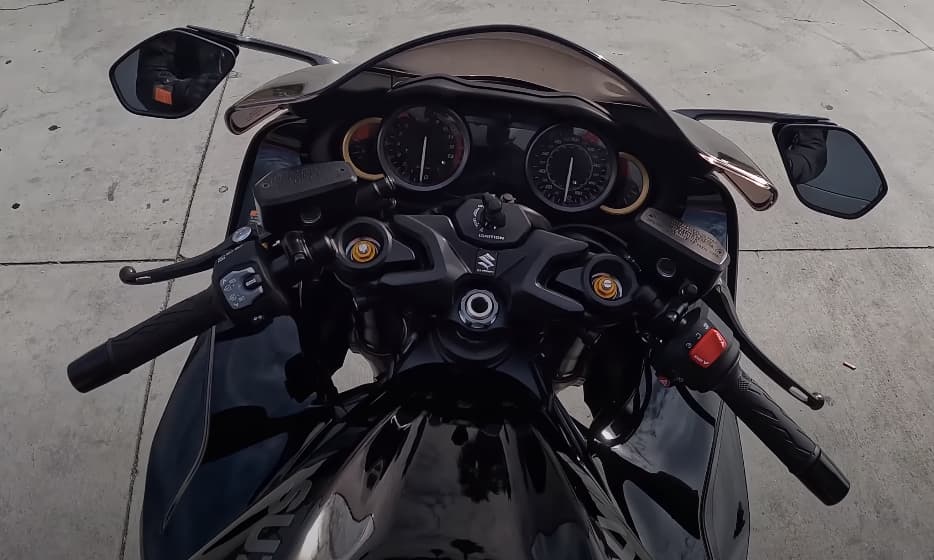
https://youtu.be/8j4IFA2bWuU?t=127 - Format : Meat space
- Audience : Audience is the motorcycling community.
- Your Experience Level : I don’t have particularly good taste or aesthetic intelligence as yet
- Nature of Job: Project.
I think one of the reasons 650ib’s full carbon Hayabusa looked so unsophisticated was because it was all gloss. So I need a bit of help from the hive mind to figure out which of the MotoComposite components should be matte and which should be gloss.
TLDR: I am intending to replace all of the gold components, the Front Air Intake and the Under Tank Panels (where your knees sit) with matte with rest of the outer panel replaced with gloss. What is the crit on that?
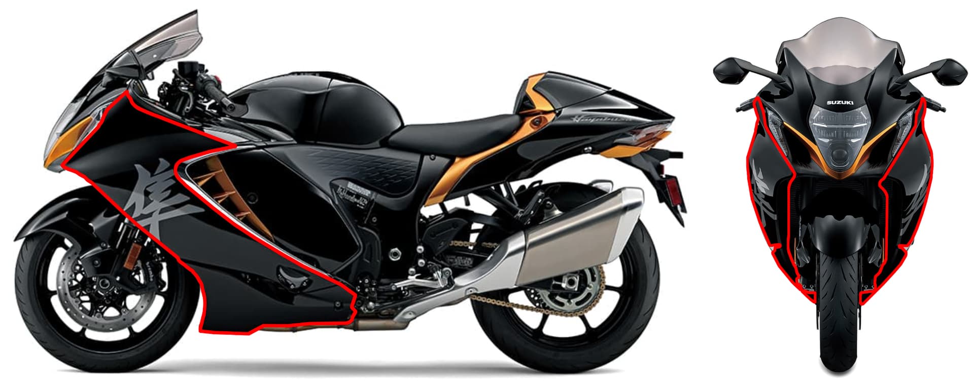
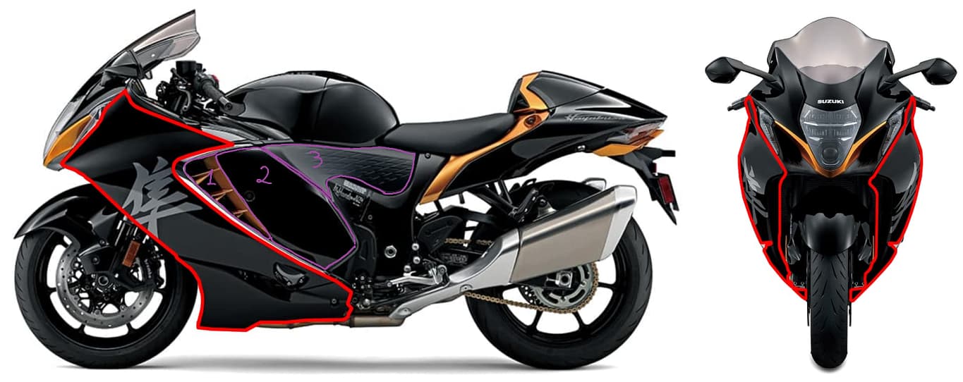
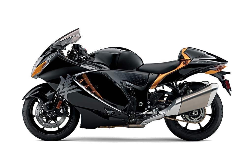
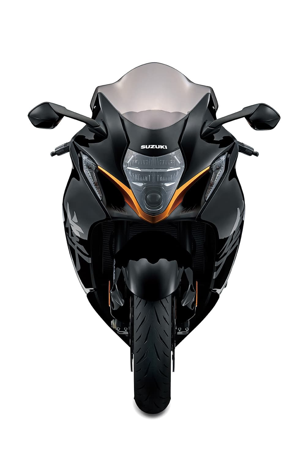
This is what we are staring with:
For more detail and jumping off points see below.
Consider the following:
- Functional highlighting: Aligning the texture of the parts with their practical purpose eg. the air intake, it reduces glare and helps to visually emphasize its function and with knee cutouts (under tank panels) a matte finish provides better grip.
- Visual dynamics: The interplay between matte and gloss elements to create a more engaging design that breaks up large glossy surfaces. While tone-on-tone variations can introduce sophistication without additional colors.
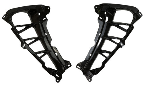
- Layering and depth: Generating a layering and depth effect so removing bulk from chassis members and high lighting exterior paneling.
- Composition balance: Balance the overall composition, preventing the design from becoming overwhelmingly glossy.
If the following components will be gloss which of the second (matte) list have I got wrong and why?
Gloss:
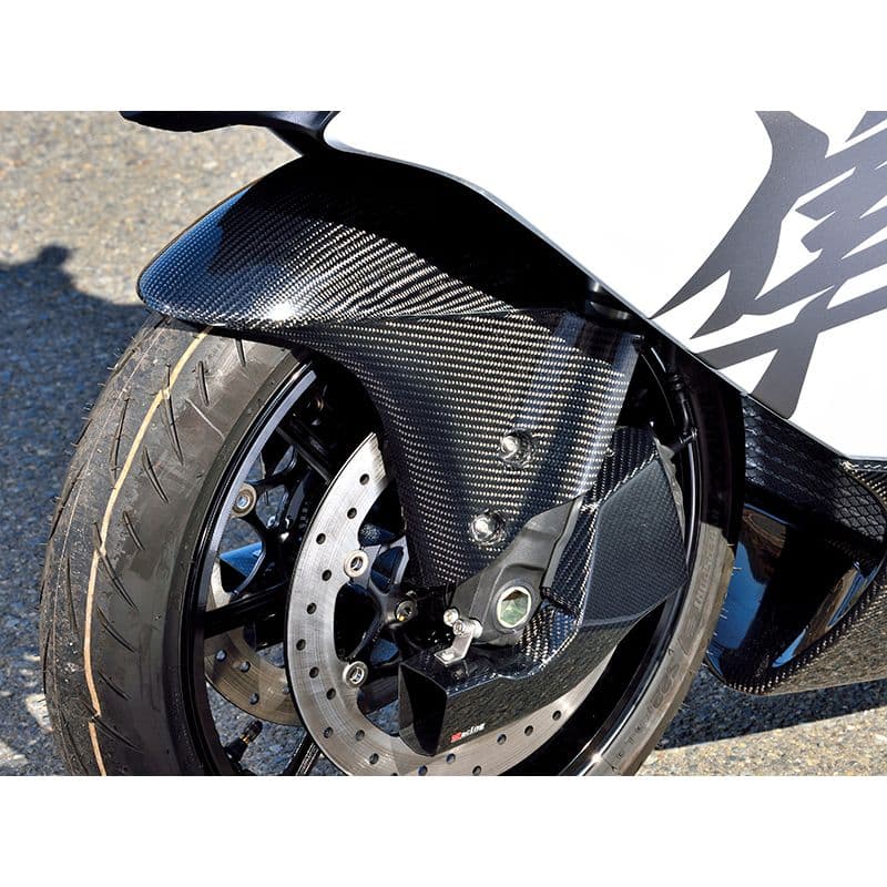
Font Fender (I already have the Magical Racing one)
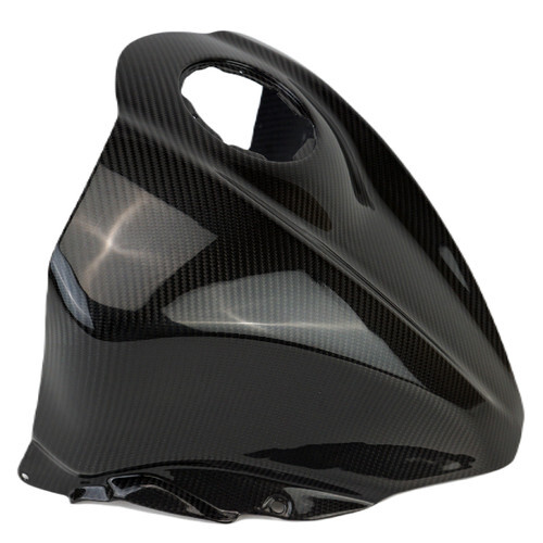
Front tank cover
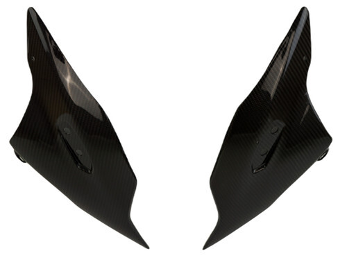
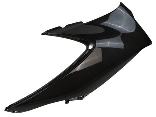
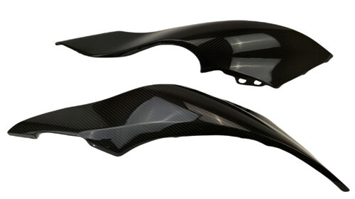
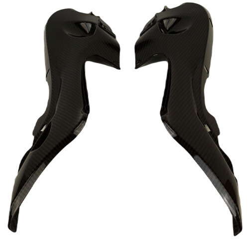
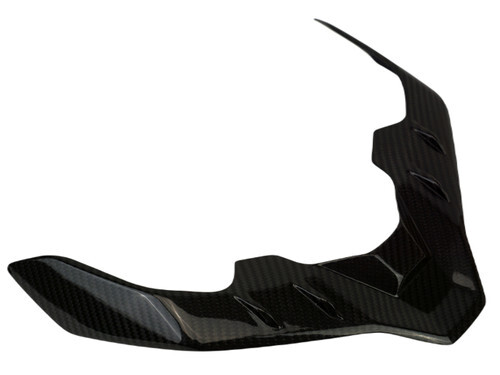
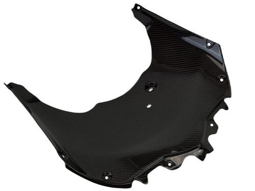
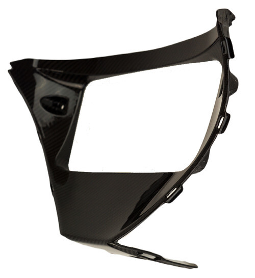
Front Cowling Sides
Windscreen Support
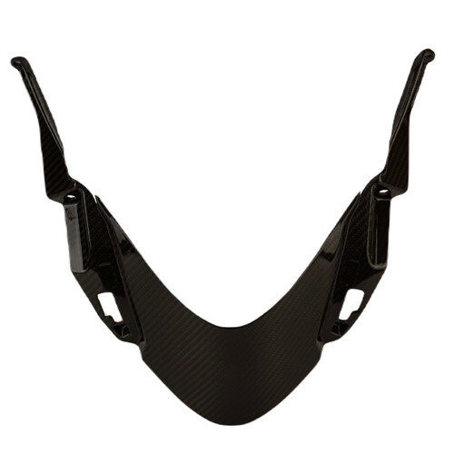
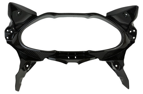
Inner Dash Panels
Knee Side Covers
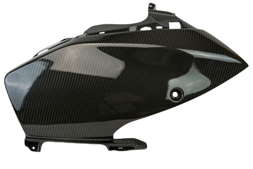
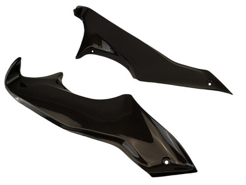
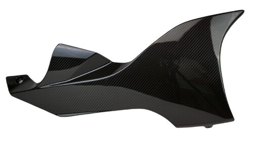
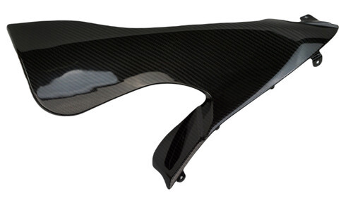
Large Side Panels
Belly Pans
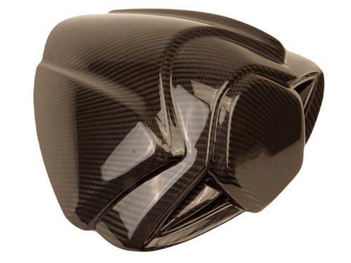
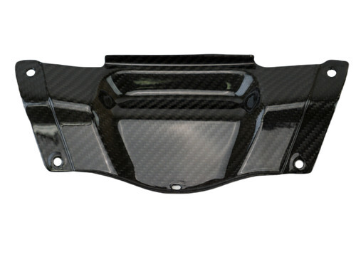
Rear Tail Panel
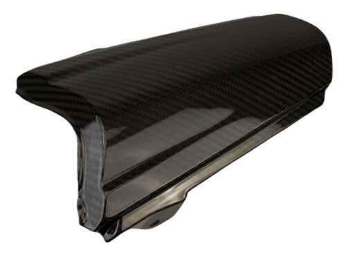
Tail Fairings
Seat Cowl
Should any of the following be gloss instead of matte? I am very undecided on the first two, I think they get progressively more obviously matte though.
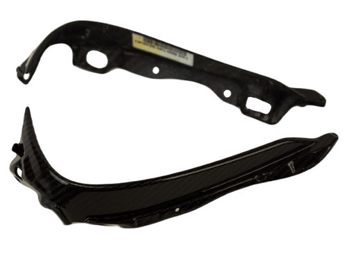
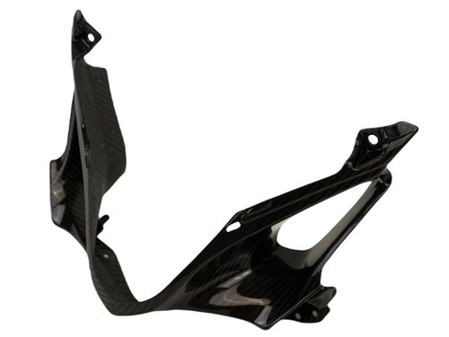
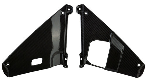
Rear Subframe Covers (usually Gold on the Black and Gold bikes)
Undertail (usually Gold with the Black and Gold bikes)
Meter Panels
Instrument Surround
Instruments Cover
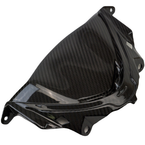
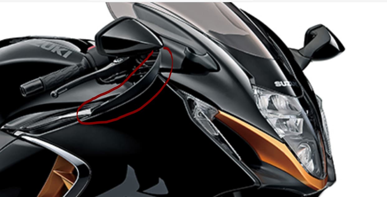
Front Air Intake
Inner Side Vents
Under Tank Panels
Front Cowl Cover (top of the front wheel well)
Under Inner Front Cowlings
V Panel
Center Tail Panel
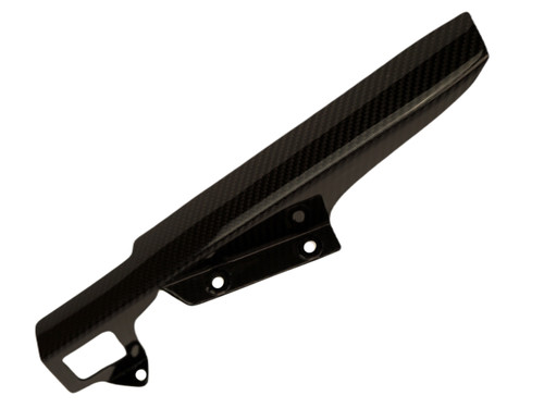
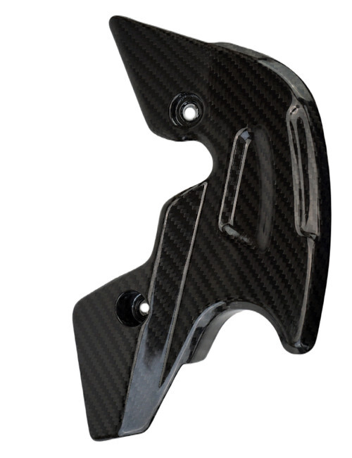
Sprocket Cover
Chain Guard