Full project details: https://www.behance.net/gallery/119259641/SHINENDO-Brand-Identity
Hey everyone!
It has been quite some time since I last posted on GDF. I hope everyone is doing fine, especially amid these difficult times.
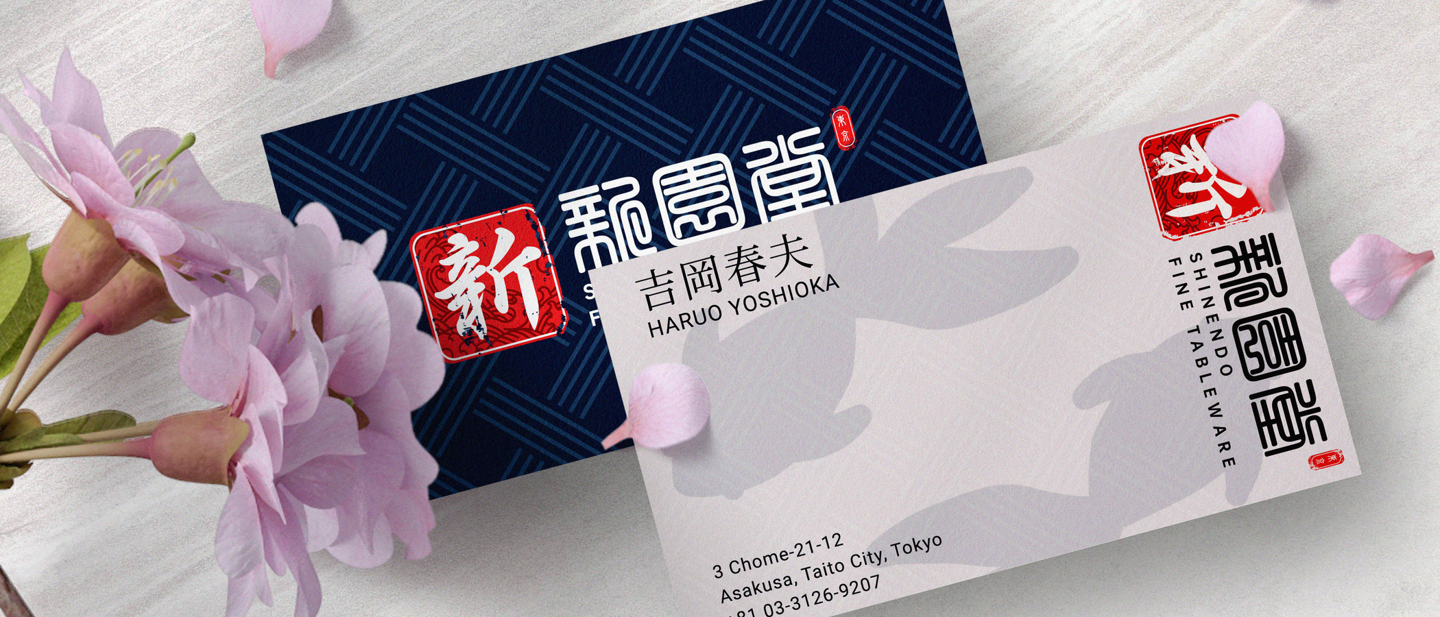
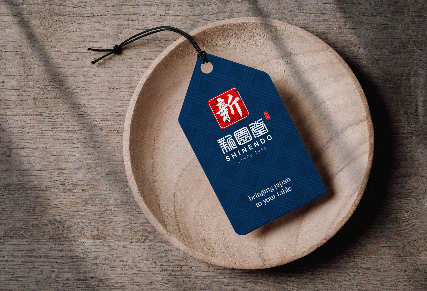
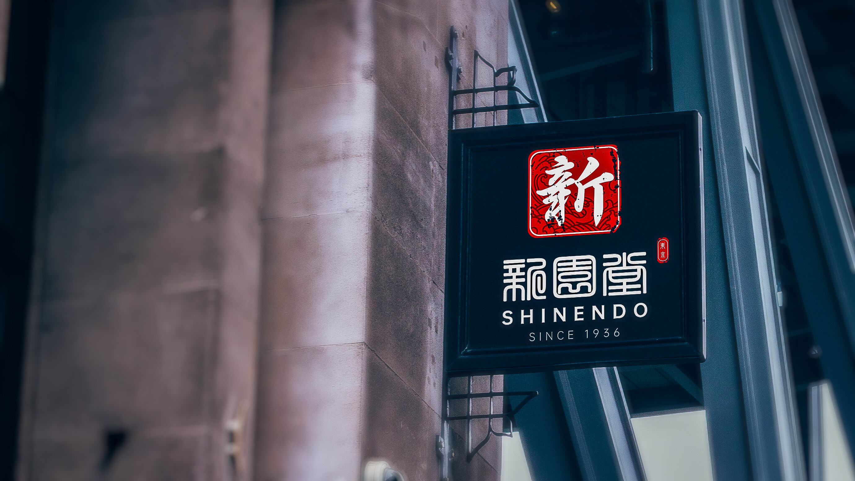
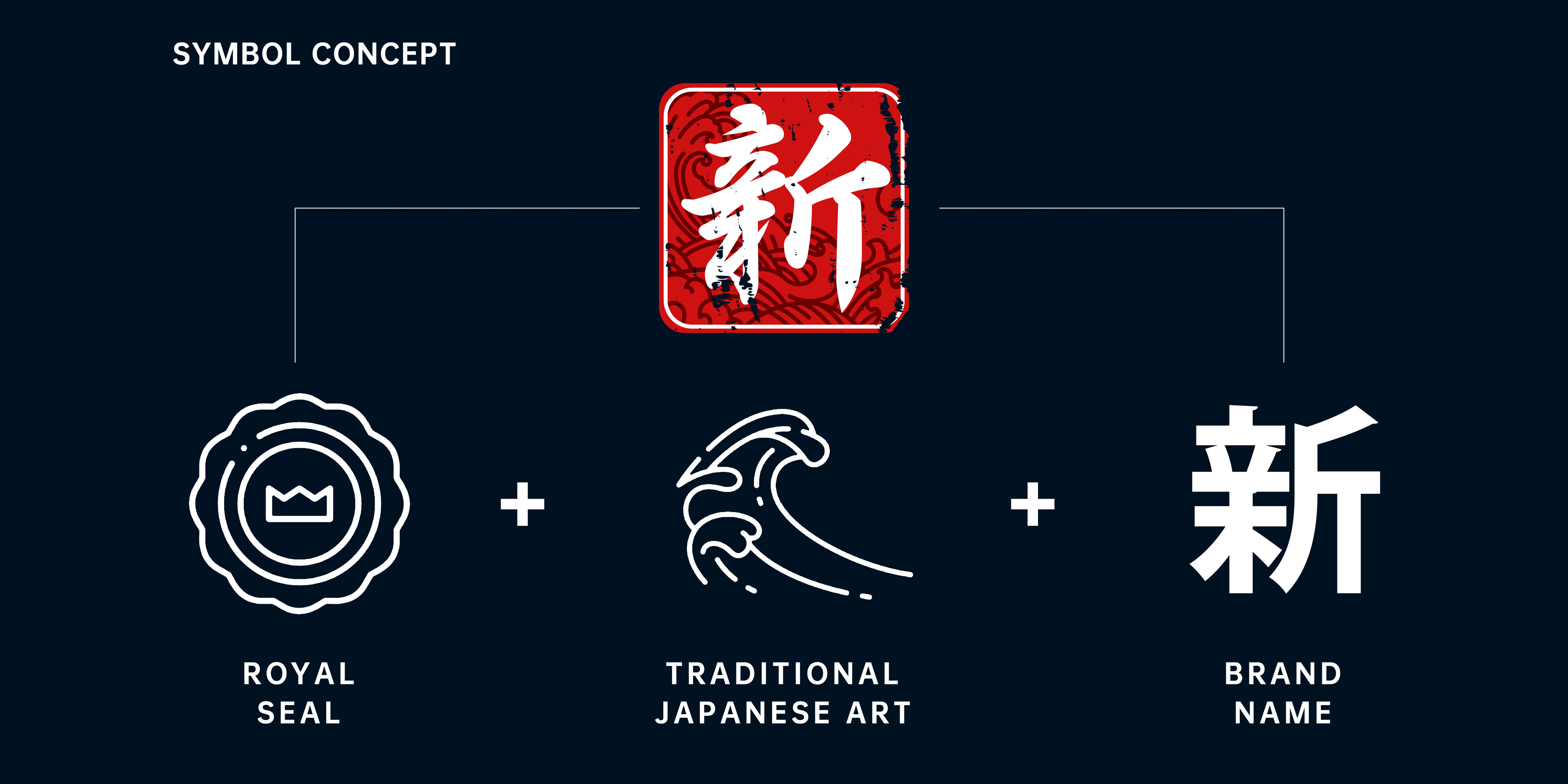
So, recently, our agency was tasked with developing a brand identity for a Japanese fine tableware select shop stationing in Asakusa, Tokyo. The brand has over 80 years of history and was selected as one of the primary brands in charge of providing the Japanese royal family with tableware. As an established brand domestically, the brand has gained popularity even among foreigners prior to the pandemic. This increase in popularity eventually pushes the brand to expand its business to overseas markets, leading to the project this time.
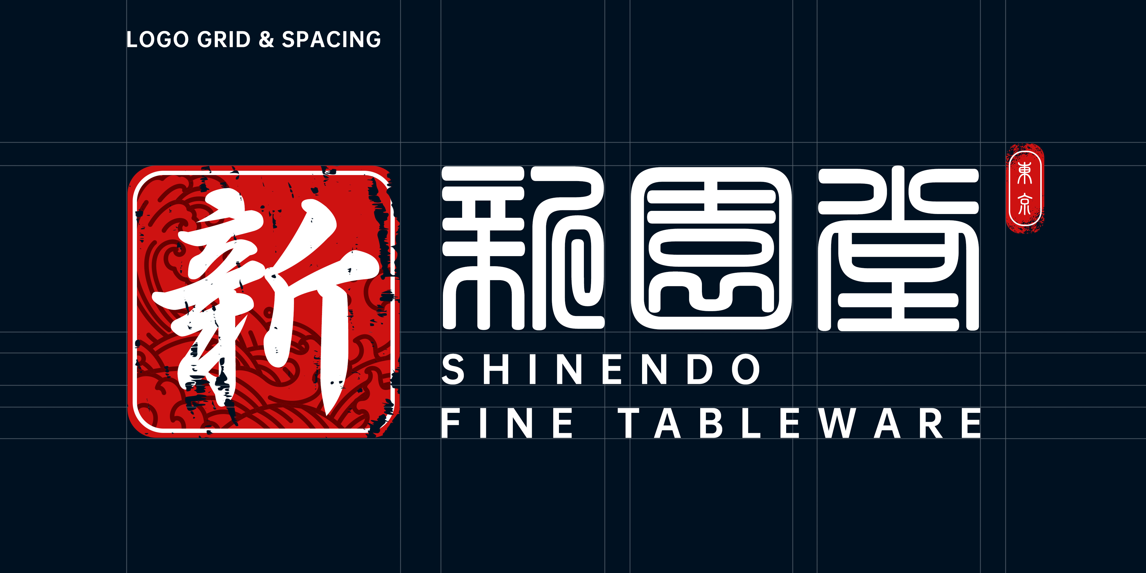
The challenge in this project is to create a modern brand identity that could communicate the brand’s core values to foreign customers without overwhelming them with complicated Japanese concepts. Furthermore, the owners asked our agency to create an identity that shows how the brand is selected by the royal family and represents the brand as representing different Japanese artistic values.
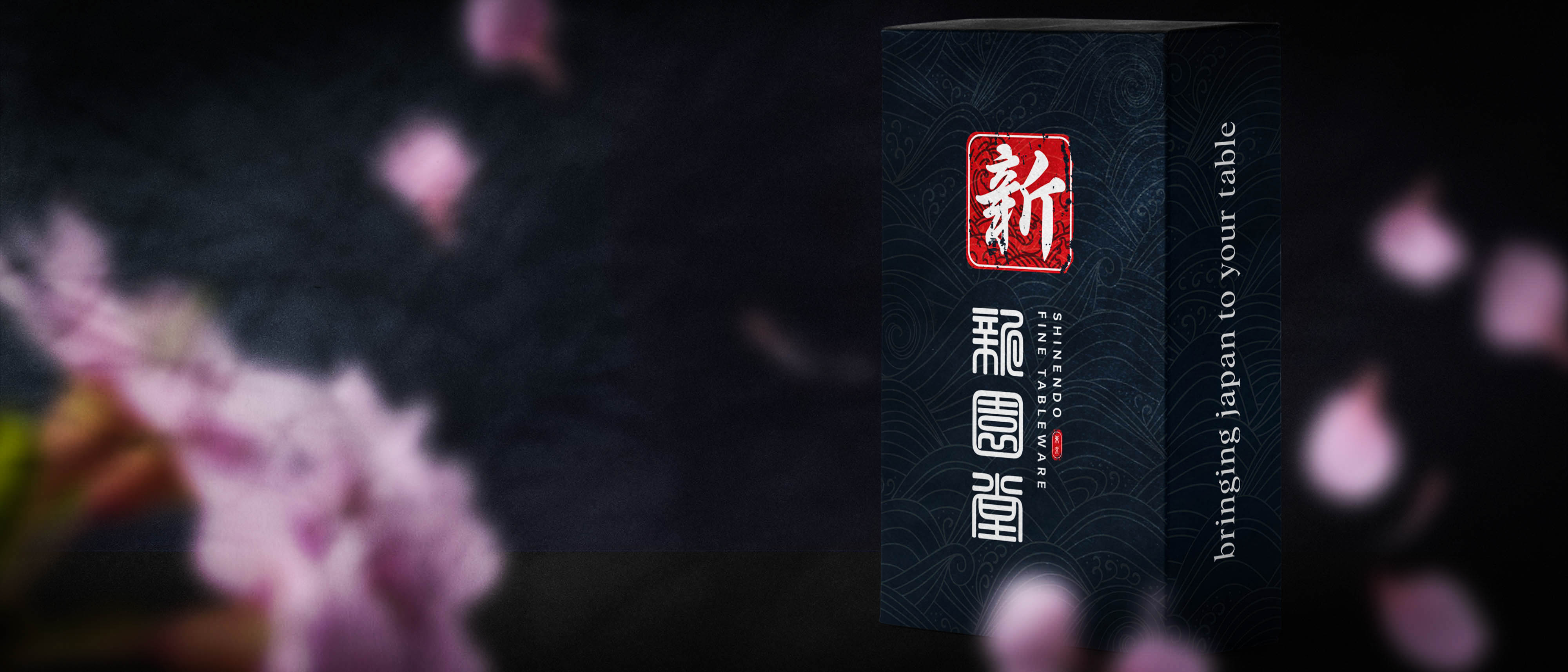
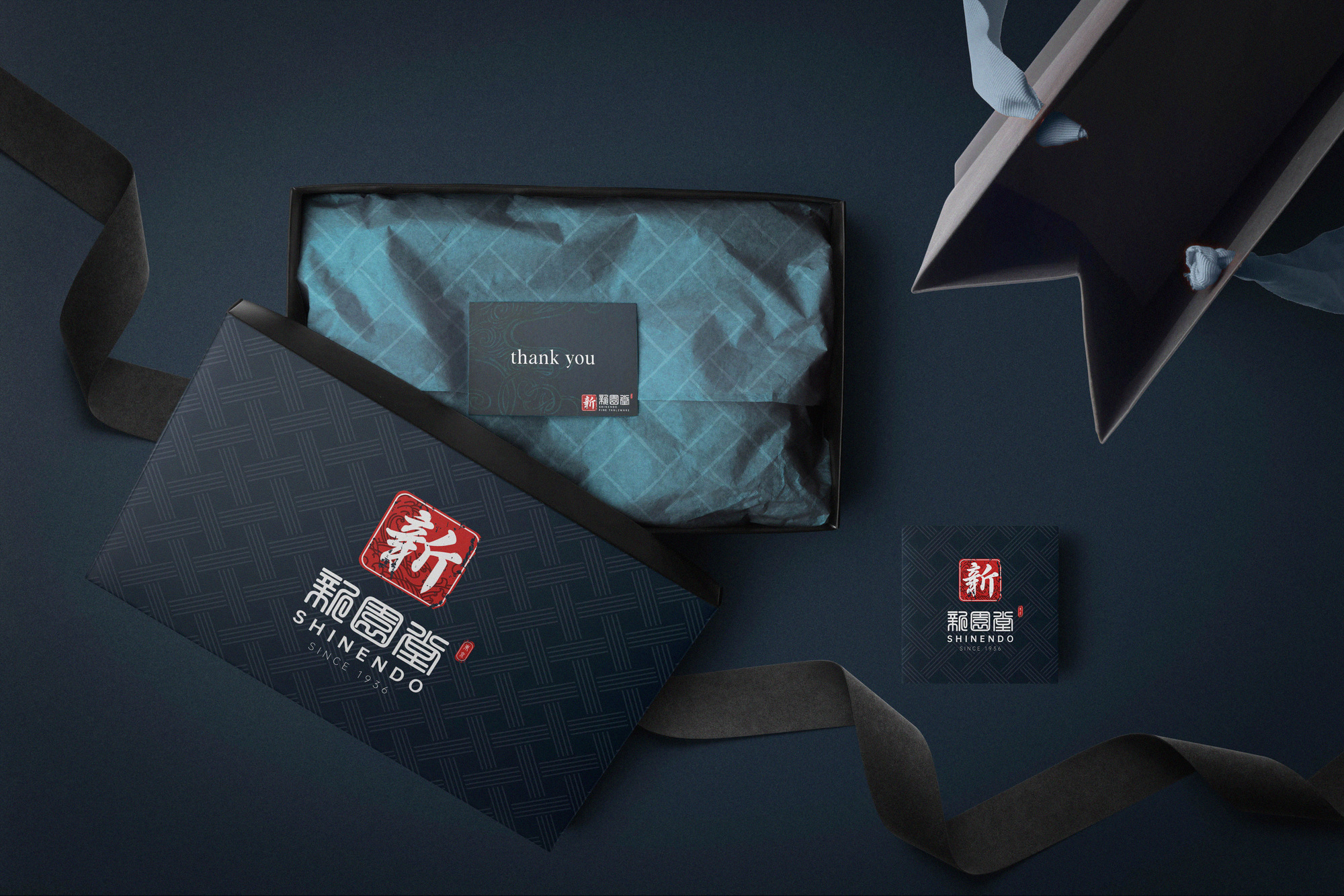
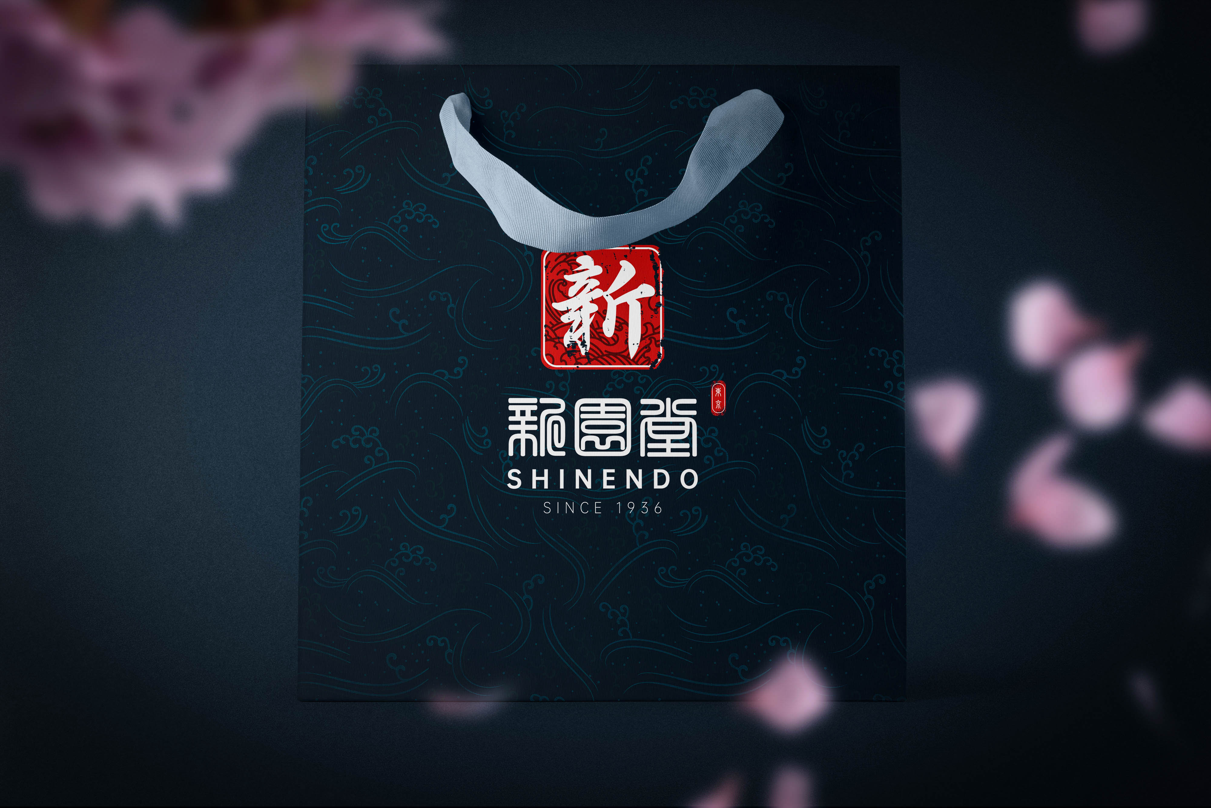
Below are a few sample production shots after the project delivery. I was hoping to receive feedback from everyone. If you are interested in the full details of our decisions, please do consider giving our project page on Behance a bit of your time.