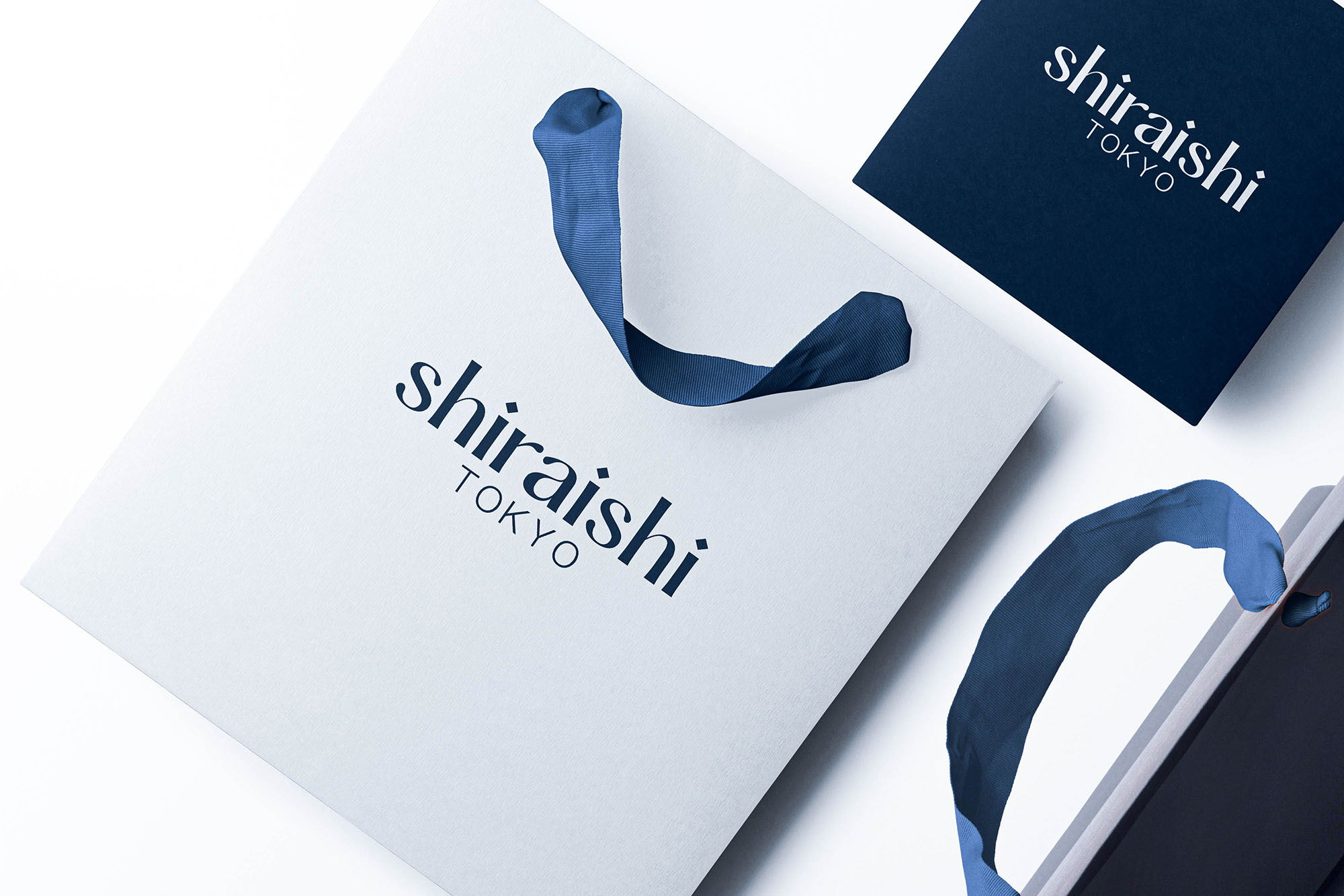
So recently, I’ve had an opportunity to work with a famed Japanese client. The client this time is SHIRAISHI, a famous B2B jeweler, whose business focuses mostly on crafting and providing products for famous sellers in Japan such as 4℃ Jewelry, STAR JEWELRY, Vendome Aoyama. However, after almost 60 years in the business and due to the changes caused by the ongoing pandemic, SHIRAISHI made the decision to expand its business into the B2C sector. Following this decision, SHIRAISHI required an overhaul for its outdated identity, and that’s where our team came in.
Understanding the brand owners’ wishes to expand to overseas markets in the future, and after delving into research and interviews, we arrived at the three keywords: Sophisticated, Confidence, and Beauty. In addition, we also discovered the underlying philosophy of the business: “Jewelries aren’t decorations to make people look more extravagant. They are objects that help to boost the wearers’ confidence and courage. In other words, SHIRAISHI’s business revolves around supporting customers’ confidence and beauty.” Based on this discovery, we decided to use the three concepts: “Elegant, Minimalist, and Open” as our design principles.
For this project, I would love to hear your opinions as an audience from outside of Japan. What do you think of the brand? With this new identity, do you think if the brand could succeed on the international stage, and are there anything you would add to make the brand looks better?
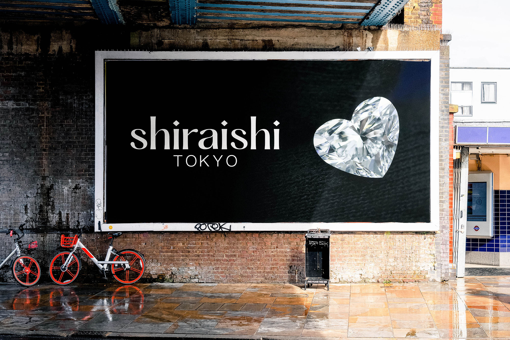
It’s a nice, simple, stylish, elegant, and high-end look. If that’s what the branding is meant to indicate, it works.
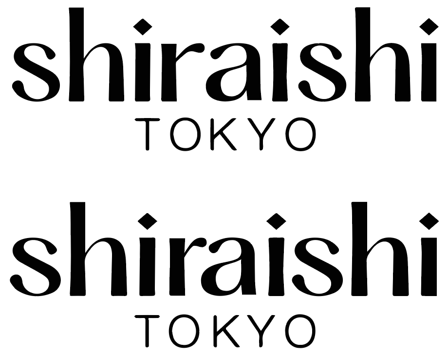
However, the letter spacing seems a little off,
The K in TOKYO could be moved closer to the Y and further away from the O.
In addition, the r and a in shiraishi are awkwardly spaced — primarily due to the letter pairing. The a looks slightly wider than it needs to be compared to the other letters, so I’d narrow it just a bit while pulling in the top curved stroke of the a just a little. I’d also pull back the long arm of the r quite a bit, then push the ra pair closer together, while adding just a tiny bit of space between the other letters.
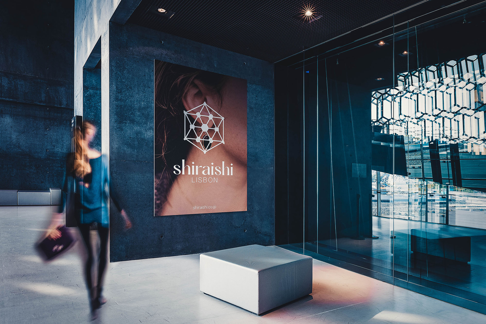
As for the mockups, if it were me, I would remove that little bit of graffiti from the billboard. You’re pursuing an elegant look, and graffiti detracts from it.
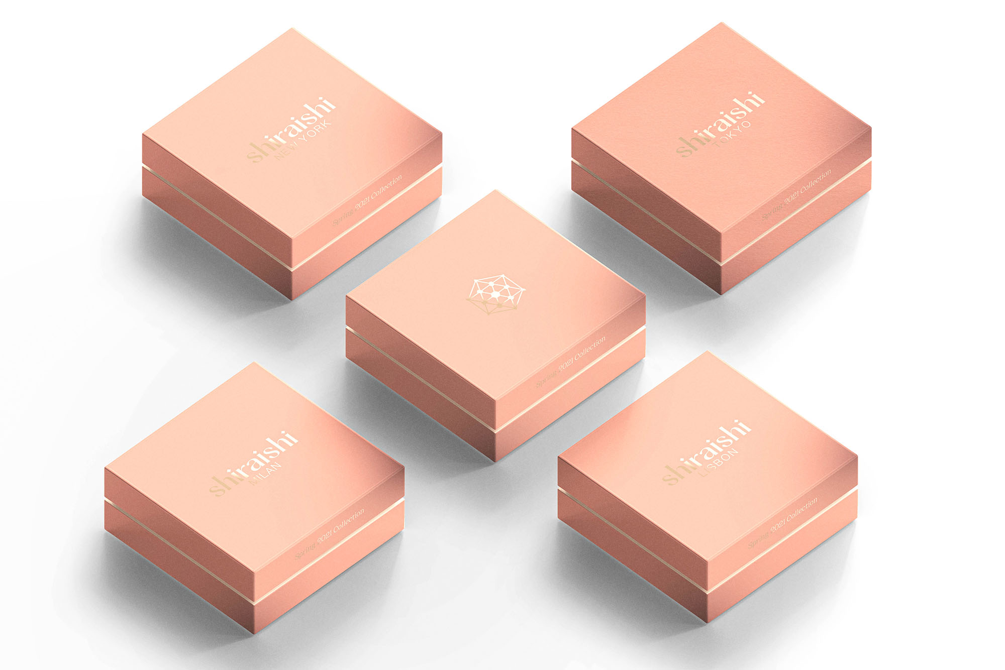
The jump to the rose gold color seems rather random. Why did you do that for one of the mockups? Also, you introduce a graphic in two of the mockups. What is the purpose for this? It seems like a tack-on that doesn’t make sense.
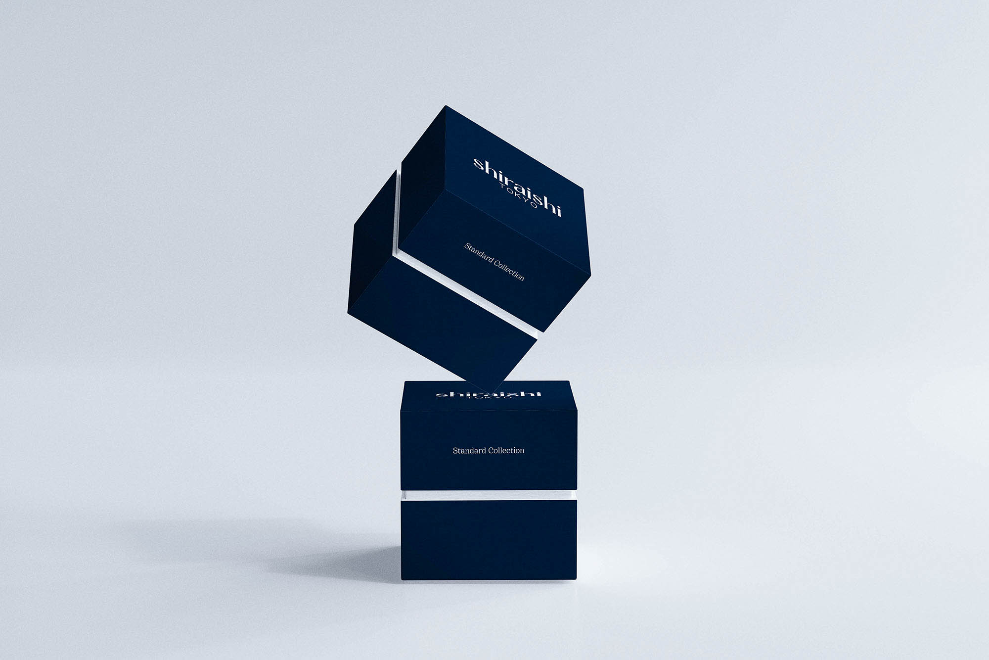
The client this time indeed wanted to present themselves as a high-end brand. For a little more context, the lowest price for the products is around $10,000 and I believe the price of a designer collection is around $120,000.
For the type mark (wordmark), I did have some problems with the spacing between R and A. The letter A is indeed wider than other characters, and because of the styling, the space between R and A has to be closer. I tried to rebalance the letter A mostly by changing the width, height of the characters and the positioning of the strokes like you said, but then for some reasons, the character itself loses the aesthetic values it has and when squashed to match the width of other characters like H and S, A becomes somewhat like a compressed font inserted between a regular font if that makes sense…
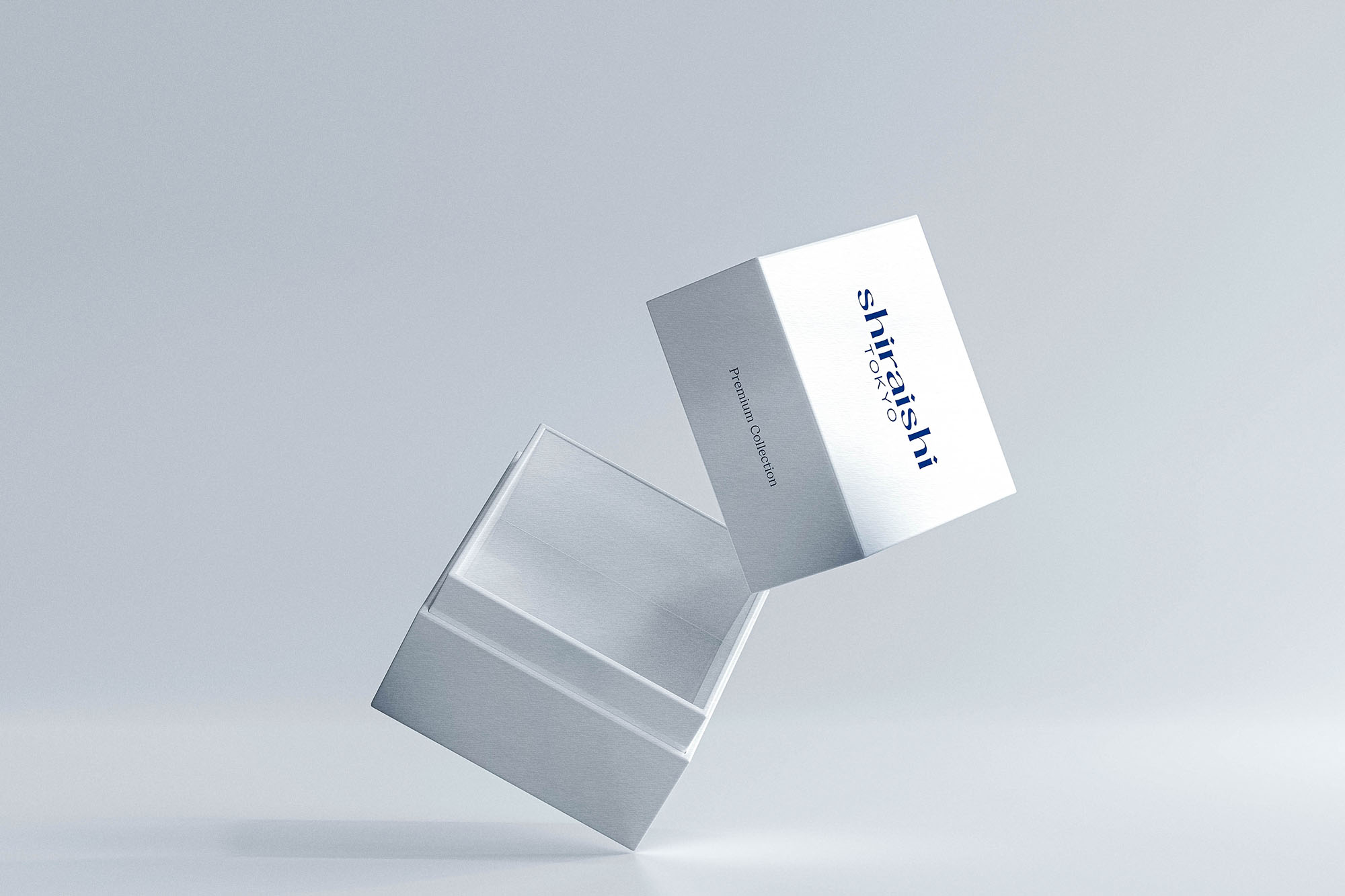
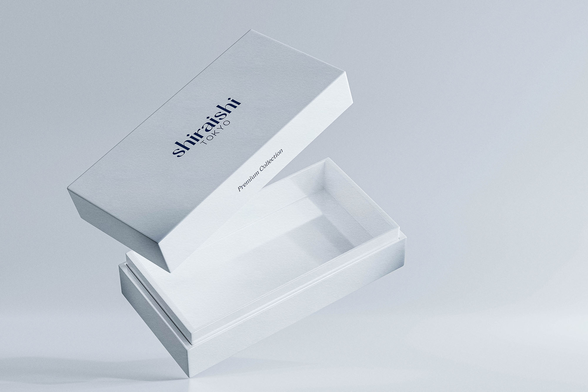
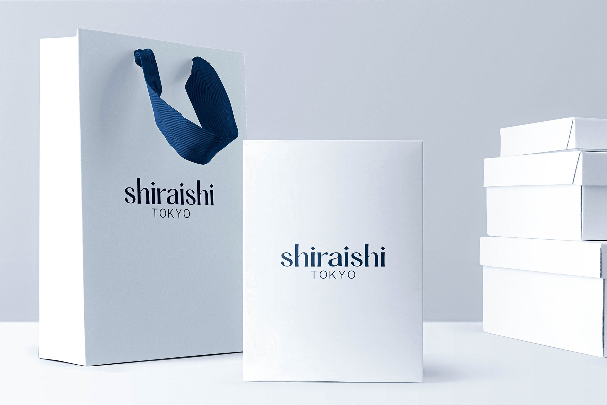
There are actually three sets of packaging: the regular collection (the deep sapphire color one), the premium collection (the white set), and the seasonal/designer collection (the rose gold color one). Different from the other two collections, the seasonal/designer collection is usually only available for a limited time and usually features products with the highest price tag. In this case, the rose gold set is a sample packaging set for the Spring collection, which is only put on sale from the Valentine to early May, and thus the sudden change in color.
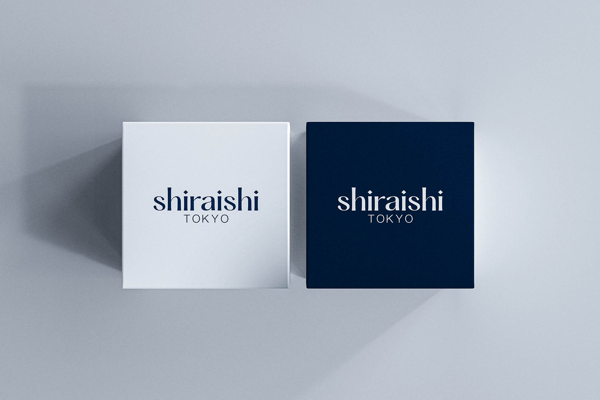
As for the packaging that uses the symbol mark, it’s primarily designed for the online store (directly operated by the headquarter) and for pair products (such as couple accessories or gifts).
To show you what I’m referring to, here’s your example (top) and mine (bottom), where I’ve adjusted kerning and the glyphs themselves. I suppose it’s a judgment call as to which works best.
I also relied on auto-tracing to re-create the letters from your examples, which doesn’t exactly help preserve the integrity of the shapes. Even so, it provides a reasonably good display of the kerning issues I mentioned.
Your methods make the R a little bit too narrow maybe, but yeah, I can see your idea. It’s, by no means, a bad approach, but as you said, it will be subjected to a judgment call (more like the client’s approval). Thanks for the feedback!
There’s very little I could say to critique or improve this project, but I’ll give it a shot anyway The wordmark and color palette immediately come across as simple and elegant. If I had to pick a small critique, it would be the tightness of the wordmark. I find myself wishing for a little more breathing room between the letterforms, especially since you stated “open” as one of your design principles. I also agree with others in that the kerning could be revisited, particularly between the r and a. These are very, very small qualms that the vast majority of people will never notice, but a high end brand such as this deserves close attention to minute details.