I don’t usually post my designs up but figured I would start putting one up every month or so just to get some feedback. I miss having crit with fellow designers like back in the college days.
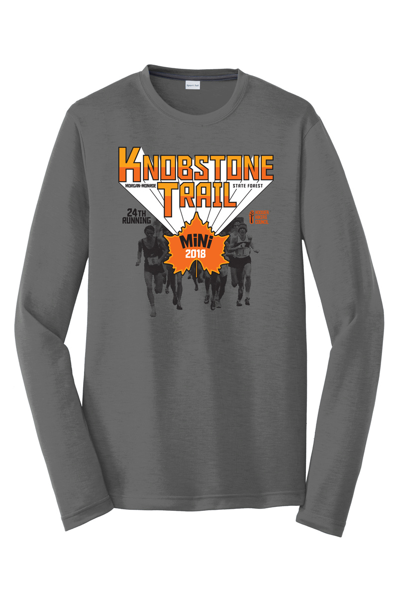
So this design is for a client of mine that runs a couple of trail races each year. They usually give me creative freedom on their designs, the only direction being that they wanted the design on dark grey. The last couple of years I went pretty modern but this year found some inspiration from the 70’s, you can see that in the color selection, the ‘flying’ text and the use of exaggerated halftone dots on the image. What do you all think?
Might be an expensive job with a 4 colour screen print but if money doesn’t matter then no worries. I like the colour combo of the deep orange and lighter orange.
I’m not really digging the top font, I think it also clashes with the font used for mini. Maybe try another 70’s font choice?
I’d be nervous about using the faces of actual runners on a product that is going to be sold, especially if elite athletes were involved… people with licensing or endorsement deals. I would make sure those specific runners were covered under a model release.