This is my first time posting in the the Crit Pit! ![]()
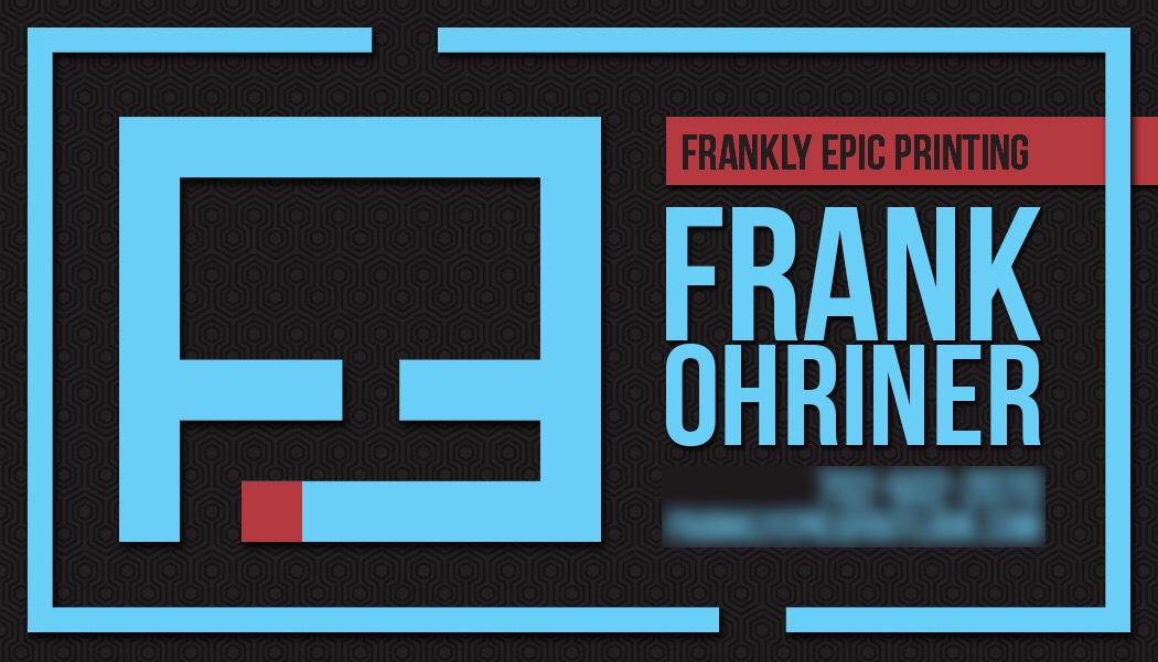
This is a biz card design for my friend’s one-man Print biz. I designed the logo and the card design. He’s happy with both, but I wanted to see what you fine people think.
Thanks for all input.
This is my first time posting in the the Crit Pit! ![]()
This is a biz card design for my friend’s one-man Print biz. I designed the logo and the card design. He’s happy with both, but I wanted to see what you fine people think.
Thanks for all input.
A good rule of thumb is NOT to post personal information ![]()
Please blur number and email and then feel free to re-post.
Thank you ![]()
Oops! Sorry!
Generally speaking I try to stay away from borders - any tiny variation in the cutting will be very obvious.
Right. It’s a good policy with respect to aesthetics too. On this card, the logo recedes within that border. Without it, the logo would be the clear focal point.
Agree about the border. Maybe add a tiny bit more space between Frank and Ohriner so that it will be easier to read at actual size.
Also, if the negative space and red square in the logo are supposed to mean something, I’m missing it. Computer screen on a desk maybe?
Your color choices are lovely. They work well together, and they feel upbeat and trendy without playing to a passing fad.
The negative space doesn’t mean anything. It’s an F attached to a mirrored E. The client was asking for a simple logo, having to do with the abbreviation of his business name. The red square was something I threw in last min. It probably won’t end up of the final product.
Thanks for the input and kind words!
Normally, the name of the business is bigger than the person’s name.
I understand it’s a one-man business, and that no other cards with other names will be needed, but the fact that this is a card from Frankly Epic Printing sort of gets lost as an afterthought, whereas it’s probably the most important bit of information on the card.