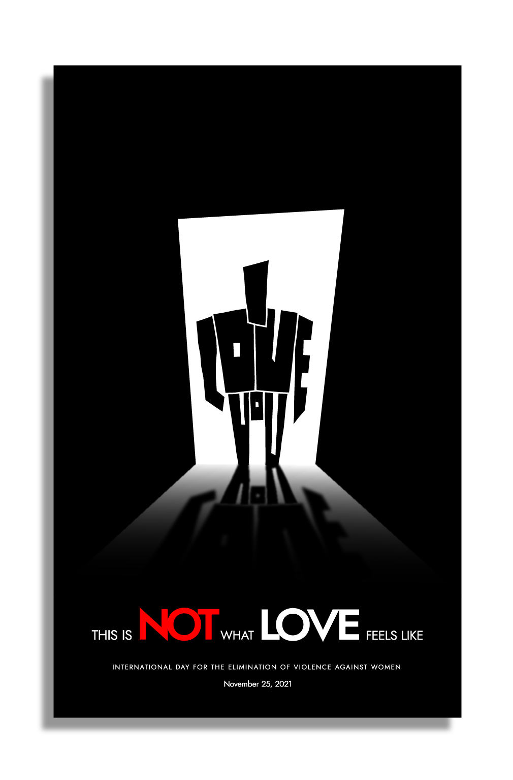
I made a simple poster for
International Day for the Elimination of Violence against Women 2021.
Some critique to improve it?
Thank you in advance
2 Likes
If you had not included a description I wouldn’t know what it was.
Looks like a robot coming through a prison door. Then the text on the poster doesn’t make sense.
1 Like
Thanks for the reply.
It’s about the fear a woman feels when her abusive boyfriend/husband stands in the door.
If the love he gives to her makes her feel fear, then that’s not love, despite he is saying “i love you”
What’s that got to do with Robots going into a prison cell?
It doesn’t make sense.
Did you do any research on previous posters in this space?
You saw a robot, I saw a menacing person made of words.
What the OP did isn’t wrong.
But it can be interpreted several ways.
Your way isn’t necessarily right.
Had you seen this poster on a wall, rather than scrolled up, you would have read the tag first, no doubt, as it draws your attention as real works, and maybe understood the message better. Or not.
The forum scroll was not the OP’s friend here.
So … Perhaps the “o” in “VoU” interpreted in my mind was correct after all.
Don’t see a menacing person at all.
I see a robot.
The tagline makes no sense.
I stand by my original critique.
You mean about violence and domestic abuse?
Yes a lot. And I’ m fed up with women’s faces with bruises and swollen lips.
It’s a cliche.
I feel somewhat confident about the concept.
I tried to approach this social issue from the victims aspect/view, not as a third person who observes an abused woman.
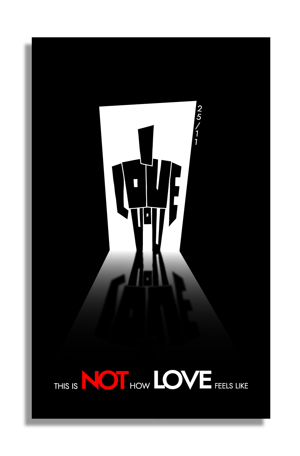
My purpose is to show a deformed/ape like man figure, clenching his fist (the L letter), with menacing posture. His says the “I love you” , but his figure delivers something completely different, even the shape of the letters show the twisted subliminal message of his statement.
Sorry if this reminds you of a robot, maybe we don’t have the same imagination capacity.
Maybe I could improve typography design on this poster, to make it somewhat stronger, but not to smother the menacing figure.
PS: This poster was accepted with overwhelmingly positive critique from the institution I was hired to make it. I could use some advise on improving it, thought.
Thank you all!
1 Like
I’ve noticed it for a while.
Anytime I say a critique others tend to jump on my critique and critique that.
Stick to critiquing the poster - the OP can take away from it what they need and be happy with it.
1 Like
Only when you become confrontational.
To the OP,
You don’t need the date on there. Detracts
I don’t know if it would work better if A, you made the tail of the “Y” in You, using a heavier shadow there and B, if the words were at the top (on this one, I think you got it right though, people read thru the words that are hard to recognize, read the words at the bottom, then go back up and see the figure or what it is.)
Try posting it smaller so it fits on screen without the scroll. That will also show you what happens when the poster is only seen from a distance. You have the emphasis on NOT LOVE, with a dark figure in a doorway, which I think is clever but you could make it even more menacing by foreshortening more as if viewed from below rather than straight on
Your grammar needs work.
This is not how love should feel
This is not what love looks like
Or something better than what you have there
I immediately saw the menacing dark figure in a doorway. It’s typical of the cartoon style “bad guy” I used to see when I was a kid.
As mentioned the tag line is worded incorrectly.
May I ask what 25/11 means?
Otherwise I really like where you are going with this ![]()
I like the idea and how you’ve made a menacing figure out of the words, “I love you.” To me, the illustration immediately communicated a menacing figure in a doorway.
As already mentioned, the 25/11 had me puzzled. Even after realizing it was a date, I wondered why it was there. Perhaps there’s a good reason but it’s not obvious.
The grammar in the headline is a little awkward. The preposition at the end of your sentence is unnecessary and arguably (by some) an error. This is not how love feels or This is not what love feels like might be better.
1 Like
The grammar bugs.
The NOT LOVE typography works, but the date???
The concept bugs too. Obviously, violence is not an expression of love. A suggestion on how to eliminate violence towards women would be more meaningful.
1 Like
I glanced at the other comments, but did not thoroughly read the entire thread, so I apologize if I’m duplicating someone else’s comments.
First of all, the copy is off. It should be “this is not what love feels like” or “this is not how love feels.” Even the latter sounds sketchy to my ear.
The date draws way too much attention to itself. If I would not have read your post, there is no clue that 11/25 is IDFTEOVAW. This needs some explanation, and the date needs a different treatment.
I’ll give you props for thinking conceptually. We don’t see that too often around here. Still, I can’t help but feel like it’s missing something. Maybe it needs different copy. Something that would subtly help explain what we’re looking at. That might help clarify that the “I love you” is blocking the door. Or maybe you show the foot of a bed or foot board or something to clarify the view from the woman’s perspective – that might drive home that she is in a bedroom wanting to get out.
Again, I like you’re thinking, but I feel like the execution is lacking something.
3 Likes
Really thank you for your constructive criticism.
I tried to make the Y have a tail but it looked like a pirate’s pegleg.
I wanted to keep the figure in a dominant position, that’s why I placed the text below, exactly as you describe the flow of viewer’s eye.
As for foreshortening, the trick was to put the letter “I” (the head) behind the “LOVE” (the chest), but then the letter “I” was not read as an “I”.
As for the grammar, I’m not a native english speaker and I asked for help from an english teacher ![]()
As for the 25/11, it was the “International Day for the Elimination of Violence against Women 2021”
Thank you all for your kind and constructive comments.
I’ll correct the grammar/wording!
1 Like
I know where you are going with this .. but, I will politely disagree. It’s assumed that is where the abuse takes place. As a woman I assure you it’s not. It’s only part of the cycle. The initial fear and dread you feel inside the second you realize that person is within striking range or verbally abusing you range is the worst part. You don’t really know what’s coming next. The image of a menacing figure is much more accurate in this case.
Just my opinion of course ![]()
1 Like
@Stefanos1984, the more I think about this, the more I like what you’ve done.
There’s something incongruent about it, which my gut instincts see as a problem. However, the discordant concept behind it — love crudely forced together with violence — is what makes it thought-provoking.
Even the sinister figure, which does look a bit robotic, works because its mechanical, threatening nature has corrupted the words that make up its form. The two concepts don’t belong together, but that’s precisely the point.
Conceptually, emotionally, and psychologically, what you’ve designed is very strong with lots of depth. I like it very much.
I would fix the grammar, though. @Steve_O and I had precisely the same suggestions for it. In conversational English, the words you used would be fine. In formal written English, the grammar needs to be a little tighter.
Now that I understand that 25/11 is the International Day for the Elimination of Violence against Women (which I didn’t know before), the following line beneath the headline in relatively small type could work well and help clarify the message.
International Day for the Elimination of Violence against Women • November 25, 2021
1 Like
I honestly didn’t realize it was a date either until Steve mentioned it. I always forget it’s written differently than here in the US ![]()