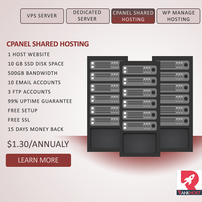
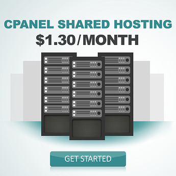
My Intention here is to make a simple banner with a touch of “Website-Menu” style.
a little bit of product strength and simple call-to-action button.
Is this a real offer? $1.30 a year for a shared hosting plan?
Its per month sir if bought 1 year package.
A couple of things.
First, it is not clear at all that the rate is per month for a one year package. As it is, it reads $1.30 per year. I’d clarify that.
The design itself is rather forgettable. If I were scrolling social media or saw this on a website, I’d pass right by it. There is nothing to grab my eye. Consider how you can use messaging and design to make someone click through rather than scroll past.
I’d argue you have too much information in the ad. You don’t need all those details.
Just tell me what it is (Cpanel shared hosting), how much it is ($1.30/Month), and where I can buy it/learn more (clickable link). When I get to the webpage you can give me all that information.
Also, I don’t know how I feel about the red, the gradient under the servers made me think they were overheating.
Not to be rude at all, but it just seems a little… boring for a social media ad. It’s a struggle for me to actually read the text and to understand what is being advertised.
EDIT: Sorry I guess it’s a banner which I don’t know what that would be. I haven’t seen a social media interactive menu banner before.
I’d back Sparrow in that argument. I’d say the read-load on this should be comparable to a billboard; more than 3-seconds’ reading and it’s not gonna digest.
I’m also with Sparrow on this point. Gradients that include red and work well may be non-existent. And, in any color, that half-a-radial below/behind the servers just “floats” them terribly; you can do much better, including having nothing at all there.
I agree on the boring colors, learn a bit about color meanings and usage. Also the gradients don’t work. I’d leave it out and change the overall layout of everything. I know that the visual is meant to be some kind of server or computer, but I don’t think everyone will understand it. Check this video to get some ideas for colors ![]() https://www.youtube.com/watch?v=gLR9JmWb5AI
https://www.youtube.com/watch?v=gLR9JmWb5AI
Would also be interesting to know for which social media site this is intended. If it is for facebook you should avoid placing this much text on it. Facebook reduces exposure to any ad that has more than 20% of the space filled with text. See http://facebookgridtool.com for this.
I agree with everything said before about the design: it isn’t catch enough.
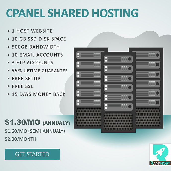
How about this sirs, I removed the menu-style design, changed the confusing pricing, the call-to-action text, and the color. ![]()
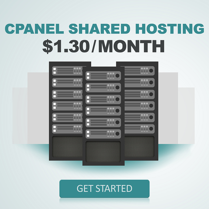
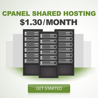
This is my third design for this more simpler Sir sparrow said. ![]()
I think the messaging and hierarchy are best on the third option. You tell what it is, the price (which I’m guessing is the major feature), and a call to action. 1, 2, 3, simple and fast to read. That’s the good news. That said, I think the design could still use some help. It seems kind of lifeless to me. Who is the target market? What will make them respond? Maybe a hit of a brighter color? If this is a social campaign, you can always create multiple versions and do A/B testing.
My target market is people who’s running website/forums that uses free hosting.
Forum owner or bloggers who’s using expensive hosting that is too much for their new sites.
Students who’s planning to make a website for their projects.
