Which is what a majority of the members are going for image wise. They werent sure on a direction and wants to try something less plain.
The song is their first single and it’s about a guy who meets a girl and she ends up drugging him, takes advantage of him and then hes trying to figure out what happened the previous night.
So I used Blender to create a 3d scene and lighting illustrator for vector people (ended up being 1 guy instead of 4) and typography, and compiled the cover together in photoshop.
Big improvement. Good job. Maybe try lowering the band’s name just a little so it is vertically centered between the bottom of “night” and the bottom of the frame?
My first though was does the band have a way to represent themselves? A “logo” or a font at least? I’m guessing they don’t. Maybe they should get that made first? So they could include it in the single cover.
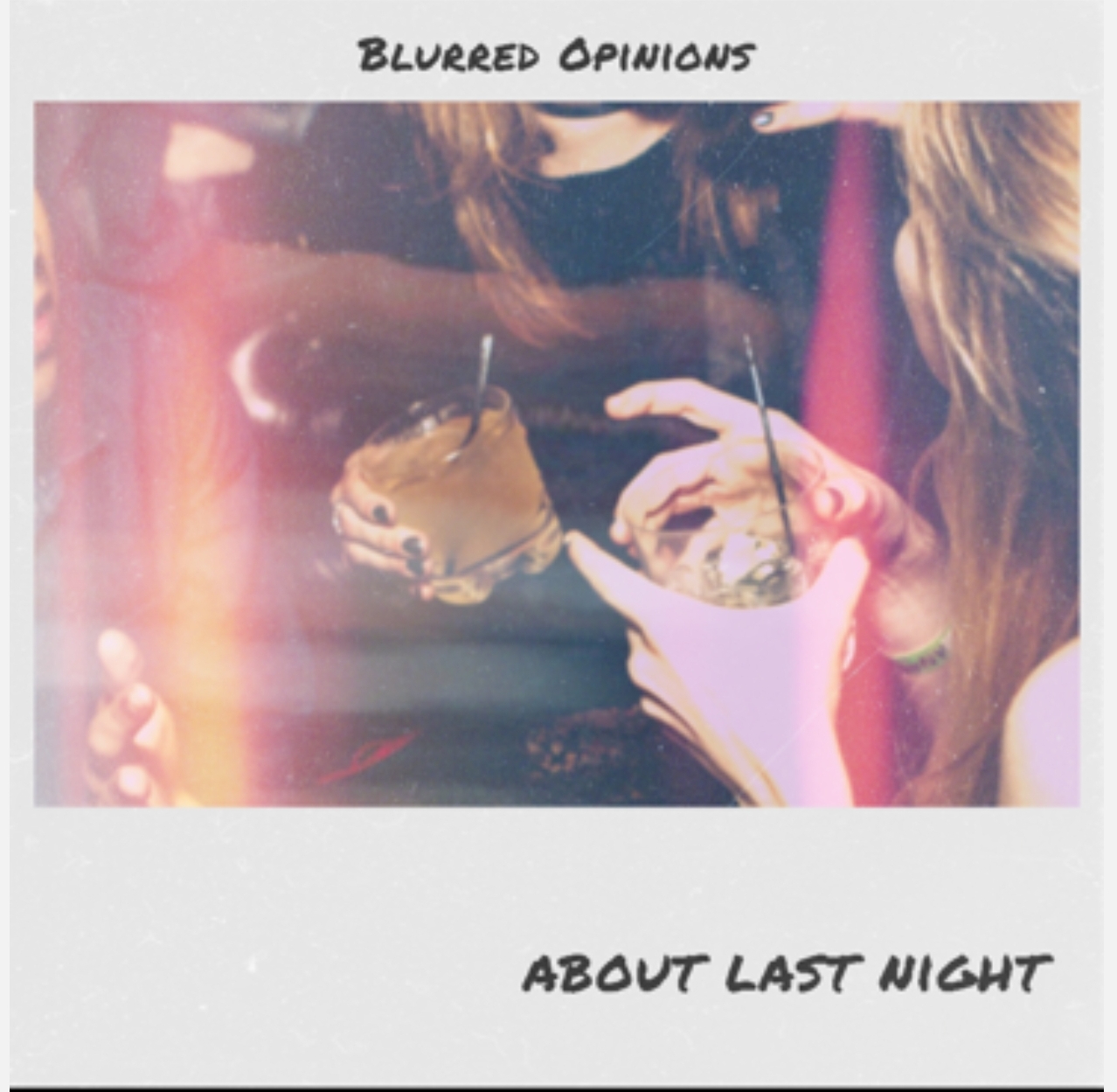
Re the two images you’ve posted, some thoughts:
I like the first one. It has a very indie vibe to it, and it seems to me, more consistent with the message of the song. If the song was called blurred opinions (rather than the band, which I guess is called that), then I’d say it was perfect and they should take it. Though I do think they should have a band logo type thing, which they can put on the single.
The second image, I also like quite a lot, and it stands out more than the first one, which is something definitely to consider. However, it doesn’t have an indie feel at all. It’s just too crisp. The thing which is most questionable to me, is the guy on the mobile. I understand it’s kind of a “what happened” idea, but that kind of image of the guy is I think is overused these days, so it’s become a little meaningless.
However, I’m by no means an expert in this kind of thing. I have been listening to loud music (including a lot of indie stuff) for 25 years, so I’ve seen a lot of single covers over that time. But that’s as far as I can go to claim to have any useful knowledge…
Underlying concepts aside, I agree with this. While the pre-rework version is surely weak, it at least conveyed the idea of foggy memories . . . of . . . last night. In the reworked version, I see how you endeavor to suggest that, but the guy-on-phone, like Bear mentioned, is just kind of so universal that it’s non-descript. He might as well be standing in a crowded airport terminal, or outside the conference room of a business office, or in any piece of stock imagery that applies to those environments and a thousand others. IMO, this doesn’t serve the title as well.
honestly man, it looks good but I think your concept is too literal and the overall composition doesn’t catch the eye especially for an indie rock fan. Im a indie rock fan (ish) and it doesn’t really speak to me. The first one though looks a bit poorly put together would speak to the target audience more.
However, the first one looks more like something from an indie band. To me an indie look is largely the result of amateurish design done by a band without the resources or design savvy to do something a bit more professional.
It’s a weird conundrum — the more professional and mainstream the design looks, the less it looks like something from an indie band. Maybe the choice comes down to just what image the band wants to have.
I hear what you’re saying. My immediate reaction to the original design – and the reason I prefer the redesign – is that the handwriting on the Polaroid frame has been done before. A lot.
I wouldn’t mind it that much if it were hand written, but digitized? The sameness accentuates its fakery. Look at the As, Os, Ts, and especially the two Ds side by side.
But all-in-all the first one is more suitable. I agree with what Just-B said.