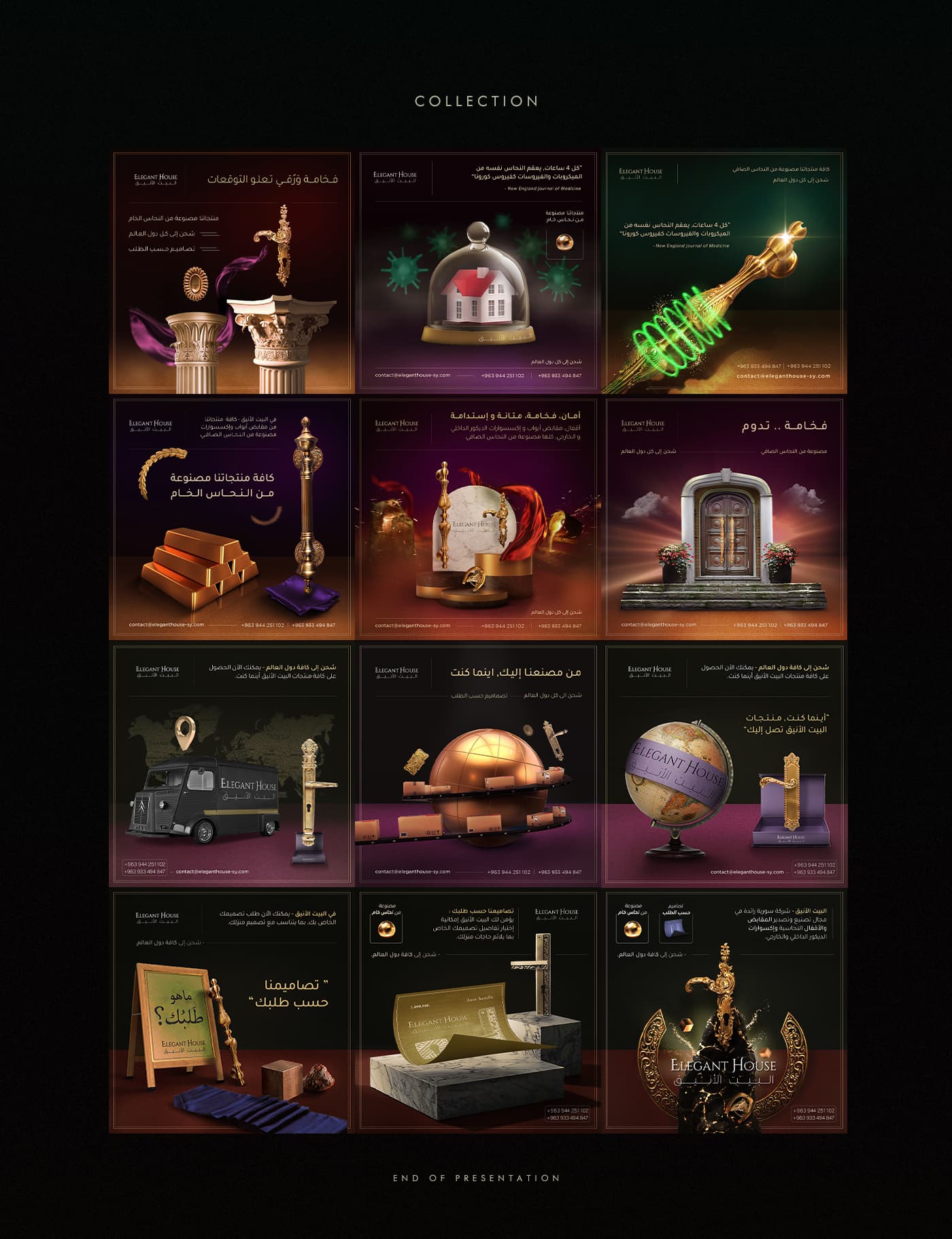
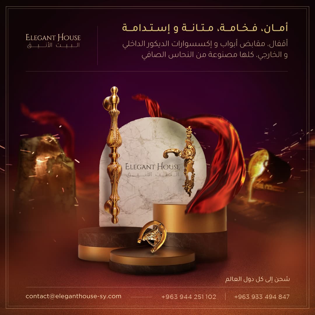
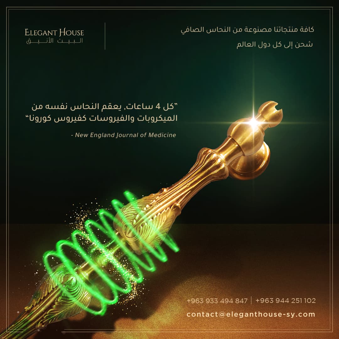
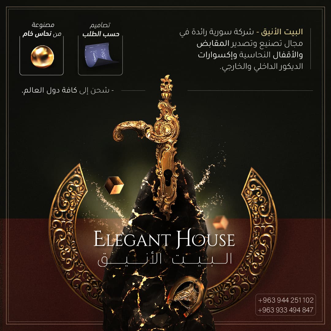
This work is done for a local client specialized in crafting high-tier copper door handles and accessories, it’s target demographic are upper class families in the region, it’s got an already good client base and substantial brand recognition, my goal was to double-down on the beauty of copper and give the designs a magical-fancy aesthetic.
They look really good. I cannot read the text.
But they are very nice looking.
Might be tempted to contact them myself… nice door handles!
1 Like
What was the business goal the campaign was trying to achieve for your client?
They are highly polished (no pun intended), but, to me, they seem to have a ‘computer game’, ‘fantasy’ feel to them. There may be a cultural expectation that I have no idea about and that has to come down to your and your client’s knowledge of local markets. As I say, they are really sleek, but they don’t feel as though they are selling door furniture, so much as magic potions, spells and weapons in a dragon-based fantasy game.
On a practical level, if they are meant to be copper door furniture, they look more like brass. I assume this may be a language difference and that you meant brass (copper-zinc alloy)? If you do mean copper, then they need to be less yellow and more copper-coloured.
Nicely executed, all the same.
2 Likes