Hi there, I’m on hold with this project for my GD course. I’m seeking thoughts on the consistency of two designs. This is fictional tech-ish company based on the web/ e-commerce /, with concepts for logo and app icon/2-nd logo. Also the color scheme is in consideration!
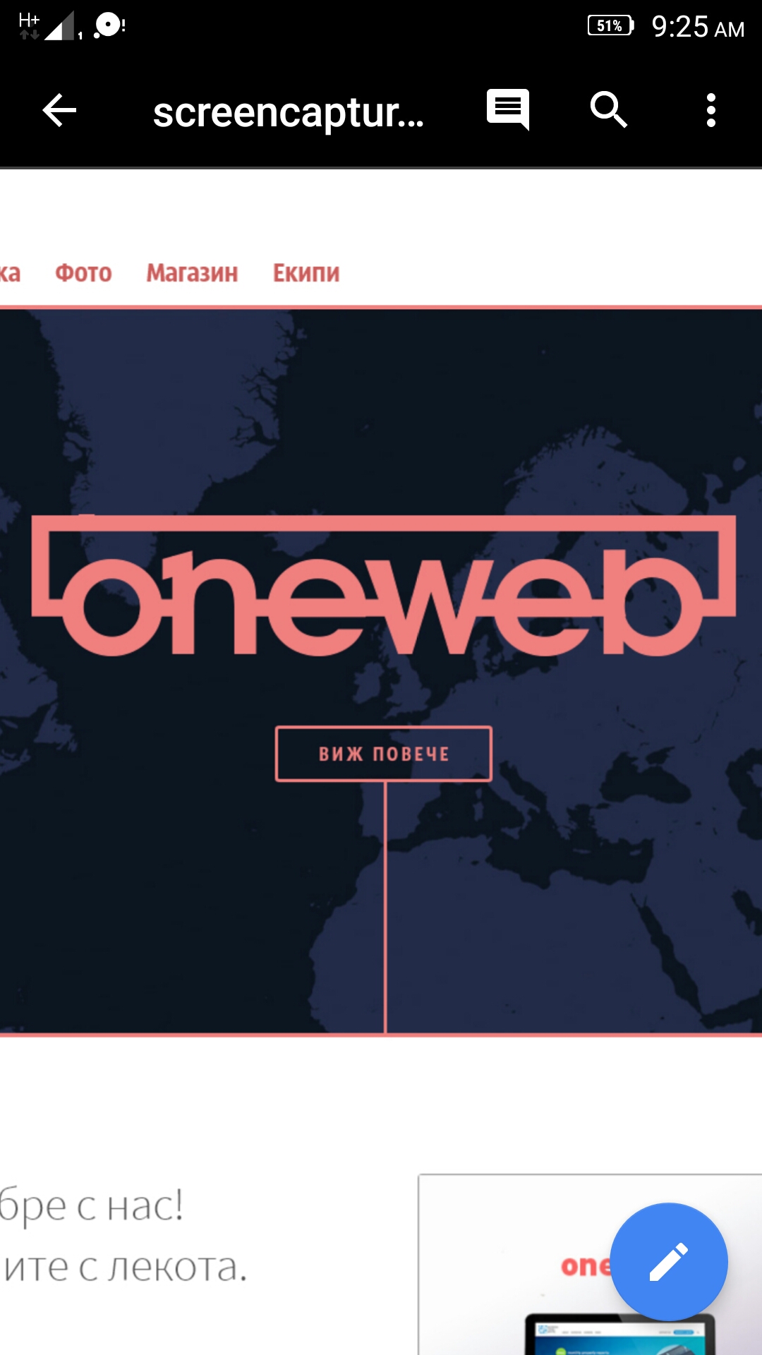
All in all, it’s clean. A few nitpicks are the “one web” wordmark that the ascender of the b being so short is awkward and I think in this case you could find a way to have it extend upwards … perhaps even “interacting” with the rectangular lien above it. And the kerning seems a hair off. It may be also since its reduced in size, but the space between the “o” and “n” seems a little tight. And I keep looking at the first e-w pairing and it looks tight too. I think its an optical trick since the open end of the e is next to it. If you do extend the b it may be worth looking at mimicking the serif on the n on the b to match. And lastly, the salmon pink color for the icon below offers more contrast, and if these two are related, the word mark should match the same salmon pink as the icon.
For the “W” icon, my biggest complaint is why are there two different shadow sizes? The shadow on the white part of the right side arm of the W is smaller than the one on the left.And why the more “angled” perspective shadow on the badge and the inner shadow of the purple background?
Also, if these are for the same “one web” company, it seems odd that the “w”'s don’t match and that there’s just a big “w” for “one web” … ignoring the one?
Thanks for your point of view. I’m considering some change for letter ‘b’, but have to take in consideration also the space distribution and optical balance, i think closing the contour before the end will make my job harder.
Have to fine tune some of the kerning for sure.
For the icon, i want to make some in depth illusion and when is at app icon size it make sense.
The problem is with ‘w’ letter and how to incorporate 1 in it. The shadows point to different alignment between the strokes, but to be complete have to make more drop-shadows in the background… So idn.
The whole idea is to make it as clean as possible but not simple and naive, so I’m little bit puzzled.
I’m working on some solutions. Will post them if your curious for the result…
And to be complete about the brief, this have to symbolize the address frame in web browsers, also the letters are combined with the line, which makes oneword..
The first two things that jumped out at me as oddities are (1) the serif on the n in oneweb, and (2) the inconsistent shadows on the big W. The b is a little unusual too due to the extra-short ascender, but it did immediately register with me as a b. Hard to explain in words, but maybe something like this could work better:
All those points are under consideration today, to come up with some median value for the problems, as i tend to make fine adjustments at this stage. For the icon the change will be drastic for sure. Thank you for the reply.