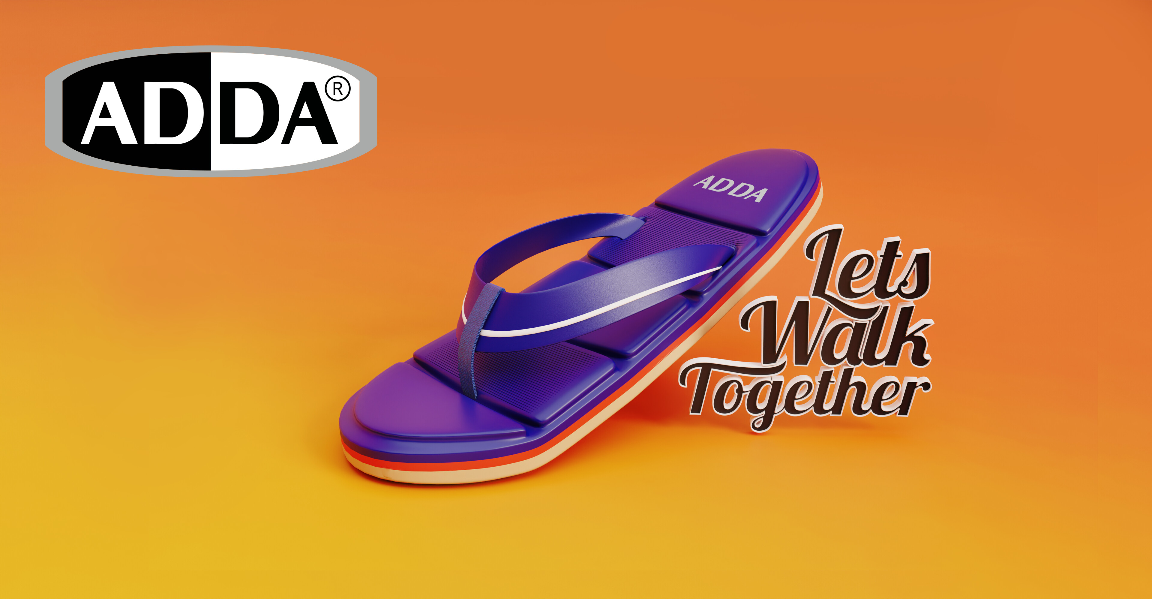
This is a signboard design for a footwear brand I made, it doesn’t look so professional in my opinion. I’ve used complimentary colors (blue subject and orange background). I think I can improve this. Please give me some constructive criticism to improve. Let me what design principles you think we can use.
Softwares used: Blender (cycles render 200 samples) and Photoshop
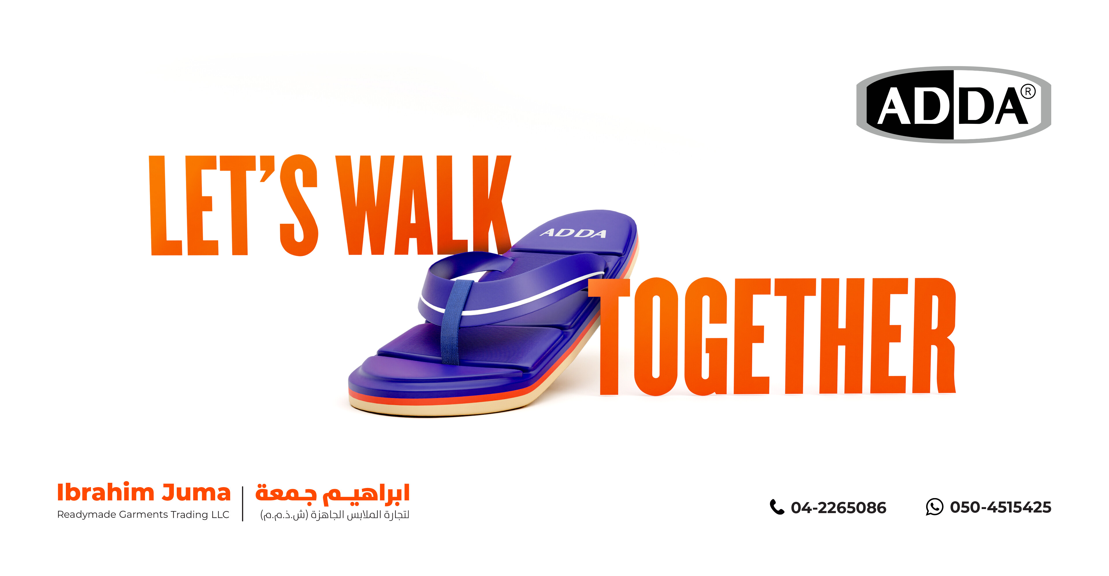
Well you’re missing an apostrophe it’s ‘Let’s’ for ‘Let us’
The typography is a bit weak. Why does the text get smaller towards the bottom?
It seems to be leaning forward.
Adda logo smaller.
Probably bottom right.
1 Like
Thanks a lot, I’ll implement that
The typography is awkward and not as legible as it could be. The white shadow compounds the problem.
There’s a static and uninteresting relationship between the negative (background) and positive (flip flop) shapes. The flip-flop seems lost in a vast sea of colorful nothingness.
The background overpowers the foreground. Warm colors advance, while cool colors recede. In other words, the color relationship between the flip-flop and the background is reversed.
You mentioned complementary colors. Why? Are you making color choices based on their color wheel relationships? If so, why? There are value, chroma, tints, and shades to consider too. Equally important are the emotional tones that colors and color combinations convey. Bright orange and intense, saturated purple are both aggressive colors. Despite them being complementary, they’re clashing and competing with each other to see which can yell the loudest. In that competition, the background is winning, which shouldn’t be the case.
I do like the flip-flop rendering, however.
1 Like
@Just-B This is the best criticism I ever got, thanks a lot. I tried to solve the problems that you stated and it worked. I removed the warm background and used it for the tagline to make it the focal point. The reason I used complementary colors is I think they grab attention. The orangish red color is their brand color, and one of their product (the flip flop) has the dark blue color so I thought it was good match.
2 Likes
Your updated design is much better. I would only change the type (because it seems to lack “breathing room.”) Perhaps change it to the same type face as the ADDA logo or a face that is more complimentary with the ADDA logo.
I love people who ask for feedback and trust that constructive criticism will make their job easier. I always ask for the feedback of my loved ones; when I’m not sure what I’ve done, it helps me grow to develop. So not long ago, I got constructive criticism from my wife; she told me that my dress style is too official; I am not a diplomat to dress classically.
With graphic design, it is not the opinions of your loved ones that matter. It’s the opinions of your clients’ customers.
Your job is to make more money for your clients, not get your design on the refrigerator door.
Sometimes too, family will not give you honest criticism cuz, well, family. They may not want to hurt your feelings.
As for what you wear? That’s your decision as well, Not theirs.
(Shrug.)
1 Like