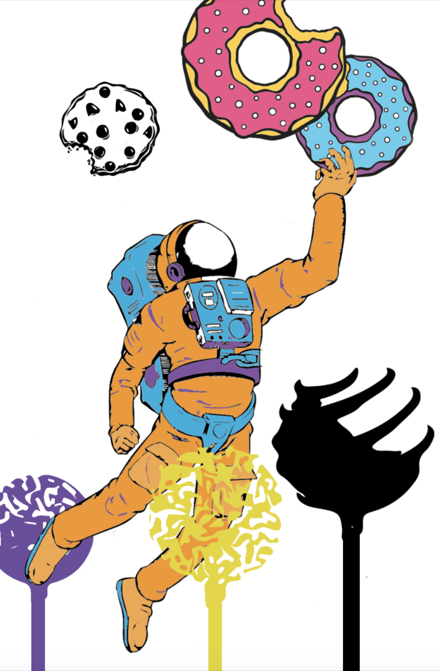
Hey guys, im currently a Graphic Design student, and id really appreciate your critique on this piece and any ideas! This is my space poster, everything is made of sweets, and im going for a pop art look. I want to add more thing such as textures, more treats, etc. but im having trouble where to place them.
2 Likes
I like where it’s going. I like your spaceman and the donuts. I like the purple cake pop.
Personally, I don’t like a the uncolored cookie. It doesn’t blend with the other treats. I also don’t like the positioning of the yellow cake pop. Your spaceman looks precariously perched upon it.
Otherwise I think it’s got some nice potential.
![]()
1 Like
If this is Graphic Design, what is the message that goes along with this? What is the sell?
Illustration for the sake of illustration is one thing, but if it is illustration for the purpose of sending a message then every little thing in the illustration has to have a well-considered purpose.
You say you want to add more stuff to it.
Already you have 3 (or more) styles mixed in here. You have a line art rendered spaceman and flat rendered donuts, calling attention to the donuts, then for some reason added rubber stamped lollipops and a pen and ink cookie that vie for attention because of their placement. Adding even more styles would be clutter. It’s fine to have contrasting styles, especially if it suits a purpose, market or demographic, in order to call attention to a detail. Am I buying donuts or lollipops here? The cookie and the black pop are out of place. IOW, Hierarchy needs to be addressed. Don’t be afraid of white space.
When illustrating for market use, always have a design brief in mind. A lot of times a commercial illustration has to accommodate text and maybe other inset graphics. College courses tend to be so disjointed students don’t readily learn to integrate their skills and sometimes professors don’t consider making their class exercises fit into why you need to know the thing you are doing in order to succeed.
1 Like
The whole point of the poster is to get people to go to space, what will make you go to space? So i decided on sweets, other people did golf, western stuff etc.
2 Likes
That’s good, that’s the message.
Next you could research the target audience. Income level, age, culture, employed/retired, kids, etc. (Design programs don’t always emphasize this early in the program, but trust me, it’s important.)
Pretend your target market is retired Microsoft employees, well off, and ready for adventure. Now research the colors, words, imagery and fonts that will speak to that audience specifically.
Once you have a grasp on that information, design decisions become much easier.
Then design a poster that uses visual hierarchy and those design decisions.
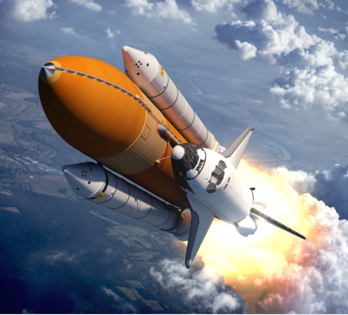
I can visualize a strong, exciting space image with a lot of room for text. Something like the one below. Not this exact one. You could also create a high-tech vector graphic.
Because candy and golf have nothing to do with space. She said kindly. ![]()
I’m not totally clear on this. Is this an illustration assignment that is supposed to suggest a reason to go to space, a design assignment to create an ad to drum up space tourism or something else altogether? There is a real lack of focus in the information being conveyed or the assignment or something.
I suppose everyone is trying to think outside the box with sweets in space, golf in space, etc. But if this is a commercial assignment, I don’t think the concept works. I can go to my grocery store or local bakery and get all the sweets I want. As far as golf goes, wouldn’t the whole lack of gravity make golf pretty difficult?
Commercial assignments are purpose-driven. What’s the purpose? To get people to sign up for space travel? If that’s the case, you’re shooting for a pretty small target market. They’d probably be more apt to go to France for pastries than Mars. Appeal to the adventure. Suggest this is the ultimate bucket list item and then tell them they can check it off their list.
All of that said, if this is more of a conceptual illustration, then my suggestion would be to find a style and that can be used through out the entire illustration. Right now, I see the following. The astronaut appears to have some detail. The cookie looks like a wood cut illustration. The donuts are a flat color style. The cake pops looks like you used AI’s trace and paint tools. Pick one style and go with that.
1 Like
That’s perfect for a tag line.
“The Ultimate Bucket List Item”
“What’s on YOUR bucket list?”
2 Likes
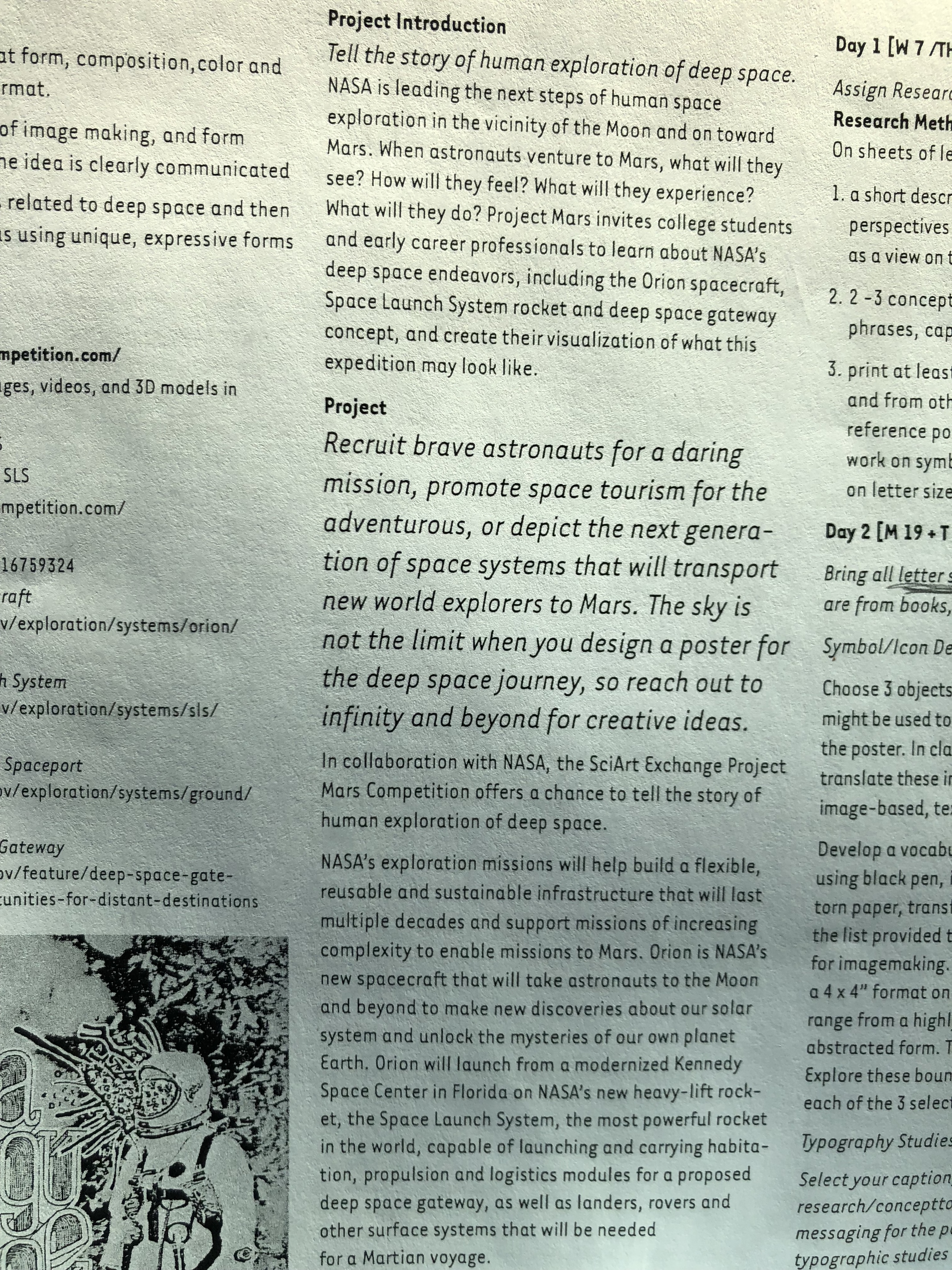
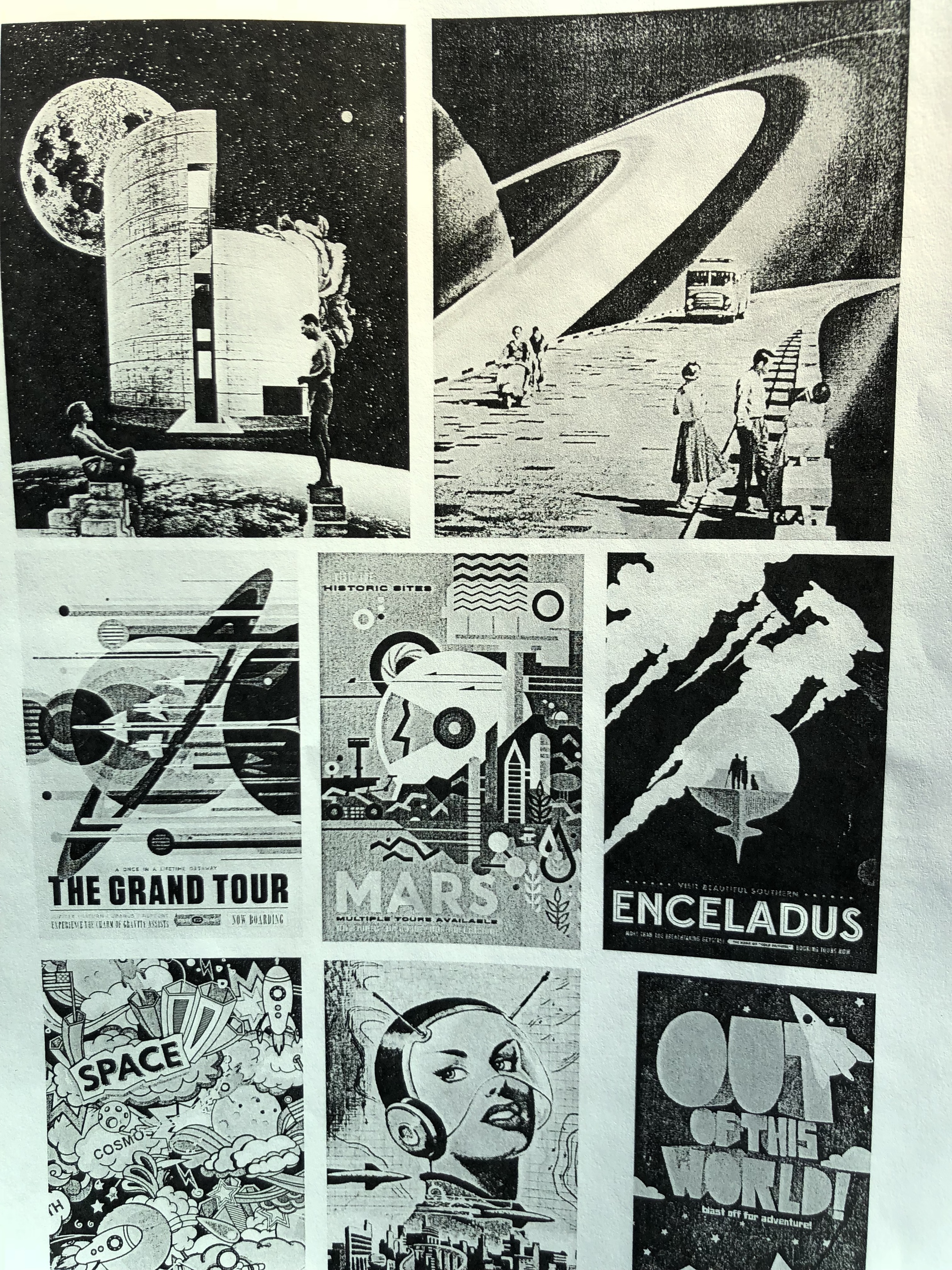
Well, the concept doesnt have to make sense, its something that ive been trying to get through my head too bc every time i try to add something, i think "this doesnt make sense though…"the Project sheet says “tell the story of human exploration of deep space” basically the professor told us to think “conceptually” she showed us example posters, some containing a road with saturn right next to it. For mine, she told me to have fun with it, were supposed to apply media experimentations to the poster and make it more interesting.
its really difficult to explain. I think the idea of having a certain style throughout the illustration would really help.
Can you post the exact assignment brief?
1 Like
Maybe if you add text it will tie everything together. Something to do with travel in a font similar to the examples you posted. Or create a destination name for this planet with donuts and sweets. Just an idea ![]()
1 Like
Oh goodness, based on that you, your classmates and your professor are WAY off the mark. You don’t need to go out into space for stuff you can find right here on Earth, like steve-o mentioned.
DocPixel had the right idea with the “get it done before you die” thing.
Or “Space, the final frontier…” for those more adventurous.
Or mining in the asteroid belt
Or manufacturing on Saturn.
Much better than donuts.
haha yeah well, thats what she wants ![]() its due in a week, so no time to change my entire idea
its due in a week, so no time to change my entire idea
Is it actually supposed to be a design assignment? Or is it something else from a supporting class? Art?
The problem with this assignment is that there is a HUGE difference between space exploration and space tourism.
Space exploration can be done mostly (if not completely) with robots. There’s plenty of arguments showing how inefficient it is to send people to do a robots job. NASA mostly deals with exploration. Virgin mostly deals with tourism. SpaceX is somewhere in-between, doing freight services for both NASA exploration and offering companies like Bigelow Aerospace delivery of their tourism space station components.
BTW here’s the full downloadable color examples from NASA: https://www.jpl.nasa.gov/visions-of-the-future/
1 Like
The biggest problem I see is the instructor not understanding the instructions.
Because I was “that guy” in my GD classes (because I already had a BS and had nothing to lose) I’d follow the instructions and present an argument about it during critique. You take a chance of not pleasing the instructor. In my case, the instructor loved to argue during critiques, in a way that made you think, so we (the study group I hung out with) were likely to get away with it. The worst we got was the professor saying, “do over” and turn in what they wanted the next day. Duplication of work, but sometimes so totally worth it.
As for something being due next week and no time to change the concept, in the real world, you usually don’t have a week when a client’s project takes a left turn. That same instructor of mine would do that during longer projects. We’d be humming along on something she assigned, then come in the next day and change one of the parameters of the design. We thought she was crazy, but if she were alive today, I’d go back and thank her profusely.
Think of it as stress practice. ![]()
Then there is the reality of the situation. You have to pass. The Marketing Director (in this case, the teacher) is totally wrong, but if you want to stay employed, you do what they want.
Can’t win, huh?
Bingo.
I had a professor in college who, on the first day of class, began talking about why he had moved inland from California to teach. According to him, the entire state of California was about to slide off into the Pacific Ocean. He figured Utah might be far enough away from the ocean to escape the gargantuan tidal wave.
The guy was nice, but just a bit nuts.
Despite this being a weekly design seminar, his lecture tangents tended to veer off into alien abductions, government conspiracies and the impending end of the world. I really struggled in that class due to my growing disgust over him wasting my time and tuition with this BS.
Anyway, back to the topic. The assignment is, well, sort of weird. Design instructors shouldn’t give confusing assignments to students that have little relevance to real-world design situation. This assignment is so open to interpretation, it’s difficult to know exactly what the instructor wants.
When I was in second grade, my parents gave me a book (that I still have) about the solar system. It contains these wonderful (at the time) illustrations about imagined space ships landing on the moons of Saturn and flying through the clouds of Venus. I was totally fascinated by the book, and it sparked a life-long interest in astronomy.
Many of the examples you posted as part of the assignment reminded me of that book. In many ways, they’re more about inspiration, grandeur, exploration, imagination and wonder than anything else. If these are the kinds of things your instructor used as examples, this obviously seems to be the kind of things she wants.
So if that’s the case, try placing yourself in the position of your target audience — people like me who might be subject to being inspired and captivated by the wonder of space exploration, then design a poster aimed at them. Hint: it probably doesn’t involve cookies, donuts and lollipops. ![]()
1 Like
Nice work 1llreality, i love the idea.
but your color choice does not relate with your message.
the contract between the orange, purple, and blue is not right
i can slightly see two types of design concept on your illustration, that are not
represented properly (pop-Art and vintage-Art)
i can’t understand the purpose of those purple, yellow and black looking circle below.
Keep on the vibe 1llreality