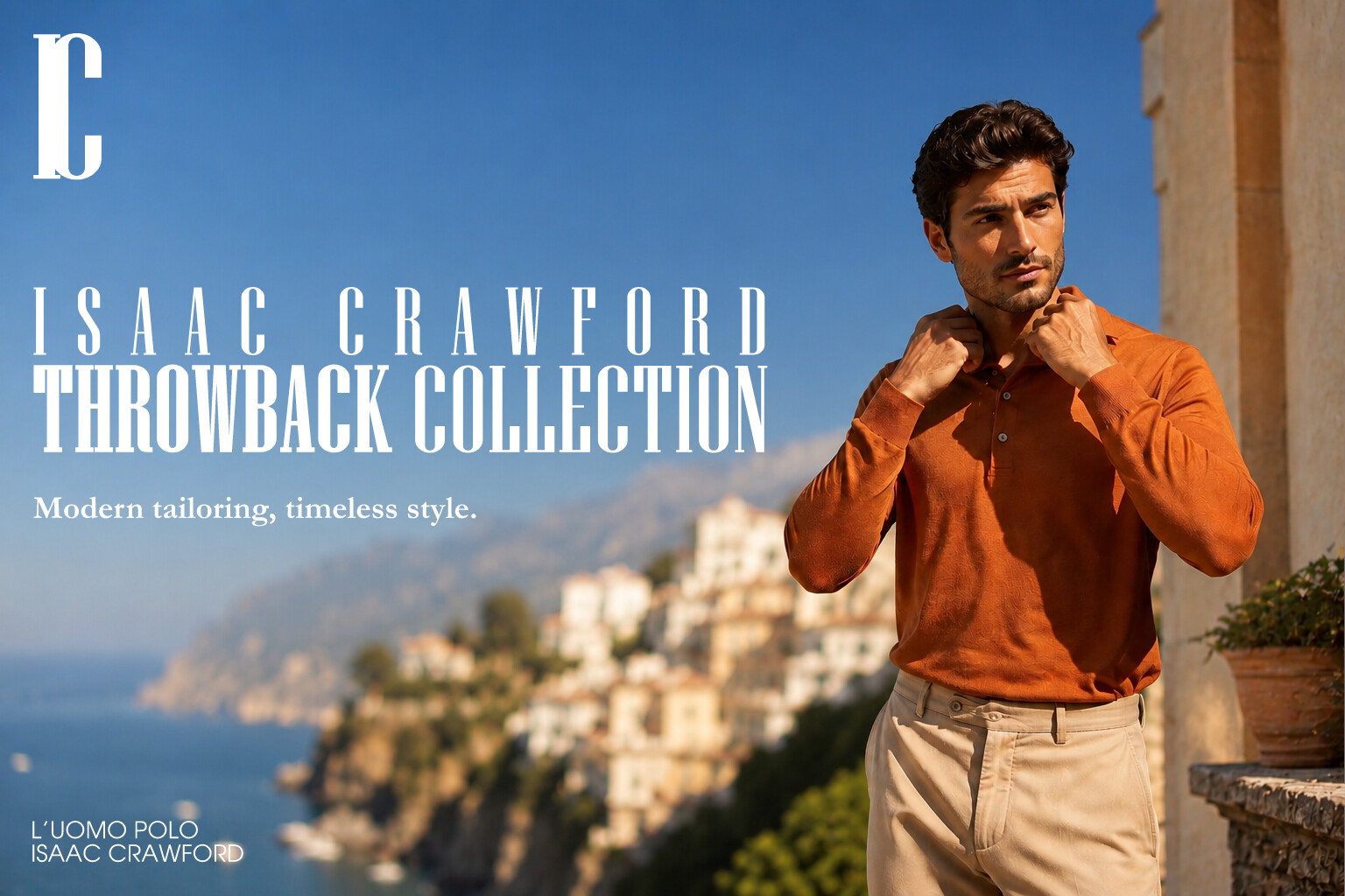
I have created a spec. ad for practice. The background image was generated by AI, as I’m not a studio owner and don’t have a professional camera, personal photographer or models. The logotype and textwork for the ad were done by myself.
The advertisement simulates high-end (Or similar) classical fashion brand advertisements. Please tell me what’s wrong or right with it. Picrel below.
The logo needs some more thought. There are gaps between the I and C at the top and bottom that look unintentional.
Is that a stroke on Throwback? I’d want to see a version without that, and then loose the logo and move the text and tagline up so there’s an implied line that direct the user from the text to the model’s face.
Lower left corner, it’s distracting to have the light colored objects directly behind the text. It makes it more difficult to read.
I think you need to clarify your main point. Currently, the design suggests that the focus is on a county rather than clothes and try to create a sense of balance and check the spacing.There are some royalty-free image websites like pixabay and pexels.
This isn’t a spec ad unless you’ve created it with the speculation that you might convince a client to buy it. Instead, It’s a practice exercise in brand advertising.
I see no problem at all in using AI for imagery in this kind of exercise. You’re obviously not going to hire a photographer and fly them off to Greece for a photo shoot. I don’t think it would be wise to use stock art either (especially the free kind) since it’s unlikely to align with a high-end brand advertising campaign. Discussing what you’re imagining with AI is a reasonable substitute for discussing it with a photographer. Besides, going forward, AI imagery will increasingly become accepted as a less expensive and reliable means of getting good results. I’m a little uncomfortable with the man, however. He looks like he’s in a bad mood from an uncomfortable shirt collar chafing his neck.
The one thing I would fault is the typography. The logo isn’t good, and for reasons others have already mentioned. Two crammed-together letters don’t usually add up to a good logo unless done with some finesse that yours is lacking. In addition, the typography that spells out the headlines is, um, clunky. The letterspacing is uneven, and giving it even color involves spacing it out, as you’ve done on the top line, but doing that would create other problems. If it were me, I’d explore a different typeface.
The two bigger text lines (above the tagline) were initially the same size (I still have that version), but I’ve recieved criticism elsewhere, that there should be one main text line, that attracts attention, that’s why I shrunk and spread out the top text (Isaac Crawford). I may try other vintage fonts I have, or just settle for a version where I have the big text in the same size on both lines.
Everyone has already picked up on pretty much what I was going to say. So no need to go over it again.
I’d say you could go one step further, and put the logo on the shirt. He does look cool and out about town, but it’s not very situational. Greece is pretty hot, especially with the sun like that - are you sure a long-sleeve top is the right product here. I just looked up Greece, menswear fashion, summer, and a lot of the products are shirts, polos, short-sleeved, or roll up sleeves, tops that can open - not long sleeve pullovers/jumpers.
Are you sure you just want to simulate other fashion brand advertisements?
I’m not saying you can’t wear a jumper in the summer. I was in Australia sunbathing on the beach and people were walking by with winter hats and coats on.
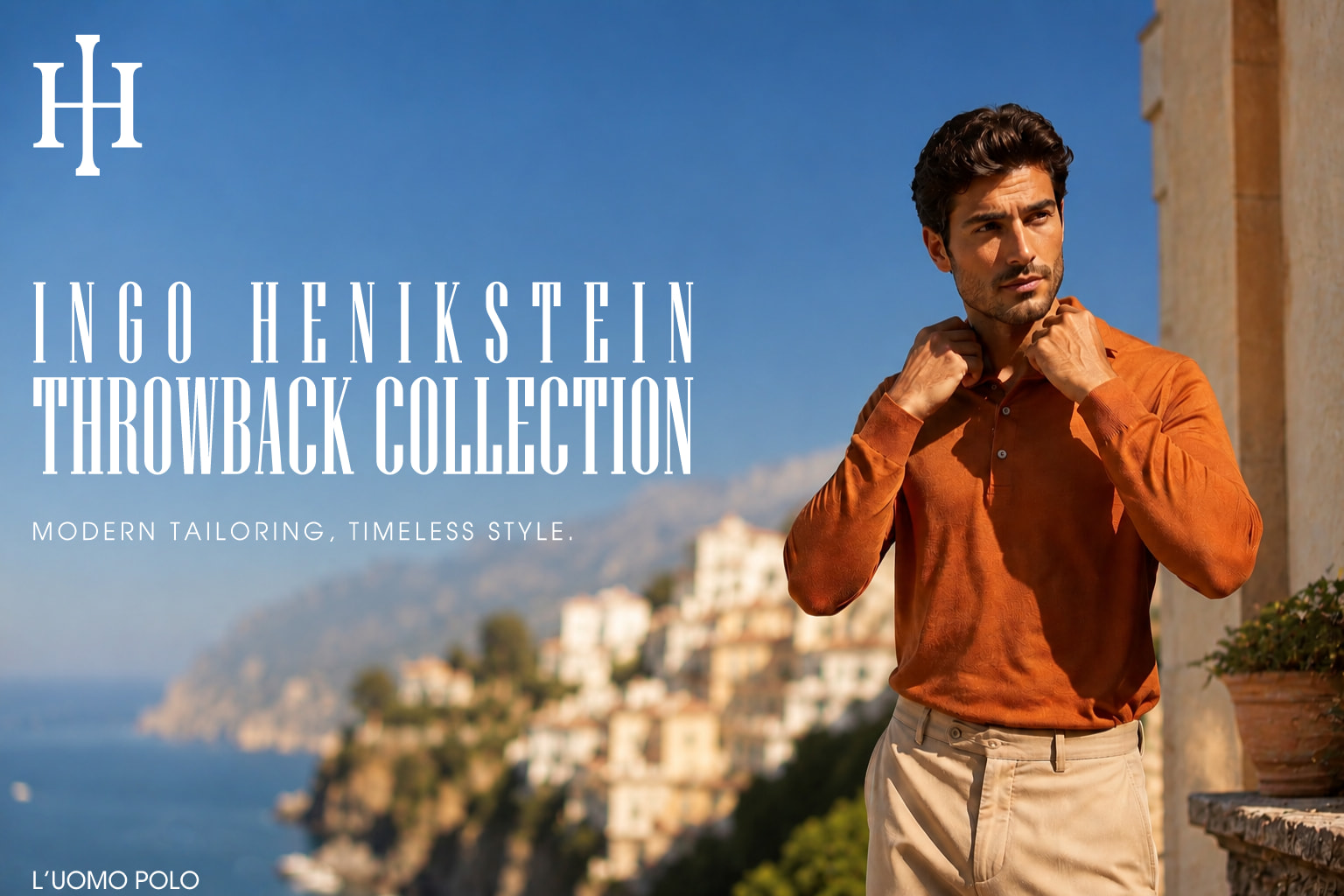
I re-did the ad composition-wise. Explanations below:
-removed the boat blotches in the left corner, for the product tag text to be fully visible.
-changed the fictional manufcaturer name, as I’ve learned that “Isaac Crawford” is a name of a few characters, people on Linkedin who turn up as first results in a search and a hairdressing salon in Los Angeles. I synthesised a “faker” name (The last name “Henikstein” might turn up in searches, but not in this combination).
-based on the name change, the monogram was changed into the “founder’s” initials overlapped into a symbol.
-tagline was remade in the same sans serif font as the product tag line, for cohesion.
-aligned everything by “I”’s (In “INGO”) left serif.
This might not be much better, but I think advice from you that I’ve applied did make it less unpleasant to observe.
(P.S - the site doesn’t load the full image for som reason, there’s also “INGO HENIKSTEIN” below the item tag, akin to real ads, but It gets cut off in the image viewer)