My next project I want to add to my portfolio is a Special Education Center (for children with learning disabilities)
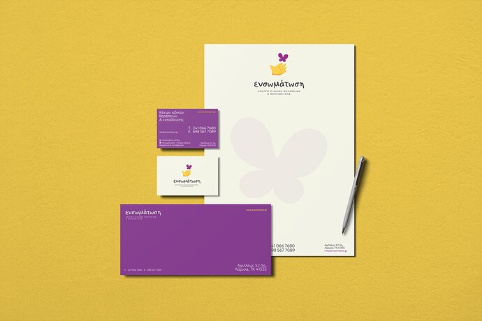
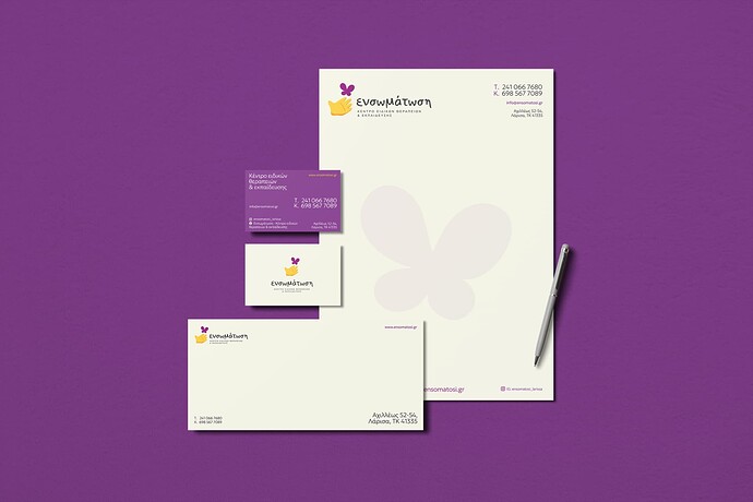
My concern is that maybe having two layouts for the logo on the same mockup is confusing (one with the logomark on the left and one in the middle). So made two options.
Any criticism is welcome about anything!
Hey @Stefanos1984, for the stationery layout, the one with the logo on the left feels more balanced and allows for consistency of the logo orientation across the stationery envelope and paper. This layout also leaves more room in the middle for text, so it’s more optimal for practical use. The only thing that may be worth adjusting is the logo size as it appears really large.
One other thing to note is that the envelope in the top image for the centered option is missing the logomark - it only has the logotype. Is there a reason for that?
And one other other thing, I love the logo and overall brand identity elements - they work really well together!
Were either of these stationery examples actually printed? I’m asking because the dark purple backgrounds would cause production issues.
Even if you found dark purple paper stock, white ink isn’t as opaque as people assume it might be — like most inks on uncoated stock, it soaks into the paper. On a dark background, it becomes grayish. Until recently, the only way to solve this problem was to use engraving or thermography, which both come with their own problems and expenses. More recently, specialty inks and printing have solved this problem with inks that sit on the surface of the paper, but it would probably require sending the stationery to a printer that specializes in that sort of thing. Maybe someone who has more direct experience in a print production environment could better address this problem.
Alternatively, you could reverse the text out of the dark color, which is also problematic because of dot gain on absorbent uncoated stock used for stationery. Dot gain occurs as the ink soaks into the paper and spreads a tiny bit. Considering the thin strokes in small typography, this can be a problem.
Another problem with printing the dark color is the envelope. How will the client print an address on a dark-colored envelope? In addition, getting an even, dense purple might require a double bump (printing two layers of ink), but this wouldn’t be doable considering the small reversed text. Another problem is that printing a full bleed on an envelope requires converting it after it’s printed. Converting is the term used for cutting, folding, gluing, and gumming the envelope.
All the problems I’ve mentioned have solutions, but they require extra expense and specialty services. These are practical production problems that add time and money to a job, and they must be considered on a real job. I wonder if you’re doing that or just designing what you think will look good.
Thank you @efmgdesign for your comments.
With the logomark on the left of course it looks more balanced, but maybe it’s inconsistent with the front side of the card which is aligned on the center.
As for the envelope I could use the logo on the other side of the envelope.
@Just-B You are right about everything. Actually all these are meant to be used on online portfolios, so there is no print purpose actually. So I am trying to make something visually more striking actually, even if I do know that all these require a lot of money to be producted.
I would probably skip the purple envelope as it looks very “cheesy”.
Any recommendation about fixing layouts or something?
@Stefanos1984 Although, as you mentioned, this project is meant for a portfolio, you want the design to reflect realistic, real-world use cases. It’s more realistic to see the paper and envelope together in mailings and the business card separately on its own. Therefore, it’s more important that the logo orientation used on the paper and envelope be consistent with each other over the paper and the front side of the business card. Along with this, the second layout option feels less chaotic to look at - it’s easier on the eyes.
You also might want to consider Real World practicality. You want something to be striking, but you are highlighting the work in the wrong way. Anyone doing the hiring, like JustB, would notice all the production issues and maybe decide you aren’t a viable candidate based on lack of those considerations. It’s rare (to the point of nonexistent) that a client has unlimited budget.
So if I go with the white envelope, I think there is nothing too expensive to me produced.
The logo is great, and the colours you’ve chosen work well together. The typeface for the wordmark is effective too.
I would explore different layouts for the business card. The lockup of the logo and wordmark isn’t consistent with the letterhead or envelope/comp clip, where it’s left aligned. The side of the card with the details don’t follow a clear hierarchy, and there’s too many font size/colour combinations going on. I would keep the website and email address together, and de-emphasise or remove the social links altogether - the Facebook link is especially long and makes it feel unbalanced.
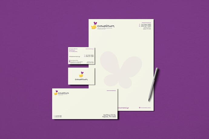
This an update
I ditched the purple side totally.
I kept total consistency between envelope and letterhead.
As for the hierarchy in the business card, I tried to make it a bit more “fun”. Diagonally with black color you find the basic info (what it is, where it is located and the phone number) and in the opposite direction diagonally with purple color are all the online info (site, mail, social).
I gave emphasis on the phone number there.
Is it bad to have two versions of a logo?
On the other hand , envelope and letterhead, I gave emphasis on the address.
That is the reasoning behind my choices.
@Stefanos1984 There’s nothing wrong with having two or more versions of a logo - a responsive logo suite is a good thing as it allows flexible placement and scaling of a logo for varying spaces. The centered logo on the business card is perfectly fine cause it best fits that space.
As for the business card layout, I think the hierarchy is fine, it’s more about whether the layout is in line with the prescribed visual direction for the brand. There’s a sense of movement and fluidity in the layout of elements - is that part of the visual direction and what you mean by ‘fun’ layout?
Being saying this about @Stefanos1984 work since they posted.
The inappropriate lawyer brand, the circle with hole punch obliterating a letter, and now solid dark colour for a comp slip that needs to be hand written on.
These are all red flags of production issues and perhaps not quite understanding the nuances of real world practicality.
And nothing wrong with that - just starting out, you’re not supposed to know everything.
But really should consider real world implications and client needs.
Oh the lawyer brand is inappropriate? You mean by how could this be applied to real practice?
About the solid dark color, you mean the purple side of the card that I skipped totally?
by “fun” I mean a bit more bold. With high contrast on font sizes and different colors.
@Stefanos1984 Ok, I see what you mean - the layout doesn’t necessarily feel ‘fun’, but it definitely feels bold with the contrast in font sizes and colors and sense of movement and fluidity of the elements. Love it, good work!
There’s always computer printed address labels (maybe even pastel colors too.) No need to hand write. But you gotta stick em.
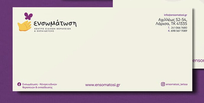
I’m unfamiliar with Greek postal regulations and conventions, but doesn’t a postage stamp and/or postage indicia need to go in the upper right corner where you have the return address? In the U.S., that spot is reserved for postage on 1st class mail.
It also seems a little unusual to place an email address, website URL, and social media information on the envelope. Those things are typically only placed on the letterhead. In addition, the bottom line of the Facebook information lies inside the safety zone, which is a problem.
In the U.S., the postal service often uses the bottom of an envelope to print routing barcodes. This wouldn’t matter much for 1st Class mail, but to receive reduced mass mailing rates, that area needs to be blank, or the postal service will charge extra.
Again, I don’t know the postal requirements in Greece, but have you checked?
Years ago, when I was an art director at an agency, one of the senior designers misunderstood one of the layout requirements for mass-mailed postcards. The client sent out nearly 100,000 of these postcards and then received a bill for somewhere around a thousand extra dollars from the postal service because the mistake voided the reduced mass mailing rates. The client was upset, and the agency needed to pay the bill. Nobody was happy.
After that incident, every time I or anyone I supervised designed any kind of mail, I always checked with the postal service or their website to make sure of the regulations and whether they had changed since the last time I checked.
I’m coming across as being a stickler for details, but details matter because mistakes in the details end up costing money. As @PrintDriver mentioned, if you show your portfolio to experienced art directors, they will see the practical, regulatory, and production mistakes, whether they mention them to you or not.
That’s why I am posting things here. For much more experienced designers to give me meticulous criticism. I missed that part Just-B. Of course the upper right is the place for the stamp!
I didn’t think of that, I was driven by design principles only. Not practical issues.
Number one design principle:
Be practical.


