Student Design Critique

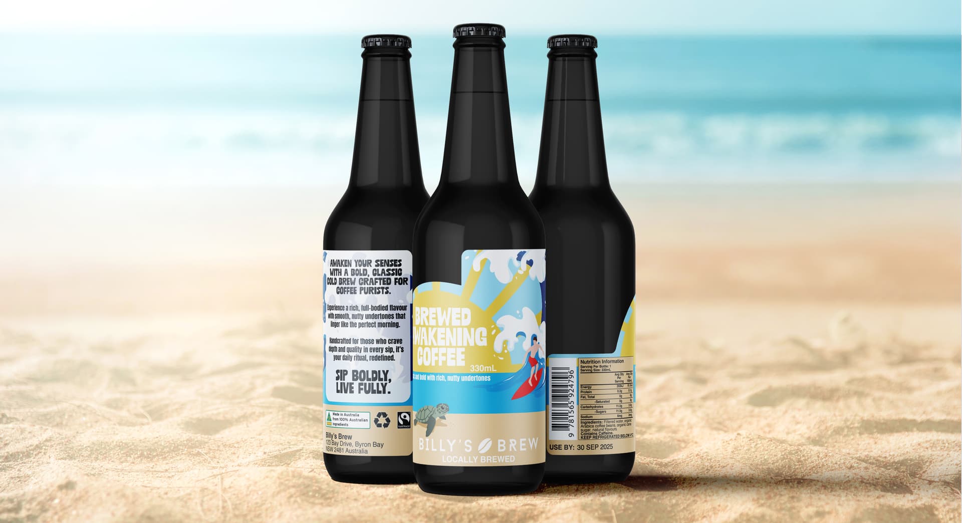
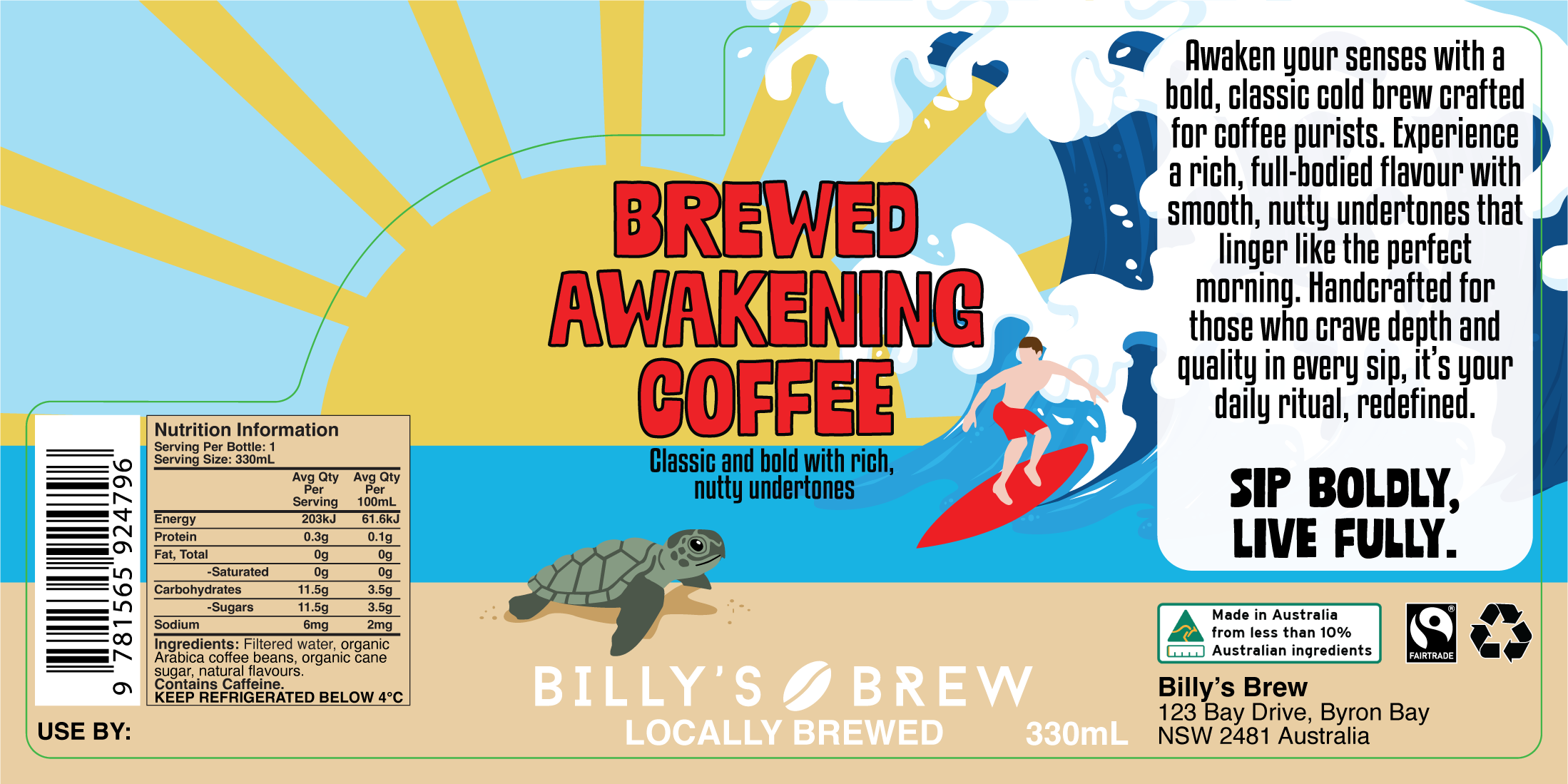
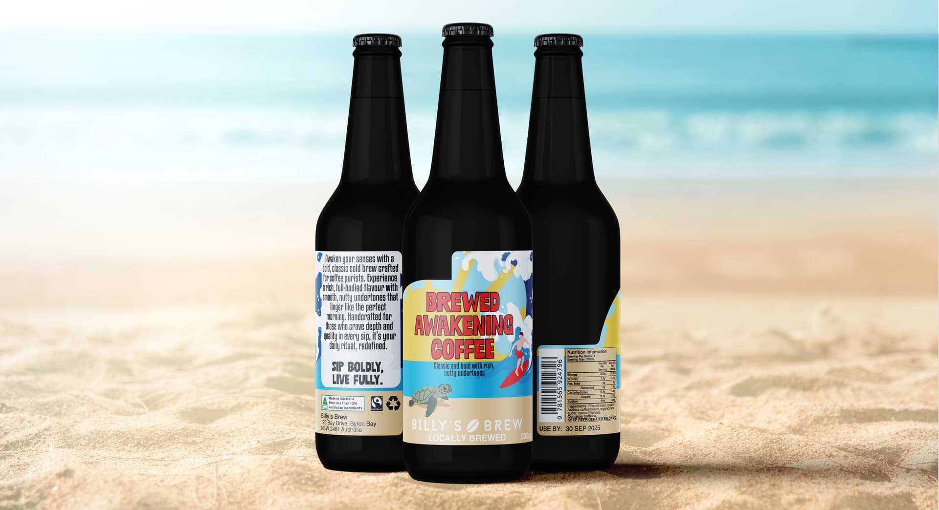
Hi All, new to the forum, so hopefully I am posting in the right place. I’m currently studying a Diploma of Graphic Design in Australia and am working on creating a label as part of our assessment. This label has been developed over 2 assignments, this being the final stage of it and my lecturer in the assessment feedback has indicated that my “Brewed Awaking Coffee” label was the strongest of the two designs initially presented (we only had to design the front portion of the label to start). The next stage is to develop the label fully to be print ready and ensure the mandatory elements are included.

The mandatory requirements were:
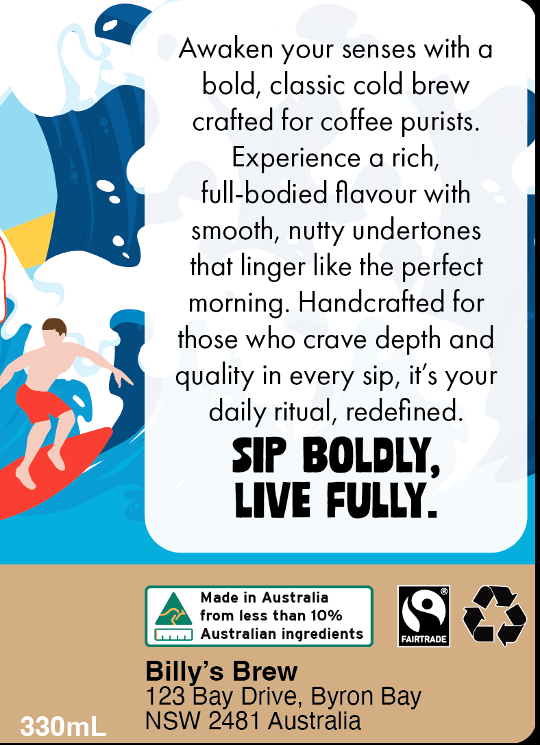
• Logo
• Name of brew
• Short description of the product (provided by the “company”)
• Barcode (scaled minimum 80% of original size)
• Fairtrade Certified logo
• Ingredients
• Volume (i.e. 330ml)
• Recycling logo
• Space for a use-by date to be printed
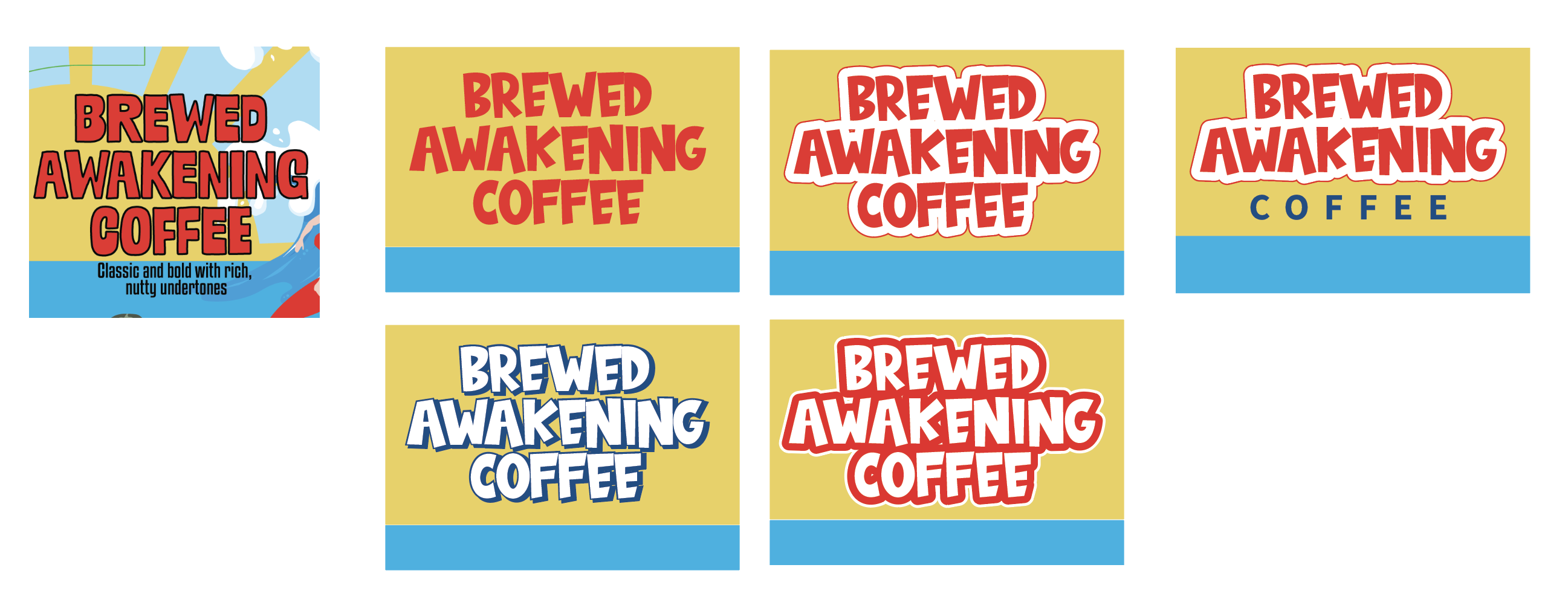
• 1 x Embellishment - I have chosen to use UV Spot Varnish in Gloss on the “Brewed Awakening Coffee” text as well as on the Logo, I am struggling to find a way to show this on the mockup to get this showing as a glossy texture in photoshop
• 1 x Die Cut (outlined in green on the full image of the layout), the bleed outside of the die cut is 3mm.

The paper stock I chose for the label is a matte texture as well to help make the UV Spot Varnish more effective.

I did add some extra elements from this after researching label requirements, and depending on where this will be sold (not mentioned in the brief e.g bottled and sold in the local coffee shop only, or sold in supermarkets, service stations, etc. ) it is an Australian Requirement to have a Nutrition information panel as well as country of origin labelling.

I have included the mockup that I have placed the label onto, with the die cut part removed.

Thank you all in advance for your time.

Hi.

Firstly, good on you for actually studying design in the first place, as so many, who choose to call themselves designers, don’t any more.

Anyway, as to a critique, this may sound more damning than I intend, or it deserves, as it is a pretty easy fix, but for me, whatever I think of it, becomes academic, as it falls at the very first hurdle. You can’t read it. Put that against competitors in any retail setting and it will get passed over.

The next part is a little less easy to fix. The product itself, combined with the language used and the packaging itself left me a bit non-plussed. So much so that I had to go in and read the small print to find out if it was an alcoholic beverage or not. That bottle shape and the word brew (although entirely accurate for coffee), immediately conjures up beer.

The whole beach surfing lifestyle and coffee also feels incongruous and off for me. That could be a cultural thing and cold coffee drinks and outdoor life are common. For me cold coffee and hot days don’t naturally marry. Iced tea, perhaps, but coffee in a beer bottle or s nor something I’d naturally associate with the beach. If it is a thing there, then I’ll pull my head right back in where it belongs.

That said, if it is something new you are bringing to market, then you’ll need to be new, bold, disruptive and exciting to counter the, ‘what? Coffee at the beach?’ Reaction, like mine. It needs to be so bold as to make me go. ,‘well, I love coffee, let’s give it a go’

I know exactly how I’d approach that, but the point here is to to give you the solution, but get you to find your solution.

The name does not scan particularly well. It’s not all that memorable and doesn’t trip off the tongue easily.

It also feels like it needs more focus and hierarchy. Currently, there are lots of elements with equal visual weight. You need to think what you want it to do and say and how you want people to think and feel about it, then use that to determine how you make (guide) them do that.

Please don’t feel this is an assassination. There are things I like about it, but it feels like some of the fundamentals have been sacrificed for a style you want to achieve.

Hope this helps rather than deflates.

1 Like

Thanks Sprout. Unfortunately the name is something I can’t change, that is the name the “company” in our design brief chose, so no play on that one. I should have added that in there. Same with the wording on the side panel that describes it. I have no control over what that actually says.

Just clarifying a couple of points, yes this is a new to the market product in our brief and they are from Byron Bay, which in Australia has a pretty big beach culture and scene. Hence the choice of using the beach. Also Australia has a pretty big coffee scene, so cold brew, iced coffee are pretty common on a hot day here. (Although so is hot coffee on a hot day)

Would you mind clarifying when you say that you can’t read it? Is it a particular part that doesn’t read well? Do I need to increase the size of the name? Or is it the choice of the side panel where I have alternated the two typefaces? Now I look at it, I don’t like the sandwich affect that have created with it, so I will definitely play around with it.

I was going for a more unique product packaging to make it stand out against the current cold coffee options available in Aussie supermarkets, similar to a kombucha bottle, so I may look for a better photoshop mock up to use so it doesn’t look like a beer, but still has a shape similar to the bottle I want to use. To be fair though, one of the mockups that they provided us to use was a beer bottle, I changed the colour to black as there is a product packaging company that does offer a black option, and its not a beer bottle colour you see much of on the shelves here.

I’m not about the die cut around the label. Actually not sure if it works or not.

Pretty sure it might need to be tapered if the bottom circumference is larger than the top circumference.

You could reduce the font size of the barcode, it’s probably fine, but text is very close to the barcode could affect scanning. The font just needs to be large enough to be human readable to compare against scan, or input manually if barcode is damaged. A bit more space between them would be useful.

Says it’s 100% Australian ingredients. What type of Coffee beans? My research suggests that Arabica and grown in Queensland and Northern New South Wales, where the climate is suitable. But the label doesn’t tell me this.

Brings me to the fairtrade logo - why do you have it if it’s 100% Australian ingredients? To legally carry the Fairtrade logo, the coffee must come from Fairtrade-certified producers and meet international supply-chain standards.

My apologies, it was still silly o’clock in the morning when I responded. I meant to elaborate. It is mostly a colour thing white on yellow doesn’t usually end well, especially from any sort of distance.

I understand that you have to stick with the name – and in this case you will, as it is a college brief. However, when you work professionally sometimes you do have to have awkward conversations with clients about such things. Sometimes they listen. Sometimes they don’t. At least if you have voiced your concerns then when things don’t work out quite as well as they’d hoped, then they can’t throw it back at you.

The amount of times clients come to you with pre-conditions because ‘their mum’s favourite colour is purple’ is risible.

Anyway, good luck with it all.

FWIW, I would give it a go. I spent a number of years in Italy and one of the nicest things early morning when you know the day is about to be a scorcher is an espresso shot at the bar. OK, so there may be a glass or two of cold Gavi later on, but first thing in the morning, there’s nothing like a good espresso.

Thank you for pointing out the bit about australian beans not being a fairtrade certified country. I had actually forgotten to check that out, and the location would be something I would actual get if it was a real company instead of just the generic Arabica Beans that we were supplied with. I have gone and changed that now so I don’t forget to a made in australia with less than x% local ingredients. I have just modified the die cut too since my initial picture I posted, as once I moved and changed the “Brewed Awakening Coffee” text, it looked odd. So it still has the curve but doesn’t drop down before going back up

Thank you for pointing me to a tapered label generator, this will come in handy in the future. The actual bottle that I used to get my measurements was the same top and bottom. Not sure how well the mockup shows that. I do have individual versions a digital bottle mock-up in the presentation that I have a white background that make this look a bit clearer on the middle of the bottle being the same circumference.

Thanks Sprout, I re-read your post earlier and thought it was actually to do with the positioning, so I changed it. Then I changed the colour of the text as white looked terrible across both the yellow and the light blue and the white from the waves. I think I also increased the size just a little bit too. I would personally like to remove the “tasting notes” on the front facing portion of the label. The “company” also incorporates it in the description, so that would be something I mention about removing if we could.

It definitely reads a lot better with the colour change, and then moved to the centre of the label makes it more prominent and bold. So would stand out a lot better on the shelf, I know red text with a black outline is a bit cliche as well, but I decided to match it to the shorts of the surfer and his board.


Nothing beats a good coffee anytime during the day.

Much better. You are far more likely to see that across the supermarket aisle now. Picking the colour from the board and trunks also makes sense to visually connect them. They all look less like disparate objects ‘plonked’ on there now. By just doing that you have now built in some hierarchy to it, the eye goes from name, which, although I don’t love it does tell you what it is. Then to the supporting surfer dude, secondary emotional build, then to the cute turtle. Although I am not a fan of the font, it is probably the right sort of thing for this, in terms of emotion building. No overall, a vast improvement.

The company name is a bit lost – perhaps not such a bad thing. I am assuming this is another thing you were given and have to work with. It’s not the loveliest logo in the world. That said, the client is going to want it a bit more prominent. I would reduce it in size and make it dark on the background colour (do they have a colour version?). Also, again, a bit more space between it and the ‘locally brewed’ Smaller and more space around has more impact than filling the space, per se. Again think hierarchy and size. If you make to dark and left it that side, it would fight with the main product name.

For what it is worth, I don’t mind the description underneath, but I’d move its down a touch, so both it and the name have a bit more room to breathe. It creates tension that it is so close to the border between yellow and blue. Give it a similar distance (then adjust visually) the space between the bottom of the word coffee and the blue/yellow borderline.

Finally, the text box on the right. Do the same. Give it room to breathe. Reduce the point size and lead it out a bit more. It will read better and not look so tense. Bring it in from the edges of the box a bit. Once you lead it out a bit, it will reduce the hole between the text and the SIP BOLDLY, LIVE FULLY text, too. When you push text right to the edge of its containing box, it always creates a sense of disharmony. The space you leave is just as important as the space you fill.

Isn‘t Byron Bay where Home and Away is filmed?

Thanks sprout, your feedback has been invaluable in helping me to improve this design.

We were only given black and white logo options, so I would have to confirm with the lecturer if we are able to colourise it. But if not, this is something that could be brought up if it were a real client and present them with a coloured option. Changing it to the black version made it draw to much focus away from the name in my opinion, even with the size reduction, so I changed the background colouring behind it to be darker to give it more contrast between the brown and the white.

I did actually have a space between the text and the SIP BOLDLY but have removed it, reduced the point size and increased the leading and it greatly improved that side of the bottle. Looks much better.

Palm Beach is where they filmed Home and Away which is about 8-9hrs south of Byron Bay.

I’d explore your “Brewed Awakening Coffee” type more. I’m not saying any of what I have done below is correct. You may even be able to use a deeper yellow as a drop shadow like effect or an outlined effect. But do not just use the default outline. If you are using Illustrator use the appearance palette where you can add more than one stroke if need be (like my right hand options below) but you can also place the stroke behind the fill as well.

Right now, while the red is bolder and easier to read, the black outline is not doing you any favors, because that actually is detracting from readability.

Also the “Awaken your senses …” text is also not as easy to read due to the tight line spacing, and that it is bold and condensed. The text needs a little more breathing room. It also definitely needs more of a margin from the edge of the rounded rectangle white shape it is within.

So, once again, I’m not saying any of the below is right, but when you look at the original next to some explorations you can see that red with black outlines is also not standing out.

2 Likes

Thanks Craig, looks like I forgot to post an updated image with the updates I had made to the Awaken your senses text. But I have increased the line spacing and added more of a margin to the edge. Also I did adjust the spaces between the brewed awaking letters to make it a bit more readable, but I do like some of the examples that you have posted so I might play with that a bit more over the next few days. Thank you for taking the time to put in some visual examples.

Updated image for the Awaken your senses text. I also took some of your feedback about the “boldness” of the typeface that I had initially used.

Better, but now there’s not enough space between the text and the strap line, deacrease overall leading a touch and add a half line space in there.

1 Like