Hi Everyone! This is my first post, I wanted to upload my resume and get any critiques. I am a second year graphic design student and have been applying to co-ops/internships but I’ve had difficulty figuring out if my resume is good as we need it to be designed well but also have it be ats approved for companies. I am trying to secure a job at a bigger company and get a job as a traditional designer but I feel my work might be lacking. I am still updating my portfolio which is on my resume but ill try to link it, i am open to critiques and suggestions on how I can improve my portfolio as well! Thank you!
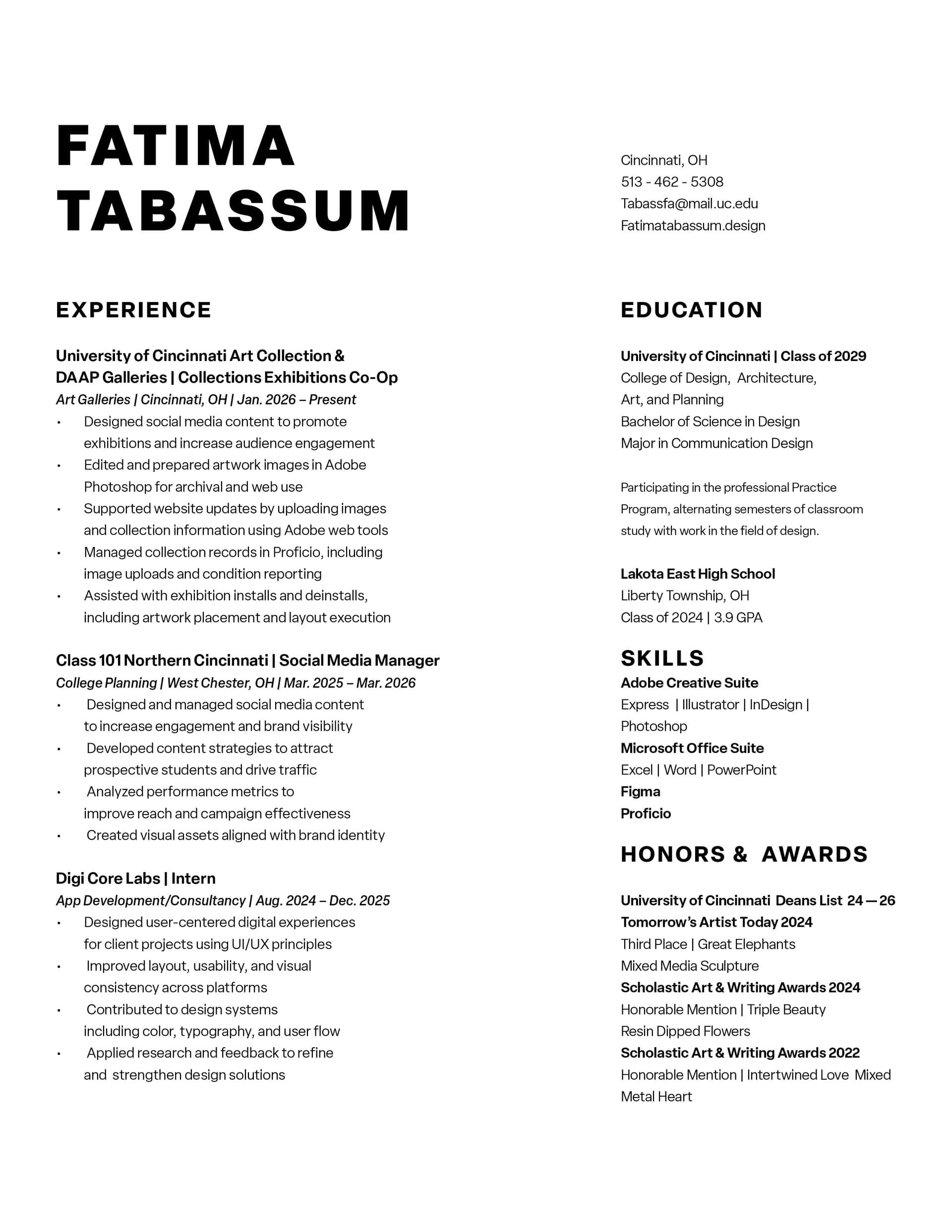
At a quick glance it looks good. Once again, quick glance, but the first line of several of your bullets near the bottom of the page do not align. They are inset by what appears to be an extra space. The space after is inconsistent in the right hand column after Education, Skills and Honors & Awards. It looks like you are generally trying to match the space after Experience. But I’m not sure if that is necessary. At the moment the space after Skills is less.
There is an extra space between “Honors &” and “Awards”.
All in all, it is clean and to the point. It should be able to be easily read by any automated resume scanning software used by companies from what I can see.
I also quickly looked through your portfolio site, and have to say for a student, the work is much better than I would have expected. I especially like the experimentation section in the Elusive Echoes piece. It is nice to see a student using hands on techniques rather than just immediately relying on the computer.
1 Like
You were also in the Class of 2029…
I would probably tighten the letter spacing of your name, but it appears it was intentional, and it’s a minor thing anyway. In other words, your resume is in very good shape, and believe me, I’ve seen more than a few that weren’t. Fix the few problems we’ve found, and I think it’s good to go.
Hi! Thank you so much for taking the time to point some things out, I have fixed all the inconsistent spacing, I was making so many versions I hadn’t realized. I also appreciate you looking at my portfolio, Thank you!
Thank you so much! I did create the letter spacing intentionally in my name as well as my titles but if you think it would do better without any spacing I can change it!
1 Like
I am looking over your portfolio and the first thing I noticed is on the DUHA logo design you have your colors in HEX. You should always use Pantone and CMYK when developing branding. HEX is strictly for screens if the customer ever wants to print they will need their colors to translate properly.
Even black is more complex than just #000000. Google rich black for printing.
fatimatabassum.myportfolio
I have made a new website, would you mind looking over this? I will make changes to the color codes, although I have noticed many people do not have the color codes at all so should I remove them instead?
No don’t remove them. Instead you should list your colors as Pantone both C & U (coated and uncoated papers) if you can, as well as the CMYK. It is important to note that often a Pantone looks richer in C and duller in U it is important to understand this. When printing things like letterhead and envelopes they would be on an uncoated stock so the client can write on them. I would also include the RGB & HEX for the brighter colors so they can see you are considering both print and digital output.
Try researching branding guides to see how they breakdown their colors and typography. I would maybe take your DUHA logo and expand on it. Show it in all black and all white on a black background. Also include a 2 color version with the orange sun and black text. I am not sure where the green background came from it is confusing as green is nowhere in your color story for this brand.
I would remove the gradient from the core logo as that is best used only in digital. If you want to flesh this out add a stationary suite (business card, letterhead and envelope), show it as a building sign, embroidered on a shirt etc. Then if you want to show some digital options you can bring the gradient back in. I think the sun would look great as an App icon.
Also something I noticed that is kind of just an eye bug is that on the notepad it is showing the logo on the page turning over. I have never seen a notepad with a logo printed on both sides of the page which is what this suggest. I would remove the logo from the back page.
I saw your other post requesting review so I won’t go into the Florals cards too much as that was already addressed well by someone else except to say you have too many font options. I know it is all the same typeface but I would limit it to 3 maybe 4 styles. Expand on it saying something like black should be used for headlines, semi bold for subheads, regular for body text something like that.
1 Like
Just a technical clarification on the Pantone references.
Pantone C and U do not automatically represent two different ink formulations. The suffix indicates the type of stock on which the colour is being shown C for coated and U for uncoated.
For example, Pantone Orange 021 C and Orange 021 U show how that colour is expected to appear on those two paper surfaces. The coated version will generally appear brighter and more saturated, while the same colour on uncoated stock will appear duller because the ink absorbs into the paper.
It’s the same ink, different substrates.
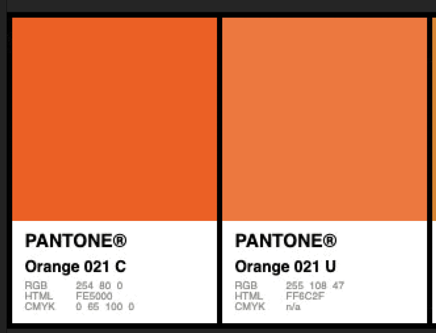
If maintaining a closer visual match between coated and uncoated applications is important, you may decide to select a different Pantone colour from the Uncoated guide that looks more like the chosen coated colour.
This means specifying a different spot colour rather than simply using the U version of the same number.
This is why the printed Pantone Formula Guides are important. You should choose colours from the physical guides rather than relying on how Pantone colours appear on an uncalibrated screen.
I would also be careful about presenting CMYK values as universal equivalents. CMYK values depend on the paper, printing conditions and colour profile being used. A build intended for coated stock may not produce the same result on uncoated stock.
For a student branding project, it would be reasonable to show:
the primary Pantone spot colour (and if you like - an approved alternative for uncoated stock, (might be overkill for a student portfolio)
CMYK values
RGB and HEX values for digital use.
The colour codes should not be removed entirely. The issue is not that they are included, but that each one should have a defined purpose. HEX and RGB are for digital output, CMYK is for process printing, and Pantone is for spot-colour reproduction.
A strong brand guide does not need to list every possible colour system merely to look comprehensive. It should specify the colour standards that are genuinely relevant to how the identity will be produced.
Bottom line
for Orange
Pantone 021 C - for coated stock
then find an equivalent similar colour for the U variant
As you can see they are wildly different.
But imagine showing your client a vibrant orange.
Then they get a dull orange from the printers.
Real world conseqence
You lose money.
1 Like
@Smurf2 Thank you for explaining that better than I did. I have run into this very problem right now. I work at a print shop and a client brought in a business card designed with a Pantone C blue but wants it on an uncoated stock and is not happy with how dull it looks. Working on alternatives for them now.
1 Like
I think this is looking really good! One thing I notice is that the spacing between each of the bulleted “paragraphs” is the same, so it makes it hard to see where each sentence ends. I would adjust the spacing between each sentence to give a clear proximity and hierarchy for each of these elements. However, I’m just a student learning design myself, so do not take anything I say as professional advice. 