Hello! I am a current graphic design student (this is my first class!), and am hoping to get some feedback on my magazine design project. The purpose of my project is to communicate how accessible fashion can be used to increase both inclusion and creative expression for people with disabilities. Likewise, the audience I am aiming for include young adults and teens with such disabilities, as well as designers in the fashion world. My design would ideally be used in fashion magazines, bookstores, waiting rooms, etc. I am open to any suggestions that could help get these ideas across, and would greatly appreciate it!
it is not a student magazine, right?
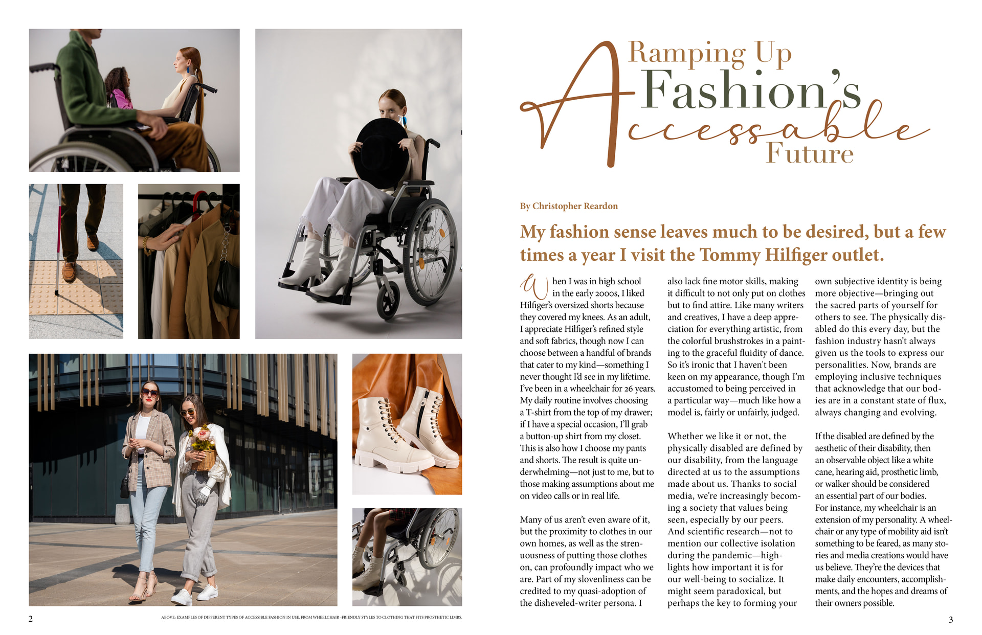
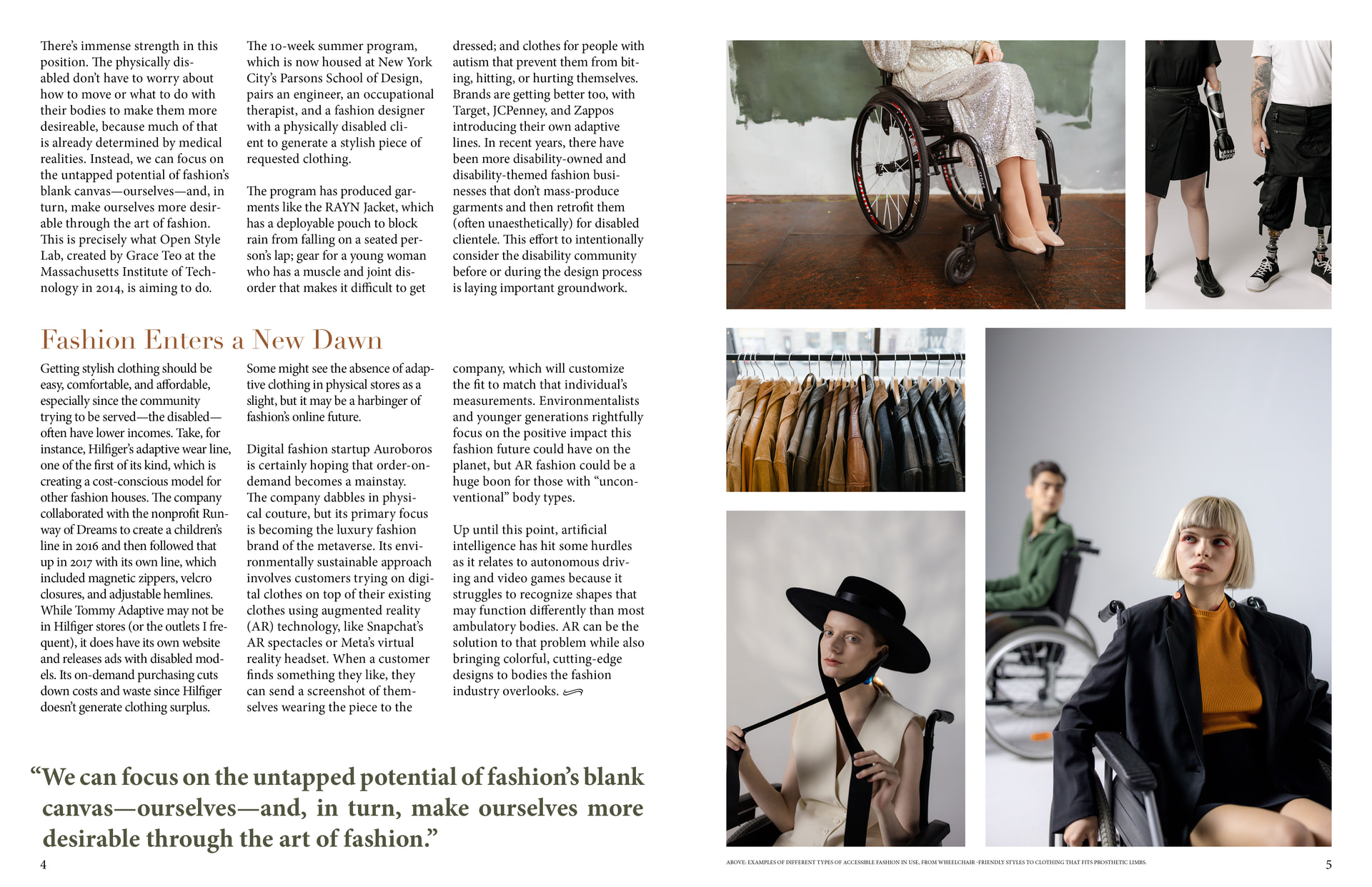
The colour combination is nice, but there are too many fonts used. I suggest using fewer fonts—ideally a maximum of 3 styles
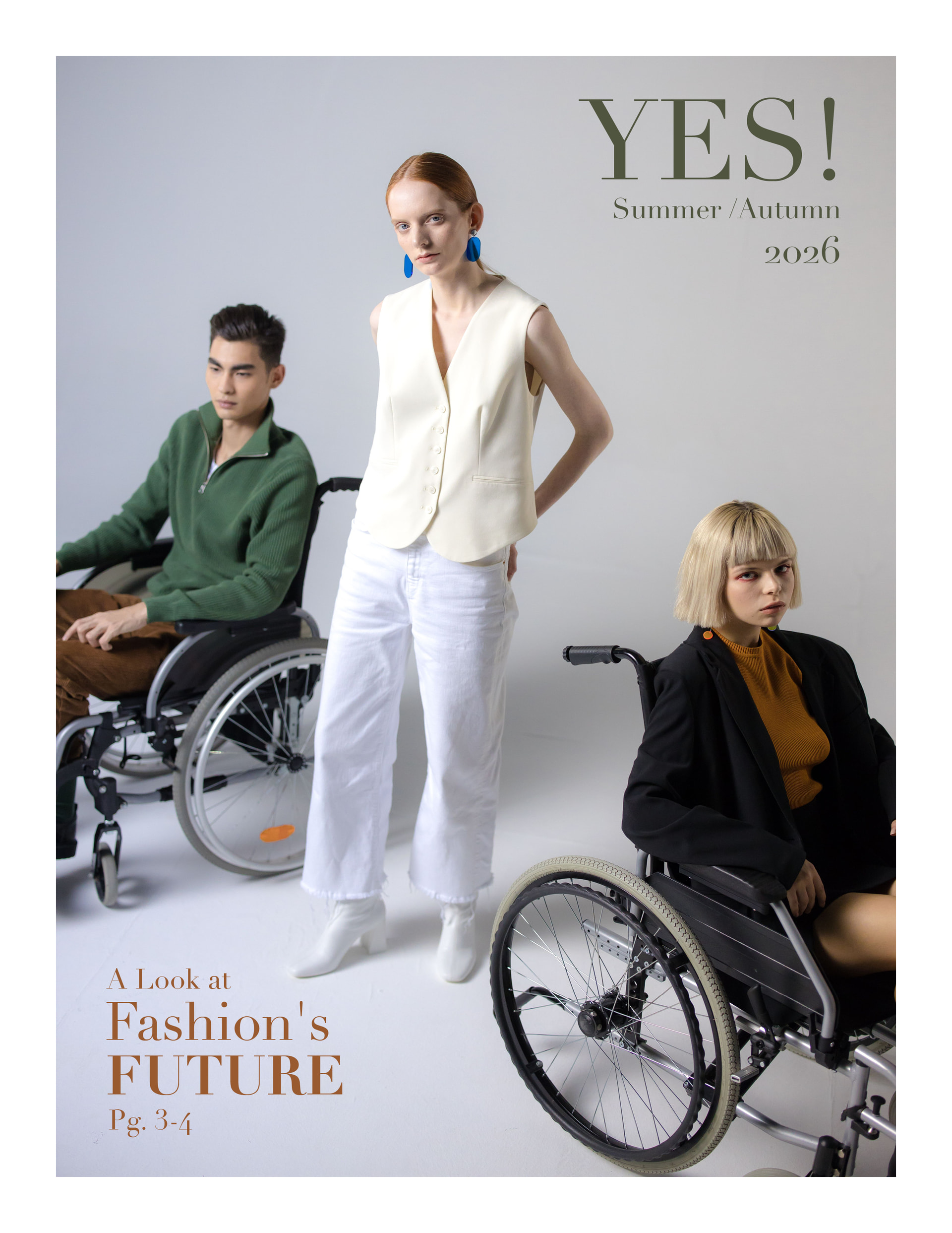
The people on the cover don’t look like they’re in a ‘YES’ mood.
Accessible is spelt wrong.
Layout is ok.
The hyphenation is strange throughout, I don’t think you need to hyphenate when the text is ragged, or at least a lot less, and not on captialised words.
Have you experimented with any other layouts? Are you settled on this?
1 Like
What is this magazine about? What is its subject matter focus? Who is the audience?
It’s pretty obvious that a magazine titled Ontario Travel is about traveling in Ontario, or that Watercolor Review is about watercolors—especially when the magazine’s cover photos reinforce their titles.
However, a magazine titled YES!, with a photo of people in wheelchairs and a teaser about fashion, is more than a little confusing. It calls for taglines and better-worded teasers to communicate what the magazine is about and what it focuses on.
Is YES! a magazine focusing on accessibility concerns and advocacy? Is it a fashion magazine with an article about fashion for disabled people? Is it a medical trade publication? Is it a general audience magazine with an article on fashion and another on disabilities or accessibility? You can’t tell from the cover alone.
1 Like
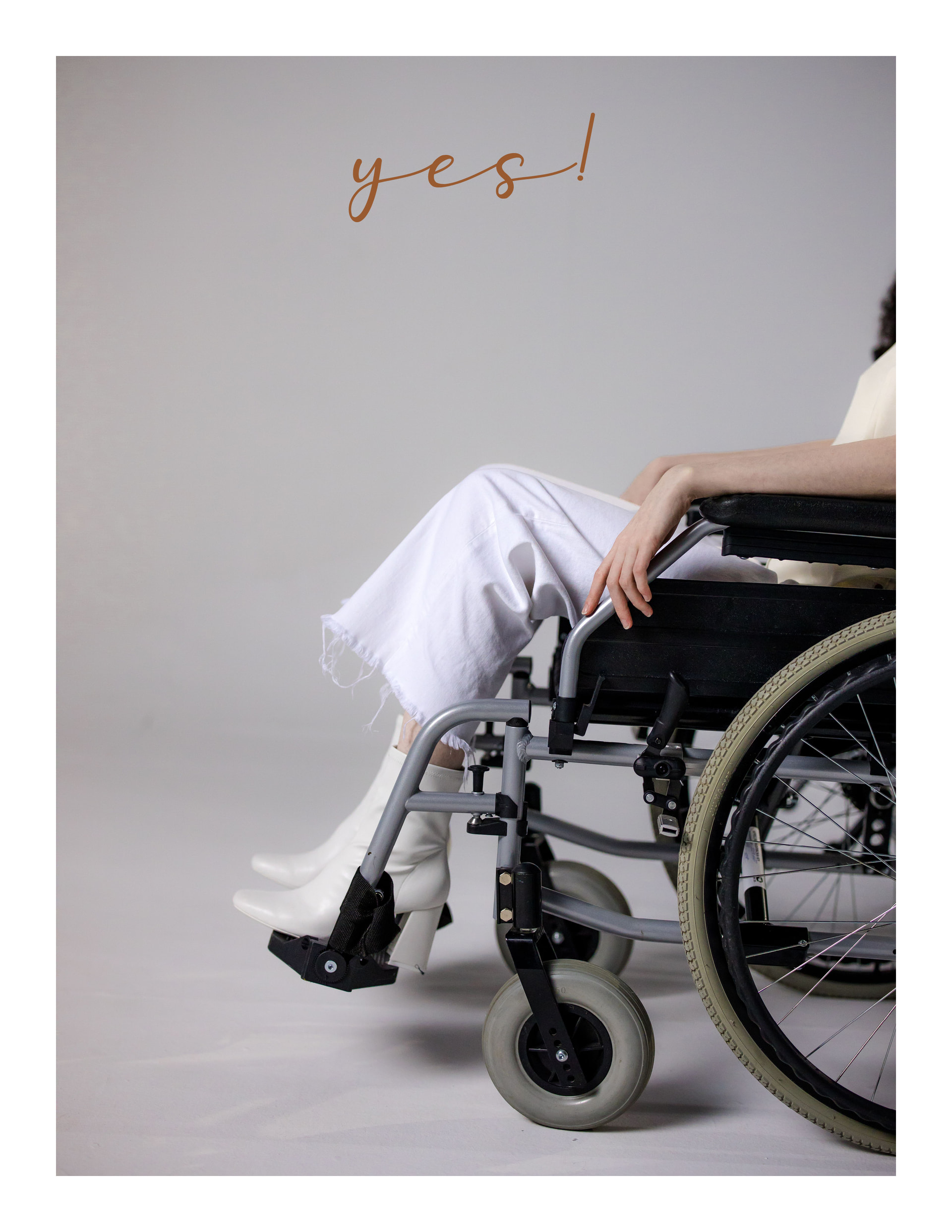
This graphic design mixes many styles, but my favourite is the last one—it looks exactly like an album cover for a band (YES)! That’s my opinion.
Doesn’t look like Roger Dean’s art at all to me!
1 Like
Well …. Let’s speak something different about this Design, I wonder someone wants to call a magazine YES! For a disabled people? Maybe there would be a better name than YES! ? May be Special or something like that ? (without insulting or offend them).
I can assure you that disabled people do not want to be called special.
The title of Yes!, if it’s for disability advocacy, is fine.
4 Likes
Thanks for your answer RedKittiekat, but when I mean “Special” it doesn’t mean about their disabilities when I mean special is it about their qualities, they are more aware, they have more attention (their character), etc…. Have you even seen the movie the rainman? what I mean their qualities which make them more interesting people to know.
That’s what you meant, but that’s not how it would be received. “Special” sounds patronizing or condescending.
People with disabilities don’t have “special” qualities just because they’re disabled. They’re like everyone else, but with additional challenges. A title like Yes! affirms that, despite those challenges, they don’t need to be defined or limited by them.
2 Likes
I was thinking about ….. I was checking the meaning on the internet and AI says: “A special child (or a child with special needs) is a young person who has physical, developmental, behavioral, or emotional differences that require extra support, tailored education, or specialized medical care beyond what is typically needed.” but for me is not “special needs” it is more like they have special qualities, may be I am confused and i would need to consider or have a look at the real meaning.
You’ve already had several people explain that “special” is not a label most disabled people want applied to them. Your intention may be complimentary, but that doesn’t determine how the word will be received.
“Special needs” is a term describing particular support requirements it does not mean disabled people possess special qualities because of their disabilities. Rain Man is also not a reasonable basis for generalising about disabled people.
There seems to be a pattern here where, instead of considering the feedback you’ve been given, you keep searching for a way to defend your original position. It’s perfectly fine to misunderstand something the important part is being willing to listen and acknowledge it.
1 Like
Yes I think so, this was a misunderstanding next time I will think twice before to say anything.
It’s ok to have an idea, and share that idea, and discuss it, and it’s also ok to say, ‘you know what, you’re right and that’s my mistake’. Have a nice day.
Off course, you are right and I made a mistake! this will not happen again and have a nice day! 