Show it to your boss and see what he thinks?
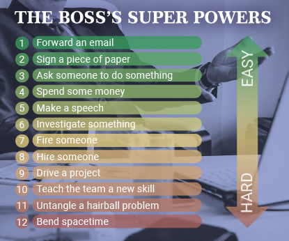
On the plus side, it’s easy to understand, and I like the concept of the gradient.
On the negative side, I’m not crazy about the color scheme, and it seems a little boring. How about playing off the “super powers” concept more? This opens up a lot of image and type possibilities.
Yeah, a bit drab. Looks like a powerpoint slide from a dry sales presentation.
… I believed “Boss’es’s’” is correct
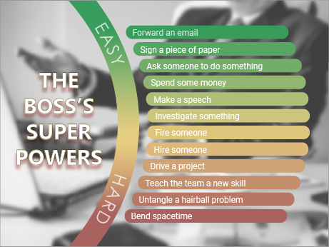
Thanks for the thoughts, Steve. Super heroes are probably beyond my capabilities, and I don’t really want to take it more comicky. But I did find a few ways to simplify it.
Biggs, it’s actually a really exciting sales presentation. ![]() But given that it is a list, any thoughts for making it less powerpointilist?
But given that it is a list, any thoughts for making it less powerpointilist?
I’ll give you credit where it’s due. You made some changes and posted it again. Good for you. This is easier to read, and having the background image without the purple tone is an improvement. Since you took the initiative to do this, I’m going to toss out an idea for you. You said you don’t want it comicky, so feel free to reject these. But go to Shutterstock and search for businessman cape. If you feel this is to comicky, that’s fine, but they might liven up the slide.
Thanks for the ideas, Steve!
I think it’s pretty funny. The last line was pretty good. As for the deisgn I’d say not much wrong with it, maybe put a stroke around each item? Can’t really think of ways to improve it it’s pretty simple.
I like the redesign
Where and how is this going to be used? A poster? A slide show? What size? Personally the colors seem a bit drab, brighten them?