surf/SURF is a tech-focused company that engages with video games, physical hardware and digital media. It’s logo and icon would be stamped on shirts, etched into brushed aluminum surfaces, etc. The idea is a very fresh, very sporty identity while keeping cool.
Coming up with the icon has been highly difficult, and so I’m looking for ideas and critique.
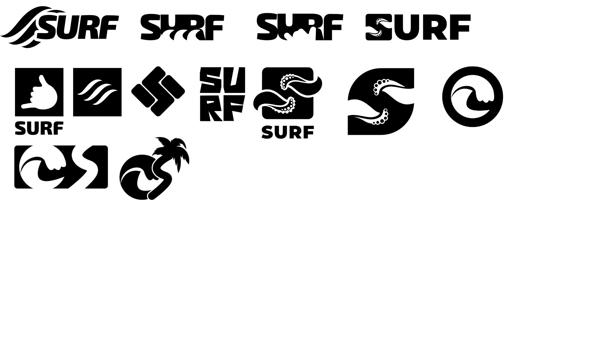
I think you have several ideas that could work with some more consideration and refinement.
I’m sort of drawn to the bubbly, octopus-like sucker thingies. I’m not sure what they’re supposed to be (if anything), but they suggest “ocean” to me. The S shape they’re in, however, seems too squarish and pointy for something as lyrical, wavy and fluid as the sea. If it were me, I’d likely smooth out that S into more of a softer, traditional S, then figure out how best to add those bubbly, foamy, tentacle things.
I suppose that suggestion heads it more into noun territory, though.
You have seeds of good ideas, the style is on spot. I would try to include some web related iconography in some smart way, otherwise the logo feels too much like the sport, and thus misleading. You wouldn’t want to explain every single client of yours that you don’t mean the the sport, but surf the web.
If it was lowercase surf and uppercase SURF, I was thinking about how when you look at something in water, the shape is changed in it’s angle or may seem different in size.. you could have a wavy line going through the word (like a strikethrough in characters) where above the strikethrough is lowercase letters and below it is uppercase.
This is a good brainstorm. At a glance, you’re focusing on the “surfing” part of the name, but nothing that ties this to technology, video games or media. They look like logos for surf shops.