Hey!
It’s my first time in the Crit-Pit, so i’m a bit nervous and excited!
I know that there’s a huge amount of type nerds and even some type designers here.
I’m asking you to check out and criticize my glyphs.
the Tabularasa Light (please no comments about the kerning. haven’t had time for that yet)
It is still work in progress, but i’m happy with its evolution so far. My main problem is that it has a huge amount of alternative glyphs.
My opinion on typefaces all depends on the usage.
This one is a fairly ephemeral and open.
My own preference is to avoid skinny-stick type at all costs. But I’m a sign guy who has had to deal with the end result of logos with stick fonts and wouldn’t wish it on anyone else.
I think it nice, readable and hangs together as cohesive group of glyphs. It’s good.
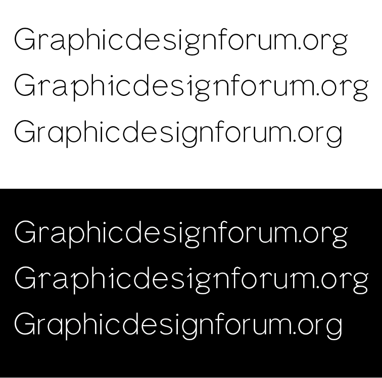
Do the three varieties show the alternates or are you trying to decide which to pursue? If they’re alternate sets in the same font, I don’t think they’ll mix and match all that well. As three separate faces, though, they’re nice. The middle one is quirky, which is fine, but those little slanted serifs really draw attention to themselves as oddities. To make them integrate a little better into the typeface, you might need to create other, similar offbeat, diagonal elements within the other glyphs — otherwise they sort of look like afterthoughts rather than an inherent part of the typeface’s personality.
Are you designing other weights and italics or just this single light face? Are you compiling it into a font? If so, which application are you using?
Nice start. I like the quirks of the second row. I could see people using that font as an alt for the first one. Have fun with the alt glyphs. Let people geek out and switch them up as they like. Also, think about ligatures (fi, ff), there’s lots of fun to be had with those.
the varieties show the alternates. it all started with the quirks on the n and the i etc. but i wanted to make sure the typeface itself could also be used in a more “normal” way without the quirks.
thanks for the tip! i will definitely look into repeating and altering these forms in the other glyphs.
i’m also working on a regular weight. bold and italics might follow. i am using the type design app “glyphs”.
Additionally i might have to add, that i am in no way an educated type designer. it is all self taught and just for fun and further understanding of type.
thanks! i also really like them — those quirks were the “idea” that started the font, that’s why i wouldn’t want to lose them.
i will follow your advice and try to geek out with the alternates more!
i also have done a few ligatures: fi ffi tt
It looks modeled after the Neo grotesque typefaces that I love so very much. Although I’m worried that it doesn’t have enough distinction to separate it from typefaces like helvetica light or univers.
And apologies if somebody mentioned this already. but some of the characters have a weird Serif-thing going on. Whereas The Identical character in other places does not.
I do like it very much however. I’m just not sure if there’s room for another Neo grotesque-esk Sans serif typeface
As much as I have a passion for type. I never considered creating my own typeface. Maybe I ought to give it a go.
Quite often it’s not the shape of the characters themselves. But the negative space created between the characters that really create the visual aesthetic. Helvetica became as popular as it is from its masterfully kerned characters, and voluptuous negative space with in and around each character. It’s legibility trumped all of their typeface set the time. And it’s still the standard today or American and international signage. Particularly the street signs and highway signs in the US.
Helvetica’s designers seem to drop the ball when they created the black font. The heavy characters appear clunky and disorganized. Where as Adrian Frutiger’s Univers Black font is a marvelous work of art.