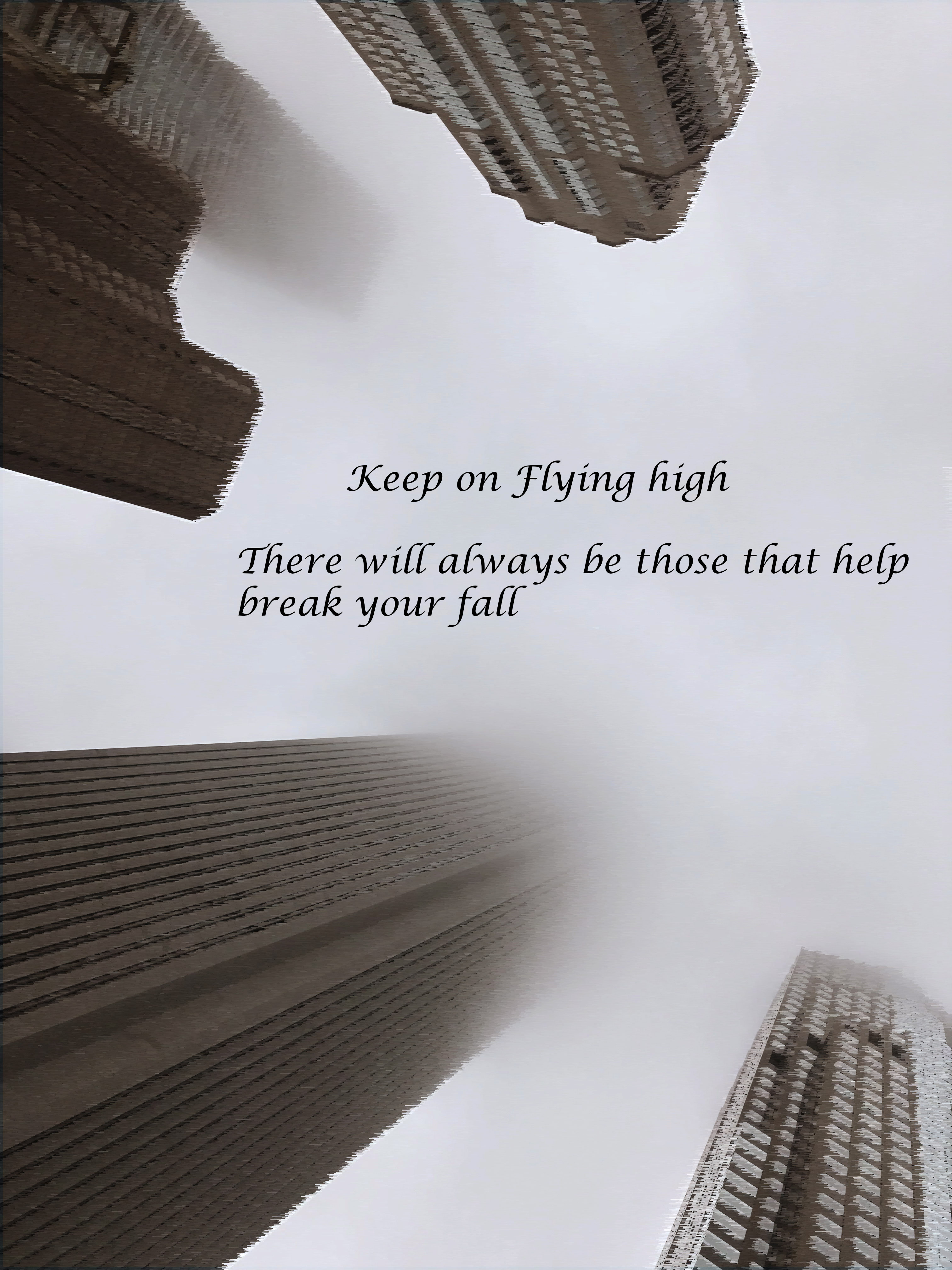
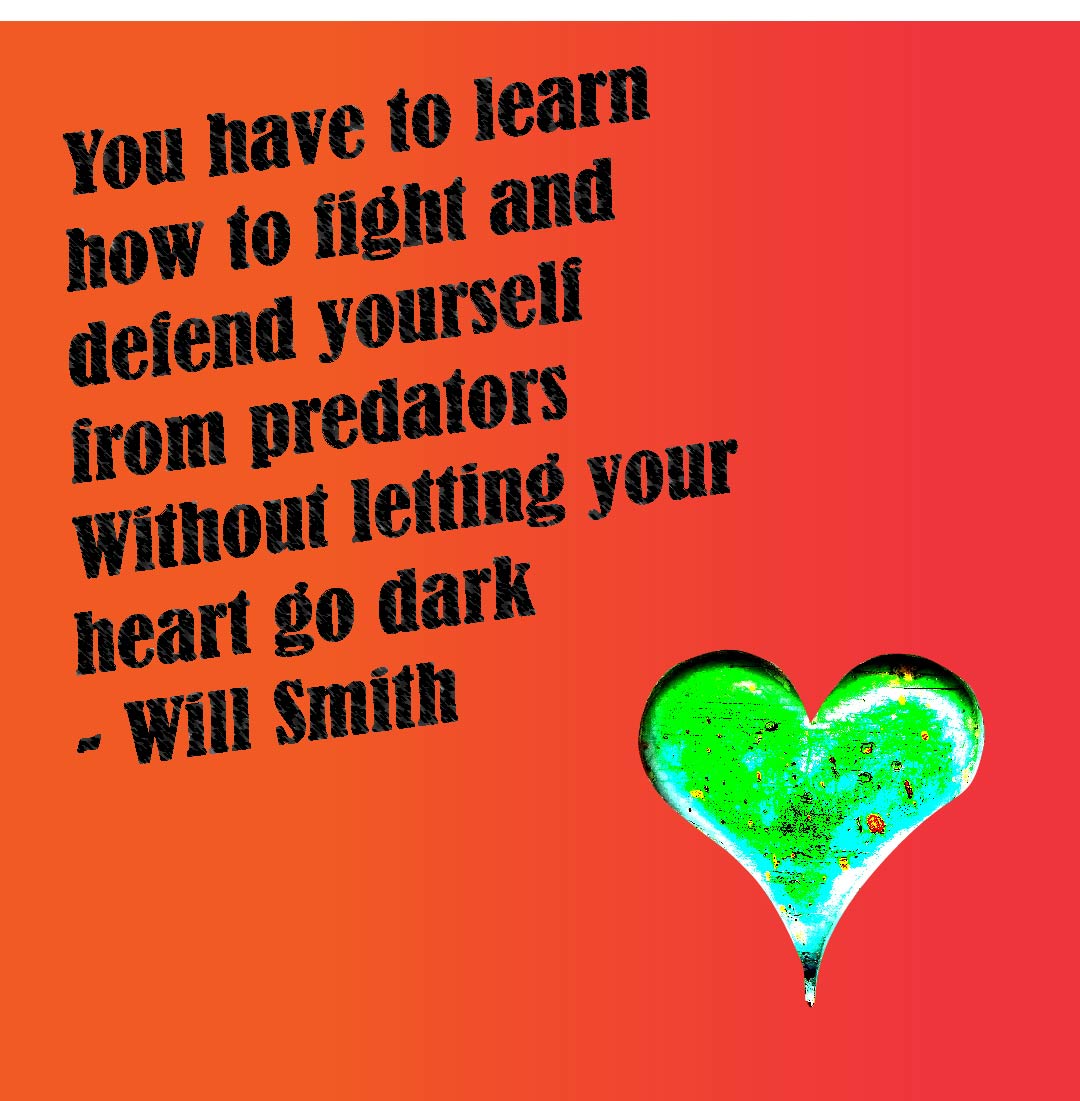
Qwyatt, these look like you were just messing around in Photoshop. I don’t see any particular sensitivity to color, balance, layout or type with what you’ve done.
If these are practice or personal projects or fine art projects, that’s fine. You’re welcome to post for feedback.
If, on the other hand, they are commercial projects, more background information would be helpful. Who are they for? What is the purpose? Who are they supposed to appeal to? How will they be used? Etc., etc.
I agree with Steve. It seems you’re just playing around with Photoshop. Without knowing what your intentions are or what these are for, I don’t really see an obvious basis from which to critique them.
These are more so personal projects, and practice honestly. But I do plan on wanting to release more commercial projects once I get used to photoshop and illustrator and improve my skills. I also realize I didn’t give backstory or any information to the projects which is my bad!!! But critique it from a standpoint of how I can develop my skills and what I did right vs. wrong if that makes sense
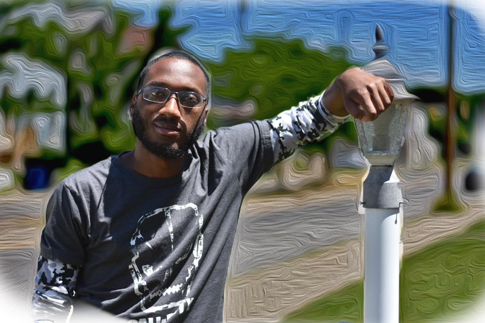
Your masking on the image with the oil paint filter looks awkward.
Are the subject and background one image? If so, it may look better if you were to take a picture of the background and apply the oil paint filter to that. Then take a picture of your subject separately, mask and place on top of the background.
The image would still look strange, but there wouldn’t be an outline of the oil paint filter around your subject.
You’re putting the cart before the horse. Learn design first, then learn software.