I am an aspiring designer from Estonia. I study design on my own and therefore I have few acquaintances who could objectively review my work. You can find full work in Behance (Laagna Notes Identity)
Concept : The Laagna Notes is a Russian-language telegram blog about everything. In the future, the blog plans to expand and will start recording its own analytical podcasts on Estonian politics and news.
Purpose or Goal : to create a visual style for a media project that will communicate with the audience like a friend
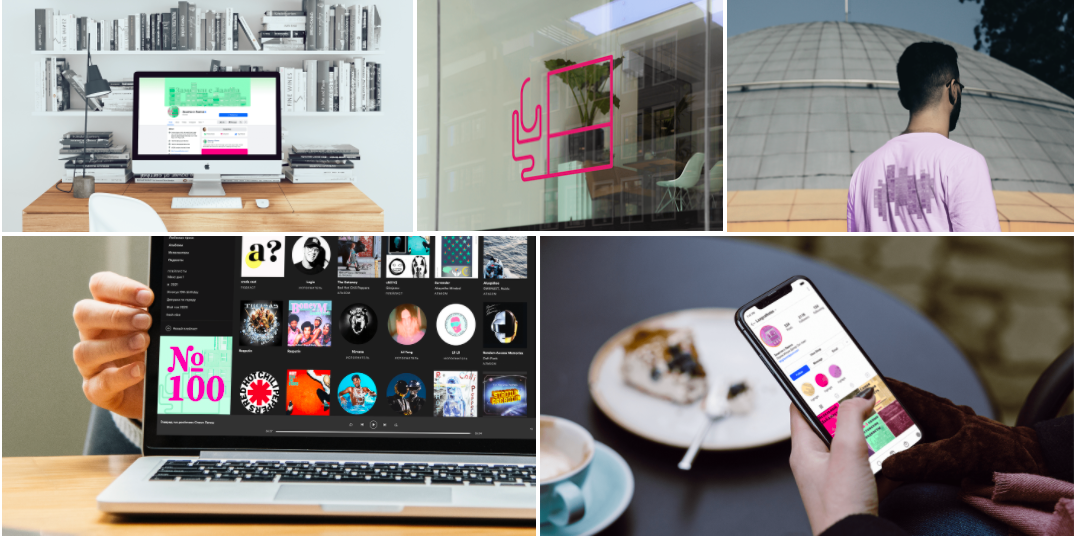
Format : Only digital format for SM: Instagram posts, facebook, spotify covers and so on.
Audience : Mostly people under 40 years old. Progressive people who listen to podcasts and are willing to trust them. The audience is exclusively related to Estonia. Those who are interested in local politics and news
You’ve certainly come up with something that’s visually dynamic and difficult to ignore. I’m only vaguely familiar with Telegram, however, so I’m uncertain about how this imagery will be used or how it compares with other Telegram blogs. At least I’m assuming you’re referring to Telegram when you write “telegram blog.”
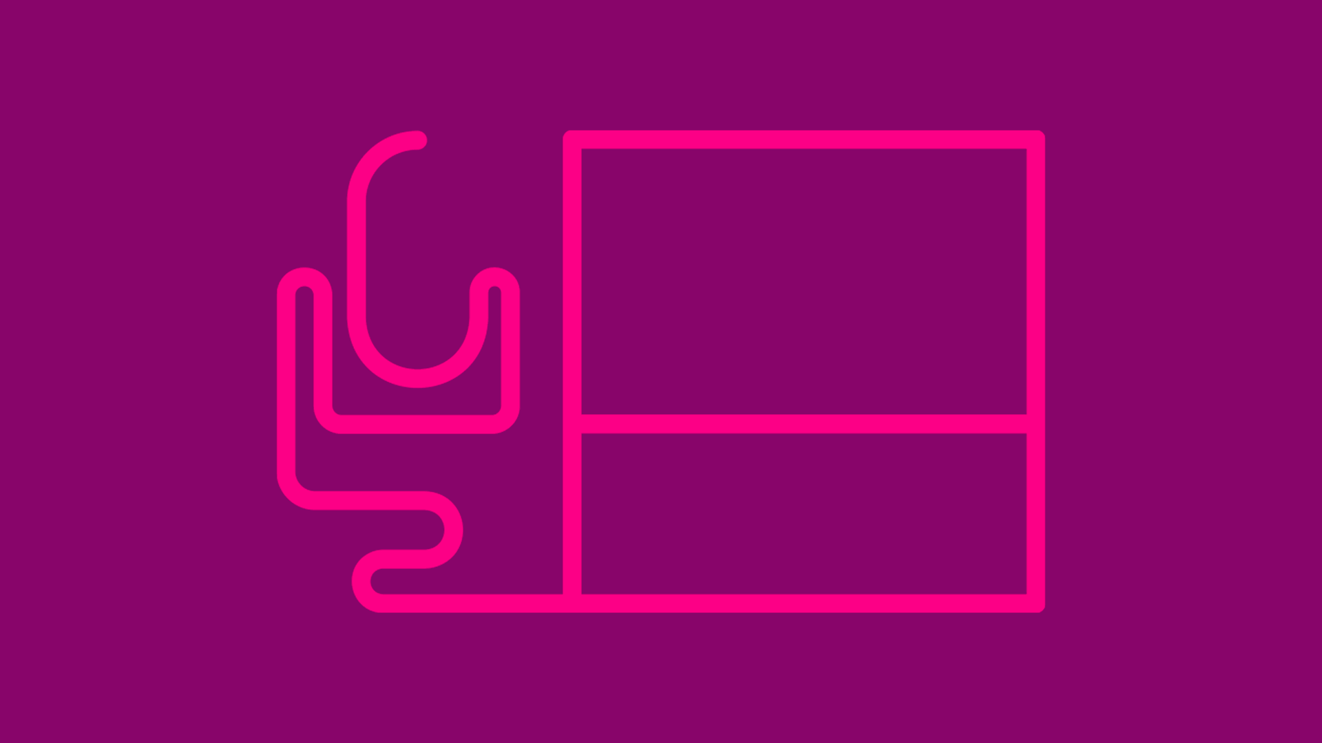
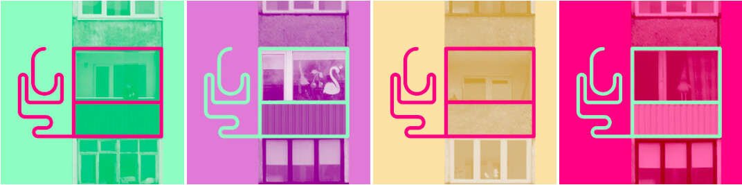
I like your idea of the microphone and the lines surrounding windows. I’m assuming it’s meant to suggest a window on the world of Estonia.
I’m a little less certain about the typography. The serif typeface seems a little too traditional for a futuristic and visually intense design. Maybe you’ve done that on purpose for a reason, though. I’m also wondering why you’ve spaced out the letters.
Overall this is great, I enjoy the versatility and forward thinking you’ve created in the brand.
The only “perhaps it can be better” from me design-wise is, I don’t think most first time viewers will understand what the microphone is in the static images. I only knew 100% from where the animation on top shows a microphone. If I’m putting myself in the first time viewers perspective, I see a “maybe” microphone, and a desktop computer? Or is it this the outline of the window? Without the animation, the design doesn’t paint the picture well enough to show the audience what they are to be receiving from you. This isn’t always bad, just something to think about. Again, this is overall beautiful work, thanks for sharing!!!
This is certainly an interesting design.
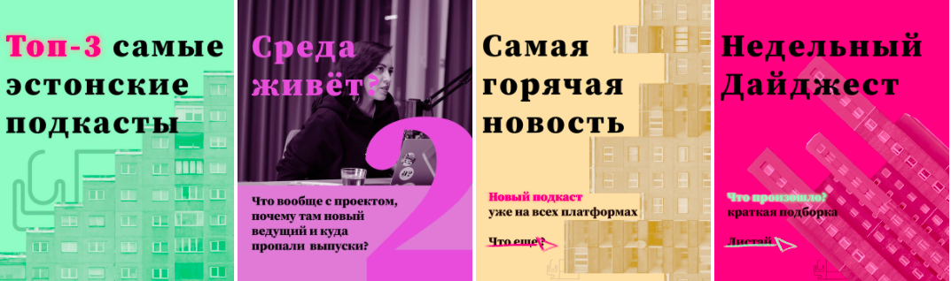
The posts are something id probably play around with in terms of composition/layout.
You say the audience is under 40, but it may just be under 30. Of course, I don’t know the nature of Russian language in Estonia or the populace there but its a good solid direction.
The first animated thing is just too fast. Chill out. I like the use of colors in the materials. The logo however is very strange. It’s a window with scribbly lines next to it and by itself it seems like it would make absolutely no sense. Being that I’m a designer I understand that you’re going for a microphone. Make it a bit more clear..there’s no need to be too abstract. it still needs to make sense. Graphic design is about visual communication. Also think about the fact that the window is twice as wide as the microphone space. Make sure to also think about how this logo will look when scaled very small or very large. The lines would be too thin for a logo.