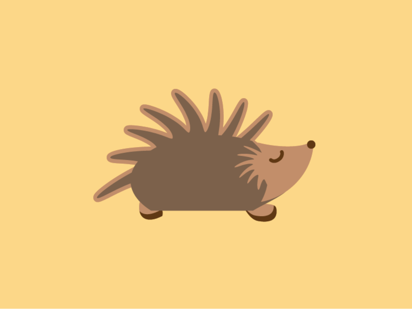
A hedgehog character designed for a logo. Still not sure with the color choice.
Feedback is welcome!
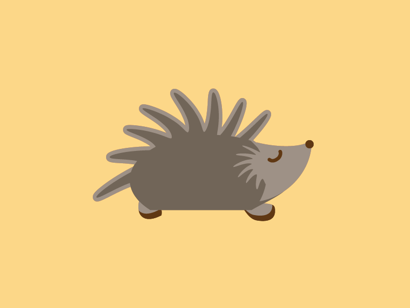
A hedgehog character designed for a logo. Still not sure with the color choice.
Feedback is welcome!
Depends on what the logo is for. I’m always going to choose the option that provides the most contrast and isn’t gray. I print. I hate printing gray.
But again, it depends on what the log is for.
I think that makes sense ![]() if it looks too greyish then the character will look too boring to see
if it looks too greyish then the character will look too boring to see ![]()
But if you are selling camouflage clothing, perhaps gray is the right choice.
Accepting an opinion from someone who doesn’t know all the details is fraught with danger.
here’s the design brief:
Lazy Hedgehog: A quirky name that suggests children’s entertainment and animated characters.
Keywords : hedgehog, lazy, fun, children, toys, kids, entertainment, animation, cartoon, quirky, funny, humor
School project or crowdsource?
That’s not a complete design brief.
he he he not exactly a crowdsource, but the client only provided me with that design brief ![]()
If it’s for a “lazy” hedgehog, I’d go with grey or even white. Colours are way too energetic! ![]()
Oh, and thanks for the opportunity to post this one:
")
![]()
![]()
he he he, I didn’t notice your message until now. The hedgehog video is oh so cute!!!
I’d pick sort a of a tan-ish color that’s not too bright orange, but not grey because I think that would be the best balance. Maybe sort of like this:
Of course depending on the purpose of the logo, the best color choice could be different. PrintDriver had a good point gray would be great if it were for a camouflage clothing company. I would think a more balanced shade would be best for most uses, but it depends.