Put that on a business card and see how it reads.
Sorry Skyth, but it’s not working.
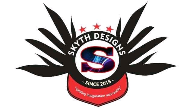
As a whole, the composition is just sort of weird — a mishmash of random shapes, colors, and slogans tossed together into a salad of stuff.
Agreed. There’s for too much going on.
It appears as though you’ve taken every recently learned skill and attempted to use each of them in a single logo.
Don’t get me wrong, every designer has been there. Myself included. Eager to apply skills - in most cases, too many of them.
Start by losing everything, except the typography. Choose a single symbol or a graphic that means something to you. Try to fashion that symbol into, or in close proximity to your typography, and see how that looks.
Remember a slogan or tagline is a separate element. It shouldn’t appear with the confines of the logo itself. I can barely read that line of type on screen, without a doubt whatever you choose to print this on, you’ll have a blob of illegible type and graphics.
My apologies for being a bit.. overcritical.. but I often wished someone had been as such with me during my earlier years of design.
Photoshop?
Thanks for your response Biggs. It has really opened my eyes.
I will surely consider all your points in my next design.
No, i used Coreldraw.
I’m planning to know Coreldraw first and then start using Adobe software’s.
There’s a raster image in the center element.
Raster parts are not a good idea in logos.
In the post title, you asked, “How can I improve?” I’m not trying to be overly harsh or discouraging, but this can’t be improved. It needs to be scraped altogether, and you need to start fresh. Start with a sketch pad and pencil. Sketch out ideas – dozens of them – before moving to the computer.
?? No image showing
First communicate, then decorate. Design always must have strong meaning.
What are your goals towards logo design, personal or going professional? I’m asking this because the design industry uses the Adobe suite. If you want to land a job I’d say dive right into Photoshop and Illustrator or you have double the work to do ![]()
I am a beginner as well, just learning as a student. Some of what we’ve been learning about logo design is that it needs to have contrast, and it needs to work well in both large and small installations. I’m thinking a simpler design would give you bolder contrast..And I’d also worry that the small text in quotes would be lost if the logo were printed in a small size.
Designer’s job is to treat data not as data but as visual elements!
People hire designers eyes not their skills on design software!
Logos must be harmonious so they can look like one entity instead of a landscape!
You need to fill up your eyes and you memory with good stuff made by professional so you can guess if you work looks like something that have be done by a professional!
The best way to judge the shape is by getting rid of color! Monochome is better!
I’m also a student, one of the things I learned in class is to take elements away one by one to see if the design still has unity and coherency without it, and then if it is fine without that element, don’t add it back it. Otherwise you can have too many unnecessary elements. Hope I said that right!
Uh, if you can’t make the software do what your mind’s eye sees, that’s a bit of a problem for a designer.
I was also going to comment on this quote to the other day, but let it pass.
I agree with the notion that people should hire designers for their design skills. The savvy ones do. Unfortunately, many clients and employer believe they’re hiring little more than artsy decorators with software skills to help execute their visions.
Um … they actually only hire the cheapest ones.
Hi there, I think there’s a lot going in this logo. I would recommend simplifying it down to one or two colors, and sticking with the wings or the stars. I also would get rid of the quote as well. I am just giving you my own feedback as to what I would do but I am also learning as well. Good luck!
Yes, right I agree with your points Biggs.