This is a concept for an artist out of syracuse ,NY. He goes by the name Sensei Keem. The name of the album is Demon Time. It is a 5 song EP. He wanted a cover that illustrated the title. Like a homage to grinding with a dark undertone. This was done in photoshop.
Any critiques are appreciated
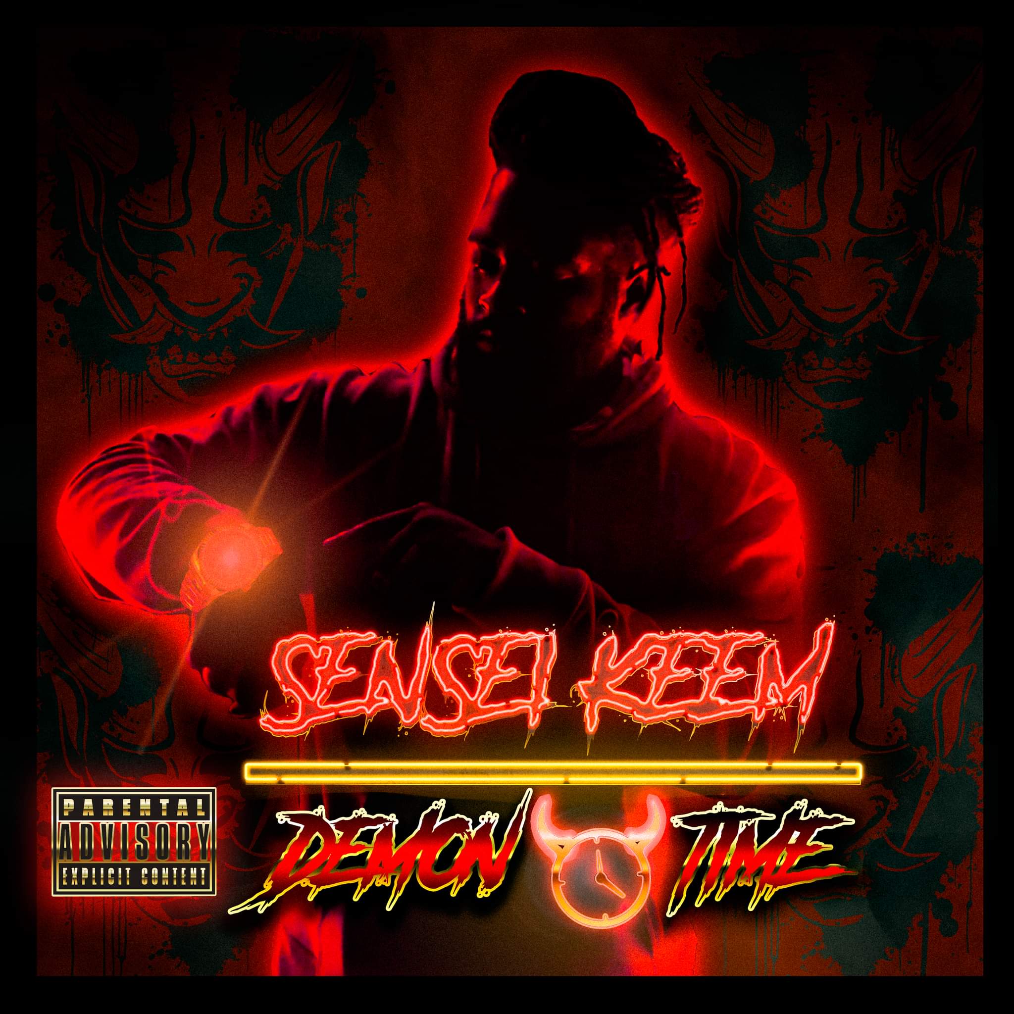
you could maybe keep the photo
you should simplify fonts and advisory badge
1 Like
The image, type, advisory badge, rule, and clock graphic are all fighting with each other. They should be a cohesive whole.
1 Like
The photo treatment is kind of cool, but the rest of it is a mess of conflicting and overplayed gimmicks.
You’ve significantly altered the Parental Advisory logo. Are there rules for its usage, and are you in compliance?