working on my midterm for typography- it’s a magazine cover design. i’m at the point where i don’t know what else to add, if anything is needed at all. any feedback is greatly appreciated!
1 Like
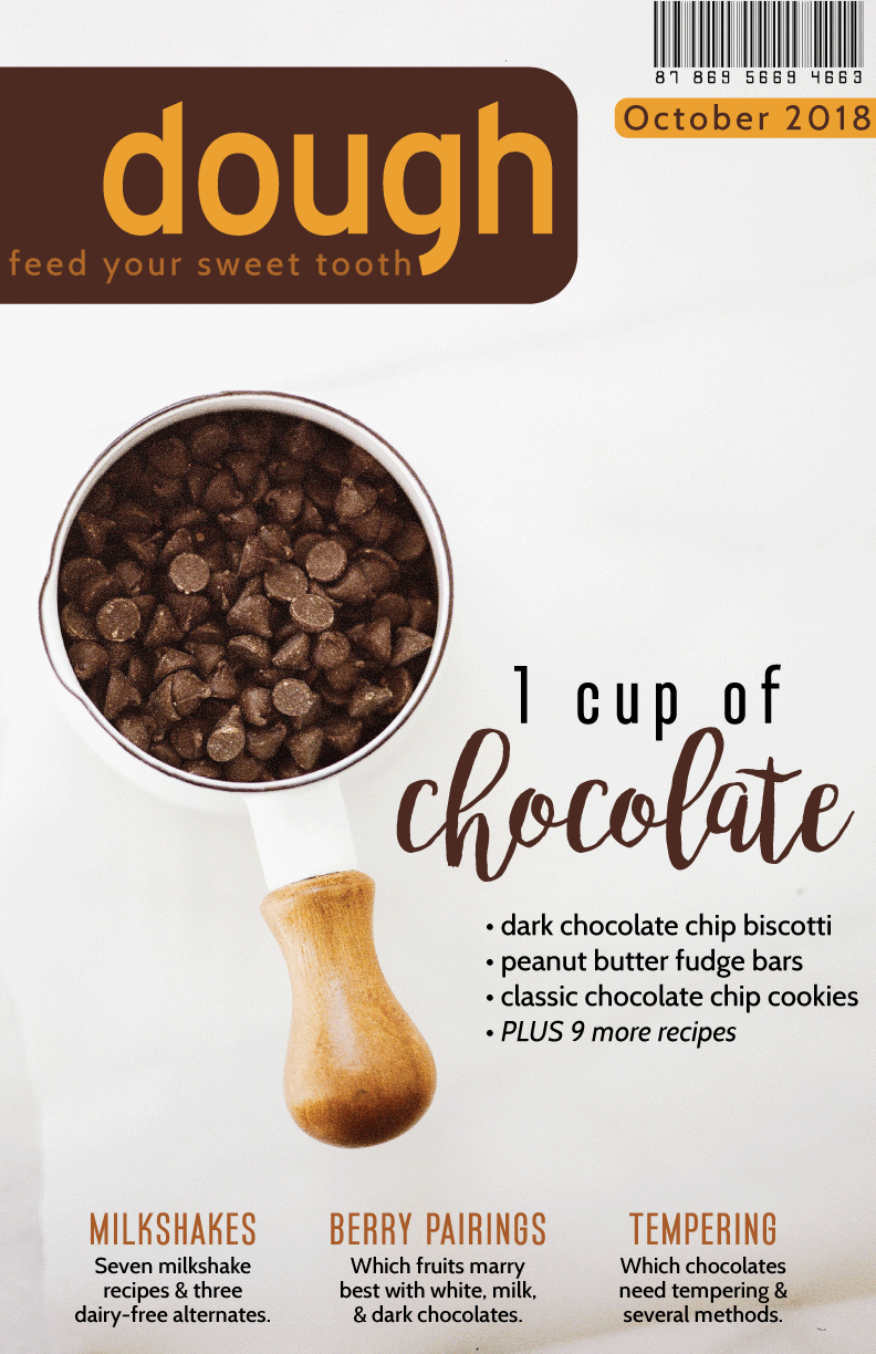
First and main thing I noticed is that many magazine covers will include what page numbers the title articles are on such as:
- Dark Chocolate Chip Biscotti (pg. 12)
- Peanut Butter Fudge Bars (pg. 15)
etc.
You might also put at the end “pg. 12 - 26”
Good looking layout, good colors, good font choice for chocolate, it’s fun, it’s chocolaty.
I am also used to barcodes being on the bottom right hand corner, or on the back cover.
I feel like “feed your sweet tooth” may need to be given some extra space on the left hand side, I think it’s just a bit too close to the edge for comfort.
Other than that I like where you are going with it ![]()
1 Like
Hmmm, I like it. It’s a bit different and refreshing.
A big chunk of my career has been taken up designing and art directing magazines, so I have definite ideas of what works and what might not work.
Is this a real magazine or just a personal or school project of some kind?
Your cover design is one of the few examples of the bar code being well-integrated into the design as opposed to it just being an unsightly little necessity positioned wherever it might best fit. I also like the personality of the low-keyed, informal masthead/logo/nameplate. The brown color scheme is great.
I would likely not track out the spacing of “1 cup of.” It might be a personal opinion, but letterspaced lowercase has never worked for me — uppercase, yes, but lowercase, no. I’d also be inclined to pull the type away from the edges a bit more — both for practical (trim) and aesthetic (claustrophobic tension) reasons.
And back to the barcode… It’s not a standard UPC/EAN magazine code. What’s the deal with that?
1 Like
Overall a decent look.
Your safeties are a little tight to the trim was the first thing I noticed.
The other thing is the gray gradient. It’s barely there. A lot of times you will have ink limit issues if you are under 10%k for most of your gradient. A good number of presses stop at 5%, giving you a harsh line.
Now I want a cup of hot chocolate.
1 Like
I used to be more concerned about that than I am now. A good offset printer on a good press can usually hold a one or two percent dot. I wouldn’t have said that twenty years ago. I’m more concerned with linear/radial gradients, but a more organic and irregular gradient in a photo — not so much. Digital, it seems, is a little more iffy at those low densities.
1 Like
Yeah, I’m more used to digital so that’s where that concern comes from. Thanks for clarifying for modern offset.
1 Like
It needs more images. Even if you’re not showing all of the recipes used for the chocolate, I’d like to see small images for the milkshakes, berries, and tempering.
I like the chocolate cup, but that handle is so damn distracting. Is it possible to spin it so that it’s a little bit more off-page?
Finally, even if they could print this cover, I think design-wise you’re lacking white space on the edges. The line “feed your sweet tooth” is way too close to the edge, as is “October 2018”. Most magazines only allow their main title to run off the page.
1 Like
A few items:
– As others have said, you need more space between some of the type and the edge of the cover.
– As others have said, don’t space out lowercase.
– Watch the space between “1” and “cup.” Even if you don’t take everyone’s advice on letter spacing the lowercase, there’s an awful lot of space there.
– Consider tweaking the descender on the g in dough so that it’s parallel with the h in tooth.
– Your four bullet points could go down a step in font weight. For example, if it’s regular, knock it down to book. This same thing would apply to the copy below Milkshakes, berry pairings, and tempering.
All of that said, I like the overall look. Lots of air and contrast. Good job.
1 Like