Hey guys, im new to this forum. Im a graphic designer from New York. I just posted my first Logofolio of logos I created during the last couple years on to my Behance page. I was only allowed to post 5, so i chose my personal favorites. Would love to get some feedback and thoughts on my work. What do you guys think?
Unfortunately, without context, they mean very little. We would need to know what problems you were trying to solve before we could critique how effective and successful they are. Otherwise we can only judge aesthetics and as design is not art, that would be a fairly pointless exercise.
Personally, from what I can see, I am alway predisposed to a minimal, shaved-down aesthetic. I am a sucker for white space.
What I am not a fan of, though, is logo design in isolation. A logo is only part of a unified communication strategy, not a stand-alone adornment. Also, immediately, I can see some glaring production issues with a few of them.
Give us some context and you will more likely get meaningful feedback.
I’m afraid the bottom one might lose the circles if reduced. it’s a little hard to read anyway.
Tapate Coverup – is that something to do with a mouth? it’s not clear from the design, if you’re going tour the visual metaphor.
souffle seems like the stouffer’s logo, even though typographically it’s not. maybe it just feels like something we’ve seen before?
I don’t know what the next two are. IUS? SUI? without a name, initial cap logos seem to lose their focus unless the acronym is well known. maybe the name in a circle around it?
the top one reminds me a little of the arachnids from Starship Troopers. Is it also an acronym for something?
I could give you a short background to each of these designs.
The first is a media and management company that take care of media, managing artists, and also marketing for small businesses and local artists.
The second was for a cosmetics and beauty business that made skincare products.
Third is a cannabis brand and an official marijuana strain created earlier this year.
fourth is for an advertising campaign promoting the use of masks during our pandemic.
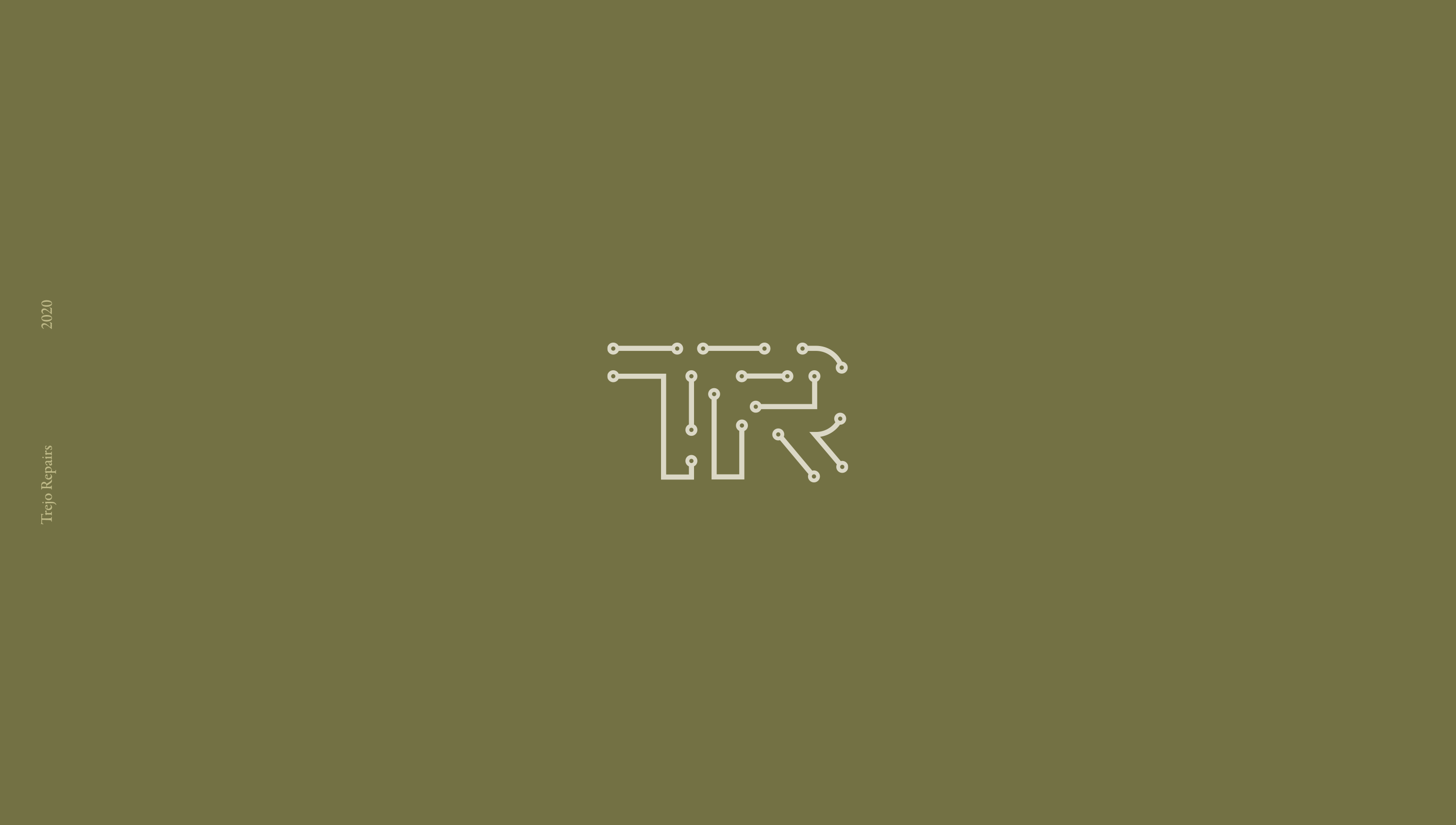
and the last is a local electronics repair business.
I did not include the names together with the logo because i wanted people to focus more on the icons and marks.
Also, can you tell me which have this glaring production issue.
They are made like this mainly for presentation on my behance page. I wanted to present my work but also stay within my branding colors for a better presentation on my profile, as many do for logofolios on Behance.
You’re right about the bottom one it probably would lose the circles if reduced. Ill take that into consideration when adding small detailed like that in logos.
Tapate Coverup its actually supposed to a mask not a mouth.
I could see what you mean in the similarities with the stouffer’s logo. Though i wasnt going for that similarity, the client was actually going for a logo that looks like a candy or food product look for the brand, even though it is a cannabis brand.
The SUI stands for “Skin U In” a cosmetics business that makes skincare products. Client wanted a logo that showed the initials. The clients were actually going for an acronym logo in hopes of being remembered when ever people saw the SUI.
And for the top one, definitely was not going for that look, but it is also a acronym, “Weekend Warriors”
you’re going to have to do some retooling. without your explanation I didn’t get any of those things from any of those logos. the mask doesn’t convey “mass,” weekend warriors – it looks like teeth but not a W, I didn’t get the cannabis reference, the acronyms seem more like a school’s logo than something for skincare, and the electronics one is a neat idea but I think overall, you’re going to have to put some more info with these. I understand you want to show your abilities with the icons, but as far as “logo” design goes, these are missing the mark. there’s just not enough visually to convey the markets you’re talking about.
think about adding the business names to these somehow, incorporating that into the design. icons are fine, but sometimes they need the name in order to be a true logo. not always, but it’s pretty rare than an icon can stand on its own for a small business.
Are these real-world logos or just exercises?
I’d have real misgivings about rebranding someone else’s mark to fit your personal website esthetic.
A logo bug out of context is useless for determining if the brand solution you’ve come up with is the ‘right’ one, all production mechanics aside.
no, no. I’m just taking about exercises. on your own. for example, trying to make the curves in the Coca Cola logo is pretty tricky, when done from scratch but it’s good practice for when you’re having trouble with bezier curves. I was learning the software for the first time and back in good ol’ freehand 3.1, it was good practice.
The weekend warrior is actually 2 Ws not just one. For the cannabis logo, as i mentioned though it is a cannabis brand the client didnt want the logo to look like it was a cannabis brand but more of a food/candy brand. I could see how the acronym one, now that you mention it i could definitely see it being a school logo.
Thank you, i really appreciate your feedback, very helpful for future work. will take this into consideration when working on my next logos.
Yes these are all real life logos. All clients of mine and all are in use right now. except for the SUI one, the clients never actually started the business, not sure why. But everyone else is still active and logos are in use to this day.
that’s great. if they’re happy, then that’s a lot of the work. you can always offer to refine it for them if they’re interested. and post again with anything else you have and somebody will always offer input and maybe some pointers for improving your work. lot of talented people on this board.
Thank you, and thats what i plan on doing which is why i posted here so that i could better feedback and understand my weak points and what i need to improve so that when i rebrand for them i could give a them a better logo.
I think PrintDriver avoided saying what he was really getting at, so I’ll say it.
Floating little, tiny logos in a big sea of army green sludge isn’t a good look or an effective presentation.
Based on your explanation, you’re imposing your branding color on logos designed for other people. Doing this makes no sense. A large part of a logo’s design is the colors. You shouldn’t just change them to match your colors.
Bottom line: in your presentation, get rid of the olive drab green, show the logos in their actual colors, and make the logos the dominant elements — not the background on which they sit.
You may have missed my point. Just stating what they are is not the same as a brief explaining the problem to be solved and then demonstrating how you solved it. Just having the logo icon without context means little. As others have said, just putting this small in the middle of a huge empty space (different to well-used white space), is not the way to go.
Logos need context and need to be displayed, as I mentioned, with their supporting brand’s visual language.
I agree with PrintDriver, the small images on such a large field of color communicate that you are insecure with your designs. And the same brackish green-color background is not tasteful or appropriate. The small-ness, same-ness, and lack of company / product / service description say “I am an Amateur” to viewers of the images.