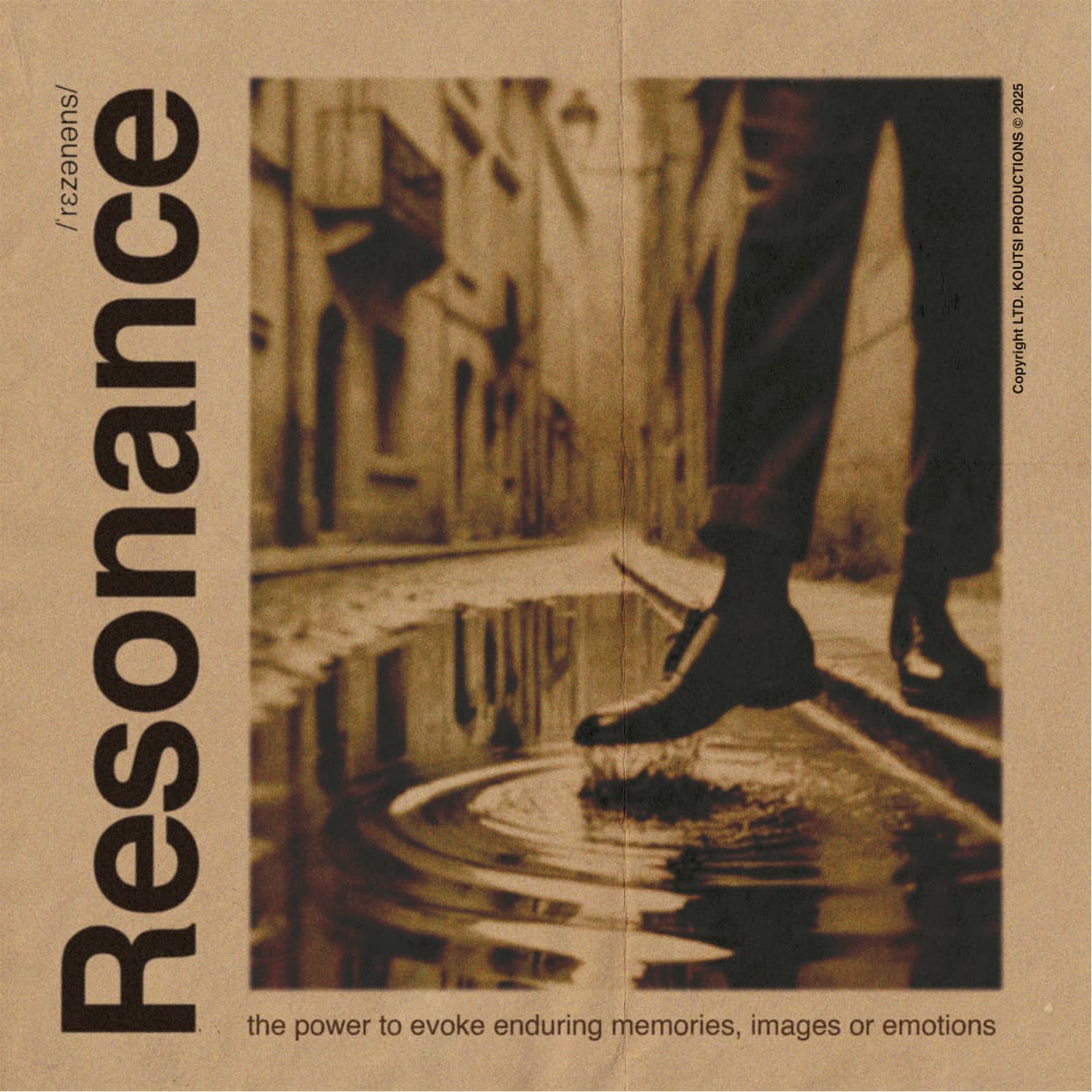
I am assigned to design a cover for a vinyl record. The style of music is bebop jazz (traditional old stlyle jazz). The name of the record is “Resonance”. So I had an inspiration for a concept as you see below.
Would you like to share some thoughts on how can I improve this, maybe to make it look more vintage or something? I will be honest, the image is generated through a very specifil prompt to AI, and then I did some photoshop edits (curves, iris blur, grain effect).
I blurred the text aswell to keep it coherend with the whole concept. Now I have some thoughts to add some ink bleed.
Thanks in Advance
I like the image and its treatment. You did a good job creating that. Aside from the image, I’m not sure the type … well … resonates. The type looks too sterile to my eye. Do an image search for “Blue Note album covers” for inspiration on type treatment.
Thanks for the answer!
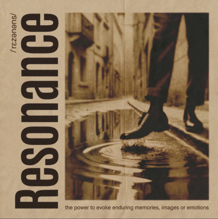
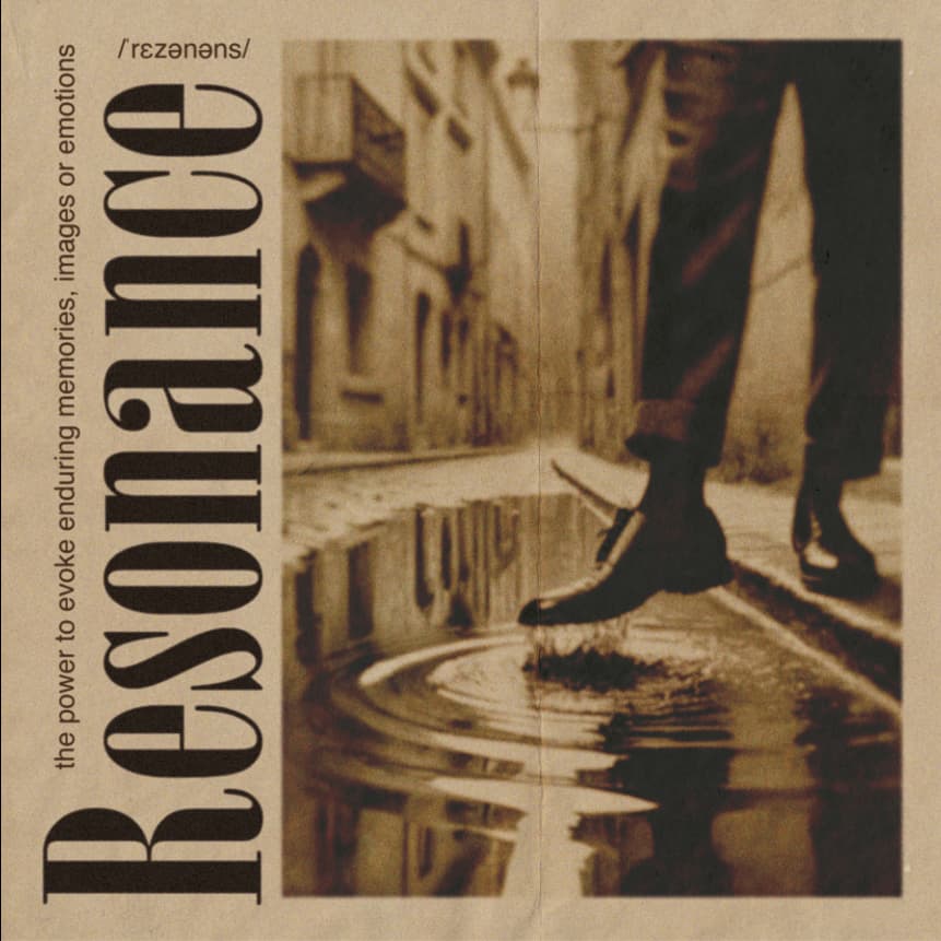
Actually the type is Helvetica (of course!) and I am still questioning it because I am still focusing on the overall layout and the picture treatment.
If you can suggest some fonts (if it is allowed of course) I would appreciate it!
As far I can see blue note loves sherif and condensed fonts.
I think you’re missing the spirit of bebop. It typically has a fast tempo and is unconventional, spontaneous, and difficult to play. It was originally a reaction by talented American black musicians against the more commercial jazz or swing orchestra music of the 1940s that was popular with the masses.
The typography you used is corporate or traditional, not experimental and spontaneous. Have you done your research? Have you listened to much bebop? Have you seen the album covers and typography typically associated with bebop?
In another context, the layout and typography could be great. However, it doesn’t suggest bebop, let alone jazz, to me.
In addition, there’s nothing on your album cover that says what’s on the recording. No words say jazz, bop, or bebop, and no visual imagery of jazz musicians or instruments. I don’t understand the purpose of the line that starts with “the power to evoke enduring…”
Thanks for your answer!
Well, the guitarist is a friend of mine and told me he doesn’t want instruments on the cover.
He also told me that he wants something clean, not playful. Of course I made him a moodboard to discuss, and he rejected everything that was playful with fancy typography etc. Photos of them playing was out of question aswell.
My original intention was to design something like angela smyth artwork
But he said no, too much playful.
Νο I don’t like that kind of jazz to be honest, and it is too technical for my liking. As a matter of fact the record its something like bebop, but more strict and less playful.
Here is a song of the record.

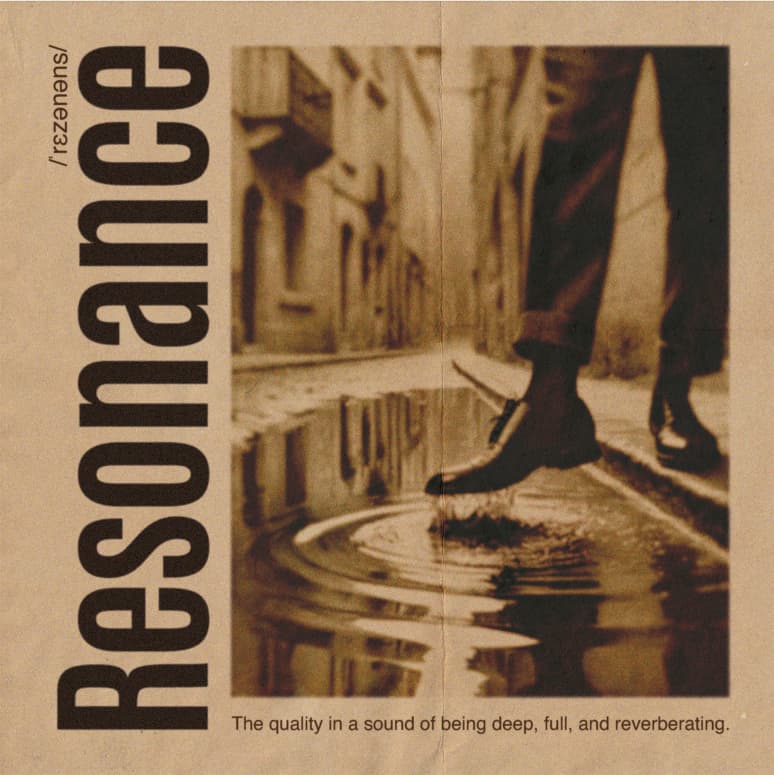
The text below the image is the definition of resonance. It’s an idea to evoke some feeling but still I don’t know…
1 Like
Clients are often their worst enemies. It seems weird that he doesn’t want the album cover to reflect the emotional character of the music, but hey, it is what it is. I don’t think it needs to look playful, but it still should look like a jazz album cover. If he likes it, though, I suppose that’s what matters.
That said, I do like the imagery, typography, and composition. My main critique is that it doesn’t seem appropriate for jazz and provides no information about the music or the artists. If I had seen it sitting on a shelf, I’d have no idea what was on the recording.
I’m not a big jazz fan either, but I respect it. I listened to the video you posted, which is pretty good.
Hello again.
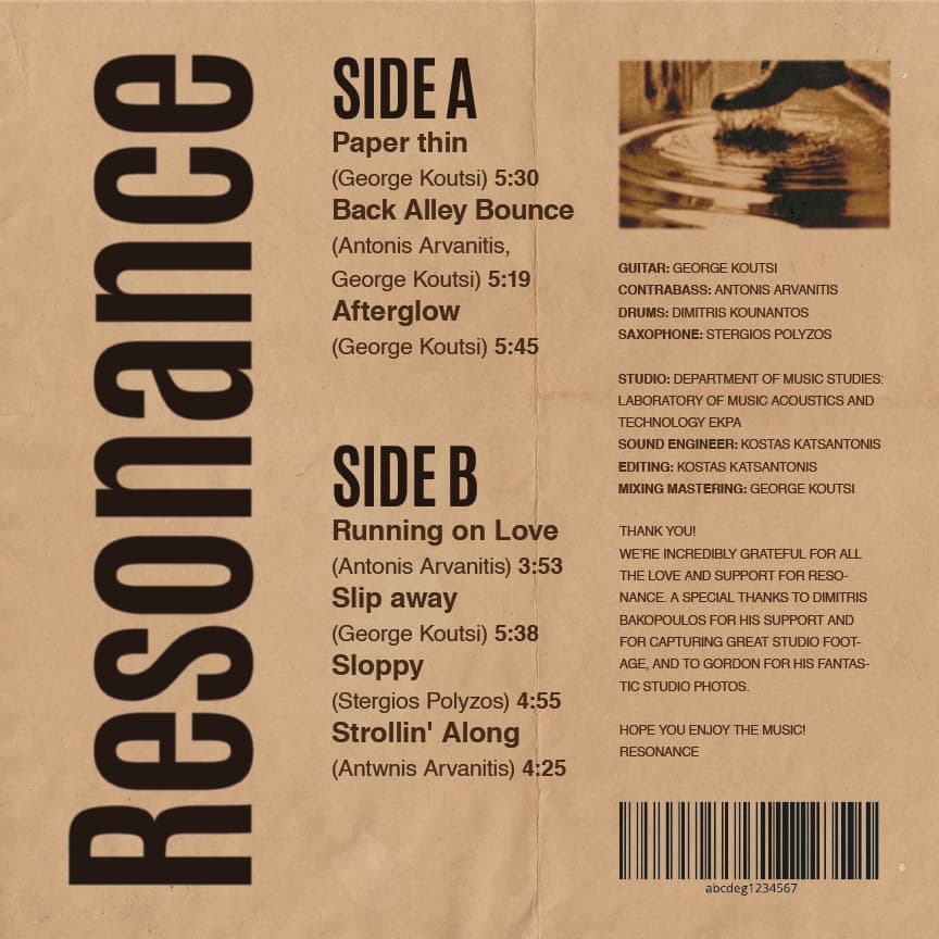
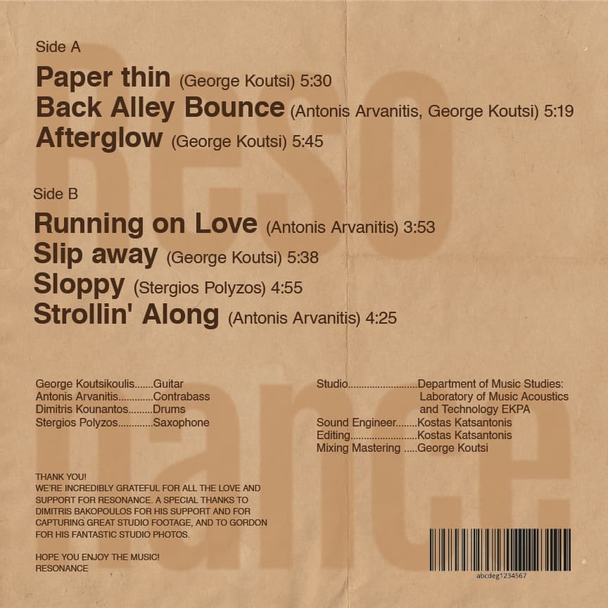
Now it’s time for the back side of the case.
This is the front:
The backsides layouts are:

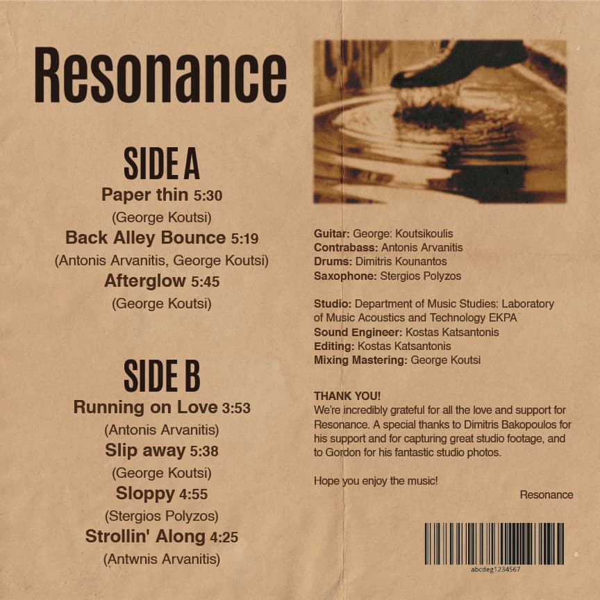
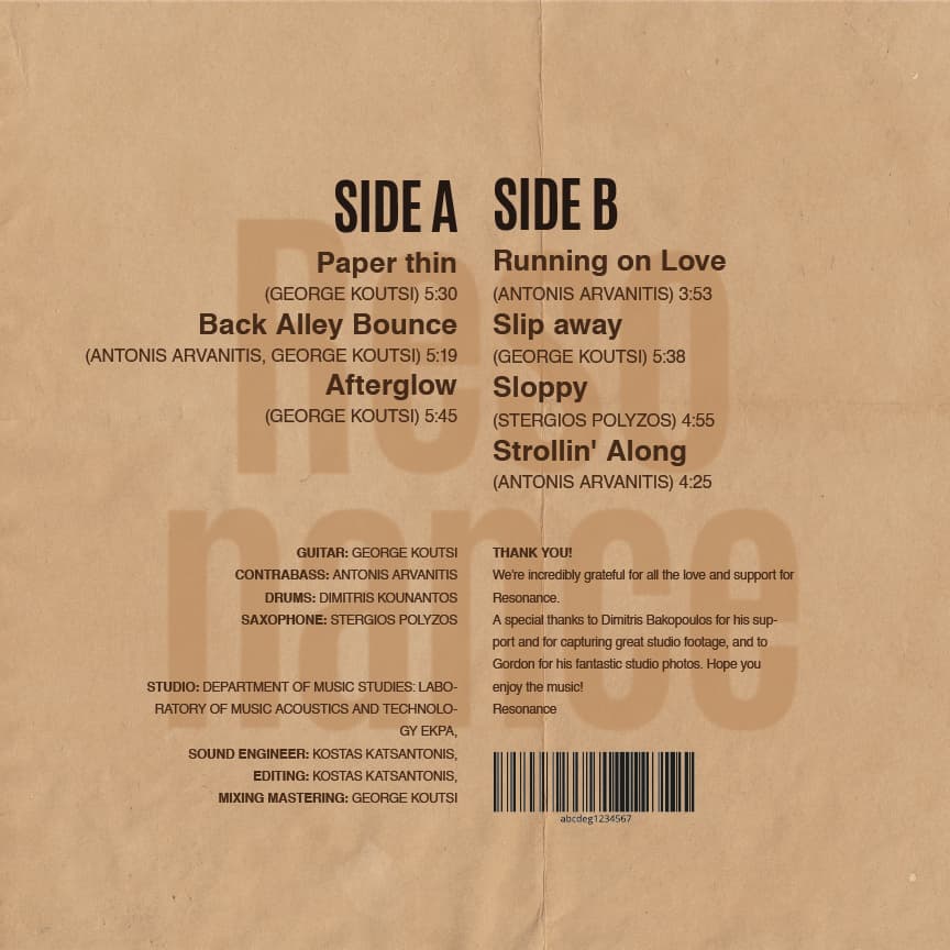
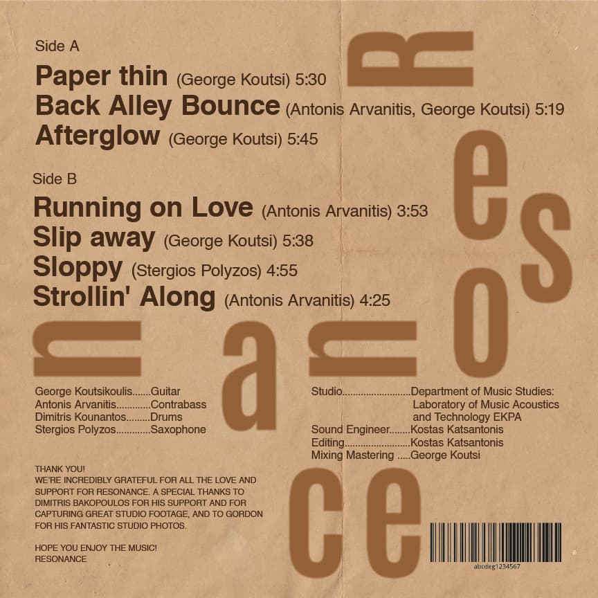
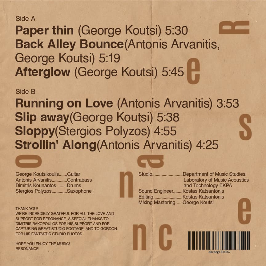

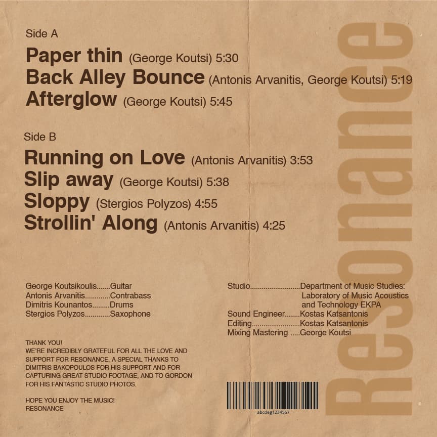
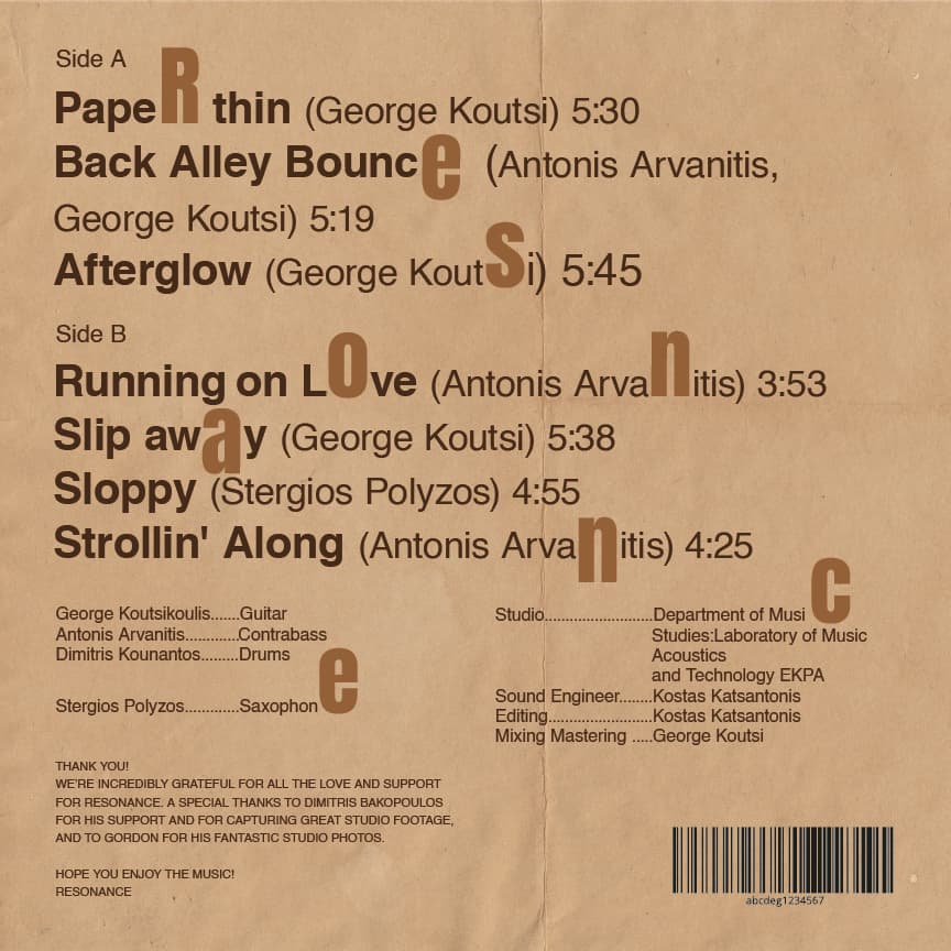
Which one do you like the most?
Any opinions are welcome of course. (These are just drafts)
Hey @Stefanos1984, the ones that have the best layout, are easiest on the eyes, and resonate with the vibes of the cover design are these two.
When it comes to the ones with the letters of the word resonance scattered in the layout, it’s distracting to the eye and feels chaotic, which would only work if the design was intentional and meant to feel chaotic and distracting. But the cover design has a totally different vibe - it’s calming and serene - and the distracting/chaotic vibes of these back cover options don’t resonate with it.
1 Like
Thank you for your time!
I think I agree with you aswell, after I took some time off the project.
1 Like