If this is a multi-page document? Making suggestions for one page without seeing the others is a little difficult since they need to match and complement each other as part of the comprehensive design of the document.
However, as a stand-alone page, the layout isn’t as terrible as you make it out to be.
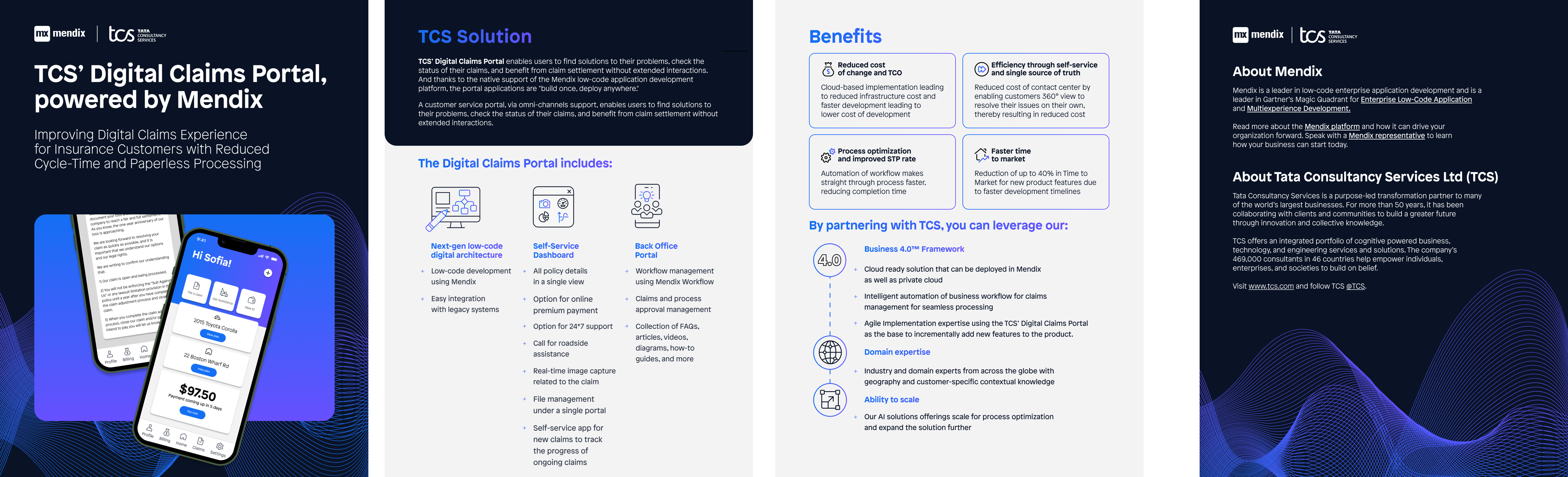
That said, I’d eliminate what seems to be a blue to purple gradient coloring the text.
Will the document be printed? If so, that RGB blue won’t print in CMYK. It will dull down to a grayish-purple. In addition, if the printed document bleeds off the edges, those rounded corners will create a problem since they’re unlikely to match up perfectly with the trim.
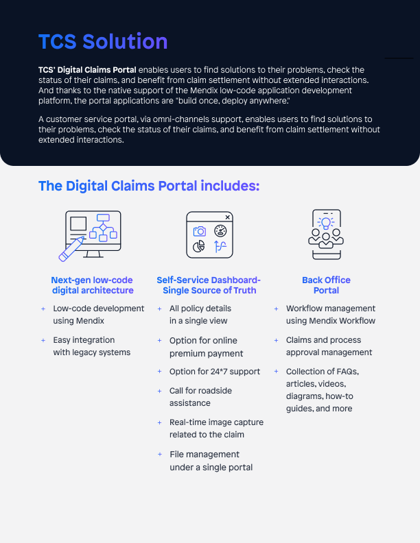
This suggestion is going to seem off, but see what it looks like if the body copy that is reversed at top is set in two columns. Yes, I know that will be breaking your grid — at least the columns — but it might look good. (As @Just-B said, you’d need to take into account the rest of the pages.) Right now, you have a very wide column and three very narrow columns. That’s throwing my eye off a bit. The other thing to consider is if the three subheads (“Next-gen low-code…” etc.) should be centered or left justified like all of the other copy on the page.
These suggestions may look like butt, but I’d at least try them.
Firstly, I wish all the stuff people put up here to crit was this bad. I think you are beating yourself up far too much, it is clean, legible, hierarchy works, etc.
Two things that stuck out for me – the first of which Steve_O pointed out and you have now fixed, the subhead alignment. The second is the space between the + bullets and the text they relate to. This could be halved. Currently, it is so wide as to hinder their relation to the relevant text.
I definitely agree with Just-B too with regards the graduated tint. Pick a good, flat blue and loose the fade. It adds nothing and comes across as gratuitous in a layout that otherwise is has well-used brevity.
It seems like there is less spacing on the middle two pages between sections.
On the final page, the space between the end of the first paragraph and the second heading which is “About Tata Consultancy” - perhaps ensure this level of spacing is consistent between sections on the central pages.