I am new to this platform and very amateur at design. I have been making posters and working on various “passion projects” for a few years now just because I love doing it (most of the stuff is just to mess with and impress my friends.) Anyway, someone recently asked me to design a poster for a religious community, which is basically like modern-real-life monks, and being that I have never done anything “professionally” I really have some nerves over making something good/worthwhile. I already have a billion questions as to printing/settings/resolutions/etc. with literally no one to ask, so I came onto here looking for some guidance from a larger community of professional artists who actually know what they’re doing. So I’m posting this poster here that will hopefully eventually be printed quite a bit and am really looking for some constructive criticism as to 1. if it’s good at all, and 2. what really needs work.
For formality sake and tl;dr, here’s the list of info about what I’m working on.
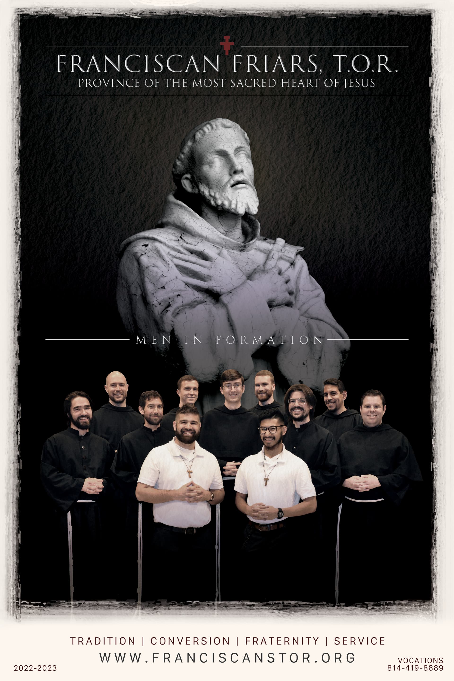
Concept A poster advertising a community of monks/friars Goal Showcasing the men in formation to become friars in order encourage those who might be interested in this sort of lifestyle so that they might to reach out and inquire about their way of life/potentially joining Format Print for 18x12 poster Audience Catholic men who are interested in a religious life Experience Level I literally do this for fun so a real job scares me Nature of Job Paid work
Anyway, I’m really looking forward to hearing what anyone has to say, so please don’t be shy or spare my feelings!
It looks pretty good to me, and I’m usually quite critical of amateur design projects. If it were me, I’d probably beef up the weight of the type and white lines a bit since they might tend to fill in a bit when printed. I might also make the outside white border a bit wider to make it look like a design element instead of it just being the left-over space needed for the “grungy” black edges.
However, the biggest problem I see has nothing to do with aesthetics; it has to do with function. You wrote that the purpose of the poster is to advertise a community of monks/friars and to encourage interested men to look into joining. I don’t think this poster does this. Instead, it comes across as a nice Catholic poster showing Franciscan Friars without the poster having any particular function or call to action.
Also, ensure that your poster is created at a high enough resolution for print. Which traditionally is 300 dpi. But TBH, 200 dpi is usually fine. And also make sure you have included bleed on the poster (you said you are an amateur, bleed is essentially extending your design beyond the print dimensions to ensure that when the poster is printed and then trimmed/cut to size that no “blank paper” shows through.)
For a 12" x 18" poster, usually .25" bleed is enough, but if you have contact with the printer you could find out if they have specific specs.
I agree with @Just-B that there could be a more obvious call to action. You do have the website and a phone number for vocations, but even perhaps a simple call to action along the lines of “to learn more or if you are considering a vocation, call us at 814-419-8889 or visit us at www.franciscanstor.org”
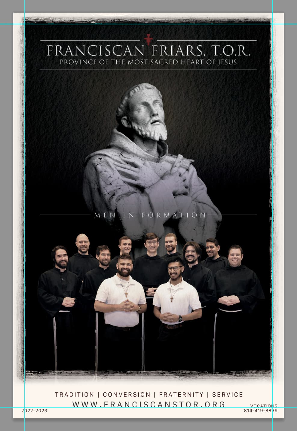
Oh, and you may want to ensure your grungy border is at a fairly consistent distance form the top as it is from the sides. Mainly simply because of the balance and style of your design. Also since when the posters are getting trimmed their can be some variance on trimming and if things are relatively close to the edge, they may get closer to the edge than expected during trimming.
It’s a lot better than what I was expecting based on the “amateur” status.
You’ve gotten some good feedback.
I’d add one thing. You have a lighter glow centered behind the statue’s head. I think the background behind the group shot of the friars needs to be lightened, too. As it is, the black robes and pants are all blending together with the dark background. The effect is that it looks like a bunch of floating heads. You might also look at editing the original group photo to lighten up the blacks and/or the shadows to get a little tone in the black robes rather than having them be solid black.
Thank you so much for your comment. This is exactly the kind of thing I’m looking for! I’ve honestly never even thought of before about the idea of what a design or poster is trying to communicate. That’s really square one for a project like this and I literally never thought of it considering I was just sent a photo of some friars and told to make something up. I really appreciate it.
Also thanks for the tip on the lines and the text. Again, that is something I literally never would have thought of if someone didn’t clue me in on it.
I think I need to rethink the boarder to somehow significantly clean in up. I’m just having trouble on photoshop making sure that the spacing is exactly the same on the left, top, and right. I’ll do some digging on YouTube to see how one gets it just right. Tips are always appreciated.
Anyway, thank you so much; this is really very helpful.
Thank you so much for this info. No one is really here to coach me, so information like this is invaluable. Like I had no idea that you have to “bleed” your design. I think I can just resize it adding .25 inches on each side, right?
I’m also fairly sure I’m at 300 dpi and 75% sure I’m using a CYMK color thing-a-ma-bob (I don’t know the word for it haha.)
Yeah, I agree with you guys (and @Smurf2) about the call to action. I really never even considered it, so I’ll talk to the friar who gave me the project and try to do some brainstorming. I’m open to suggestions if you have any!
Also, I mention in my response to @Just-B that I really need to rework the boarder. I’m kinda struggling making it even on each size. I’m not sure exactly how to ensure it’s equal spacing on the top, left, and right, but I’m sure someone has it on YouTube.
@Steve_O Thanks for that! I will definitely re-work the image to have the robes and pants stand out on the black background much more. That’s a really good insight - they really do look like floating heads haha. I think I can also add a glow like I did around the statue’s head to make it a little more defined. Again, really I’m grateful for the time taken to respond.
Anyway, thank you so much for this. This is really quite helpful and I really appreciate your time to think it out and type out a response!
This quickly shows you how you probably want to ensure your margins are pretty consistent. If you see the guides I overlaid on top of your image, you can see how the left side is perhaps a little less than the right side grunge effect and the top is definitely less. You’ll also notice that the “2022-2023” and “vocations/phone number” also don’t “match” the margin.
I would also say Photoshop is not the ideal software to use to create a poster. It can be done, but PhotoShop is more for photo compositing, photo retouching, photo manipulation. If you do keep continue within Photoshop, do not flatten your text layers or any vector shapes (I’m not sure if the red mark near the top is a vector shape) when you create your PDF.
I mentioned bleed, and to be honest, your design is on a solid light cream color which is consistent. Adding a bleed should be quite simple. Your printer would most likely appreciate it being included, but a printer in this case due to it being a consistent (from what I can see) flat color should be able to create it on their own. Because you are creating in Photoshop, in this case, I would not add the bleed because it may confuse the printer, unless you create and add crop marks as well to show the trim size (your 12" x 18" size).
If you’re using Photoshop keep your text layers as laayers , graphical elements like the line use a vector shape.
If the text is editable in Photoshop save as a pdf and ensure Photoshop pdf editing capabilities is selected. This means you can open the file in Photoshop to make edits, and ensures the file can be printed from a print shop.
The pdf settings youre looking for would he high resolution.
You don’t need bleed or crop marks.
There are no bleed elements and the print size will be taken from the size of the pdf page, so crop makes not necessary either.
Thanks again for the help. Question for you, is rasterizing the same as flattening? Also, why can’t I flatten my text layers? Should I just leave them as regular text layers? Does it do something to them?
Yeah, the red cross up top is a vector shape but I merged all the vector shapes into one layer; is that an okay thing to do?
Also, how would you ensure everything is square with one another? Is that why say indesign or illustrator is a better program? I’m gonna check off the grid-view in PS to see if that can help me line things up a bit better.
Also for @Smurf2 or anyone really, when I go to export as a PDF and then preview it, all of the blacks don’t show up as rich as they do in PS. Is that normal and is that how they’ll print or is that just a weird artifact of exporting as a PDF?
@Pete, kudos to you for delving into an unknown for you and being open to asking for help and listening to ideas. I agree with all that’s been said but mostly want to comment on the idea of communication (again, I appreciated your comment on realizing this idea). One of the first things graphic designers learn is that design is different than art—design must communicate someone’s message to a designated audience. Art commonly communicates the artist’s feelings. Your eye for design is great. Now you need to learn the who, what, where, when, how of both the Franciscans and their audience. Ask lots of questions. Who is the type of person who becomes a Franciscan? What do they do as a Franciscan? Etc. Emotion is the greatest motivational tool so how can you bring more emotion to this poster? The statute shows a bit of spiritual emotion (also might be a bit scary at first glance), but can you tug more at the audience’s heartstrings? Maybe a Franciscan kneeling down and helping a child? Keep up with the good work. Keep learning and asking questions. You’re doing great!