Semi-amateur designer that need a bit of feedback on a t-shirt design, the project just went from on-the-side project single print to mass handouts, so I want someone with a keener eye to take a look before I have to send it to print.
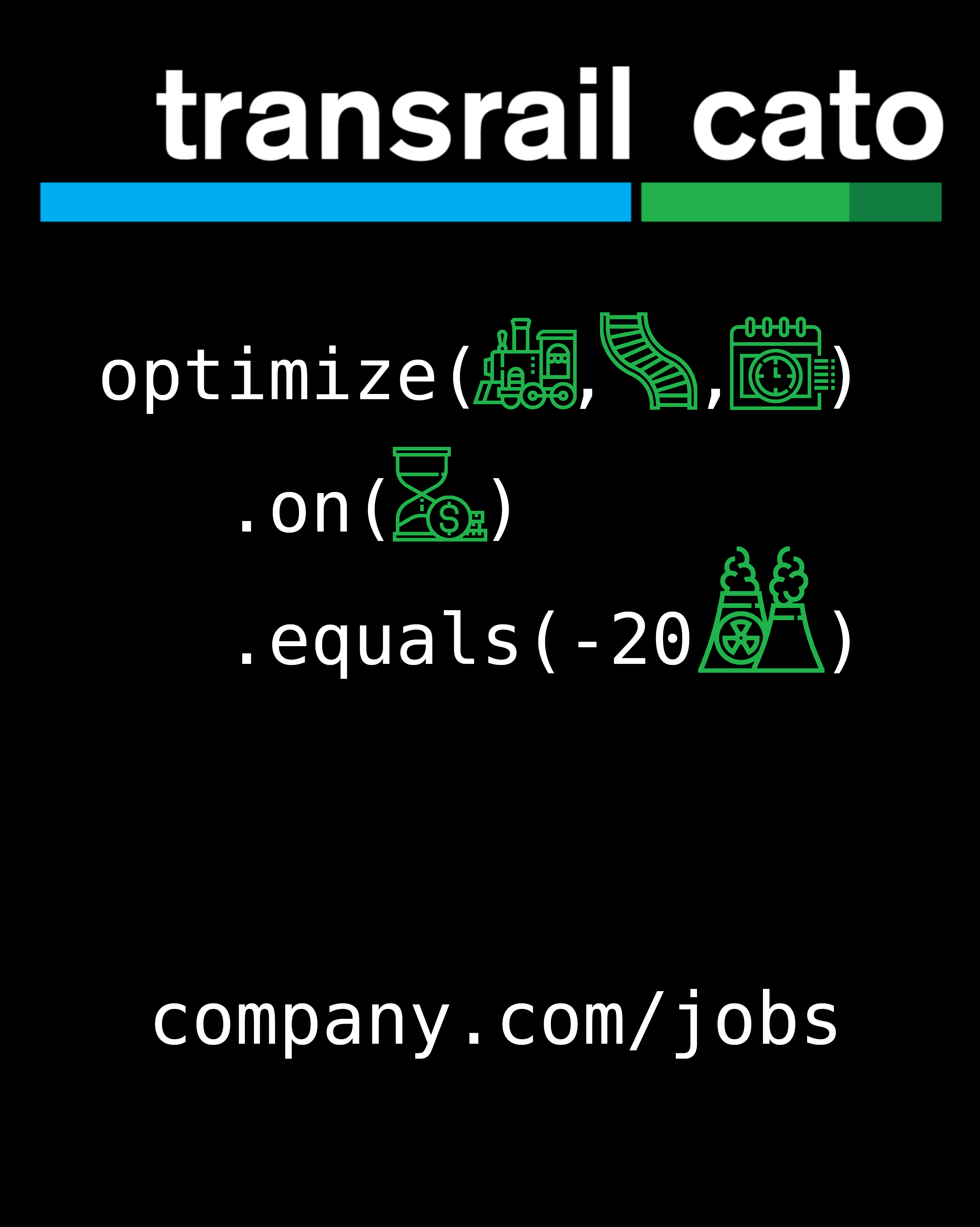
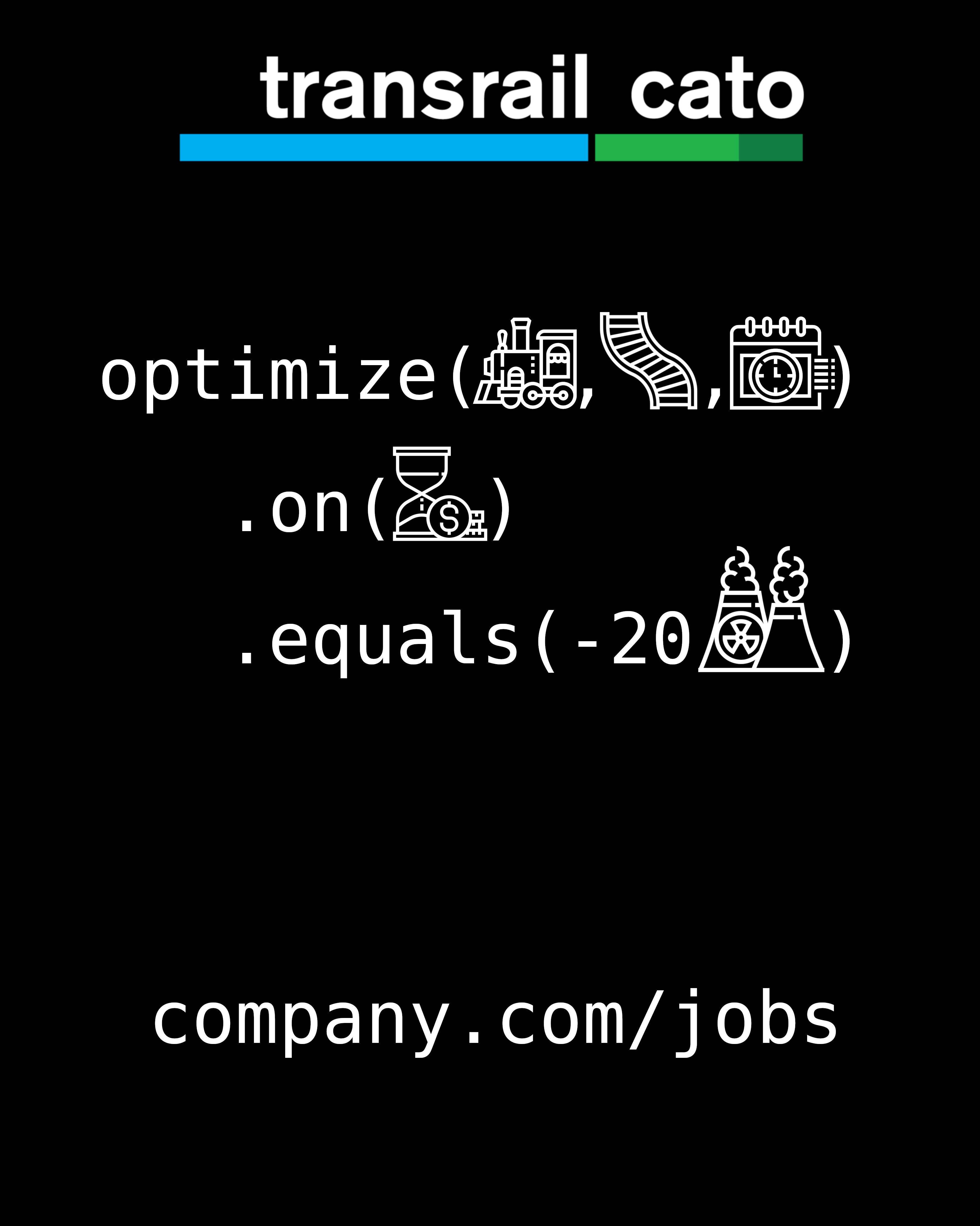
I tried some different color schemes, but I don’t quite know what works best, if any of them. It is to be printed on the back of black t-shirts.
Also need feedback on the general layout and style.
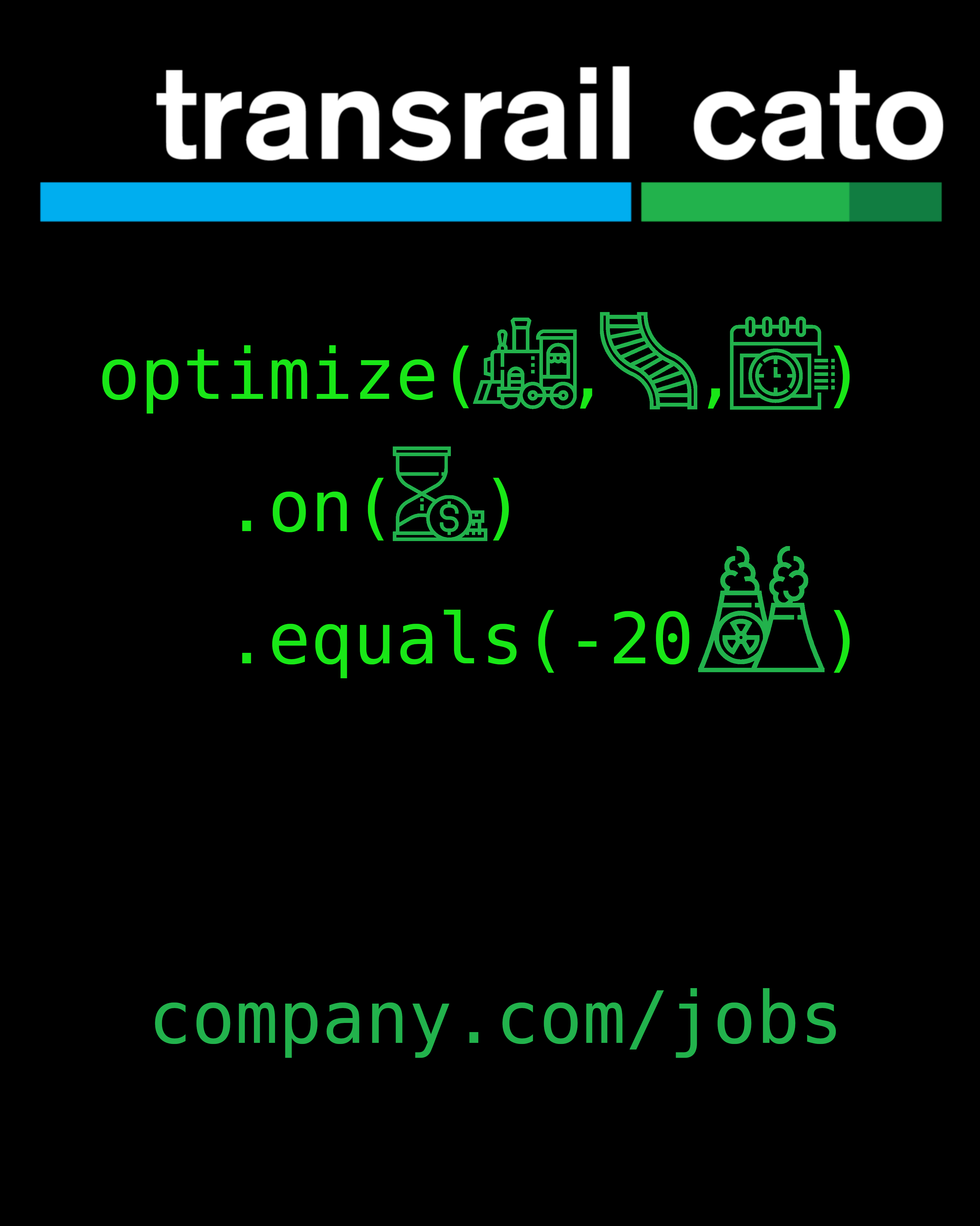
The target audience is programmers, which hopefully should recognize the syntax? But do the icons work?
Thought to be used as free handouts for recruitment purposes and to be worn on conventions and similar.
Logo is already established, cannot be changed.
Icons are purchased from Freepik, icons with less complexity might have been desirable but didn’t have the time to look that up.
Font is BitStream Vera Sans Mono (programming syntax is always mono, free license).
The claim in the message is bold on purpose, it is based in facts and research.
Just about the first thing one needs to consider in t-shirt design is whether people would want to wear the shirt. Given your audience of programmers, is this something they’d want to wear on their backs, as in do they like it enough to, in essence, announce to everyone who sees it that they like this, agree with what it says and and feel good about it to the point of it being a personal statement they want to make?
As for the symbols with the little fine lines, remember, this will be applied to fabric. They could be difficult to print, and after a few washings, they’ll be the first things to start falling apart.
I’ll give you three things: 1) I’m not the sharpest tool in the shed, 2) I’m not a programmer, and 3) I’m not in the rail line industry.
That said, the message doesn’t immediately pop. I had to study this and look at the transrail website. After doing that, I could maybe take a guess at what you’re trying to convey, but it would be just that: a guess.
Be careful with your messaging, and be careful with the medium. A t-shirt is not a flier. A flier is not a t-shirt.
I’d do some market testing before printing as a t-shirt or a flier. Do people get it? How long does it take for them to get it?
This might be a clever idea. But if it doesn’t communicate quickly and clearly, it doesn’t work.
What exactly are you trying to say with your code? The syntax you wrote doesn’t make much sense, and would most likely be a unit test. Does the result of the function optimize with trains, rails, and whateverThatIs passed into the helper on with timeMoney equal [and this would be a syntax error] -20powerPlants?
Also, nobody does 3-space indentations. 2 or 4 is standard.