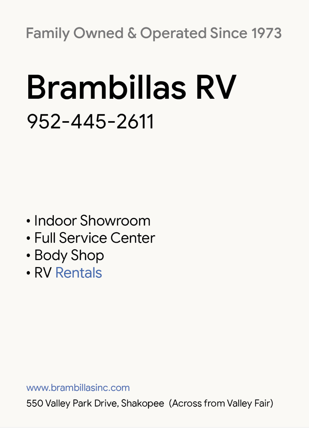
I’m new to this forum and am looking to improve my graphic design skills. I’ve been focusing on Type Hierarchy and not so much on fonts, colors, etc. Would love to hear some feedback on this, thank you!
I agree. The only possible change I might make is for what they do to come physically above the phone number (but, of course that depends on the application) and put a tad more leading between the bullets. Just makes the more comfortable to read as separate services. However, I’m splitting hairs here. Great job.
What you have done feeds right into my aesthetic preference anyway. I love minimal typography and loads of white/breathing space.
When I first saw your post and scrolled down to the ‘before’ example, for half a second I thought that’s what you had done! I was ready to let loose!
Keep at it. Nice to see someone learning their craft. It seems to be an increasingly rare thing these days.
Thank you! Will make these changes and I will definitely keep doing these exercises as I am new to graphic design and trying to learn on my own. I have been taking “bad” examples and reworking them to hone my skills and build up a more critical eye.