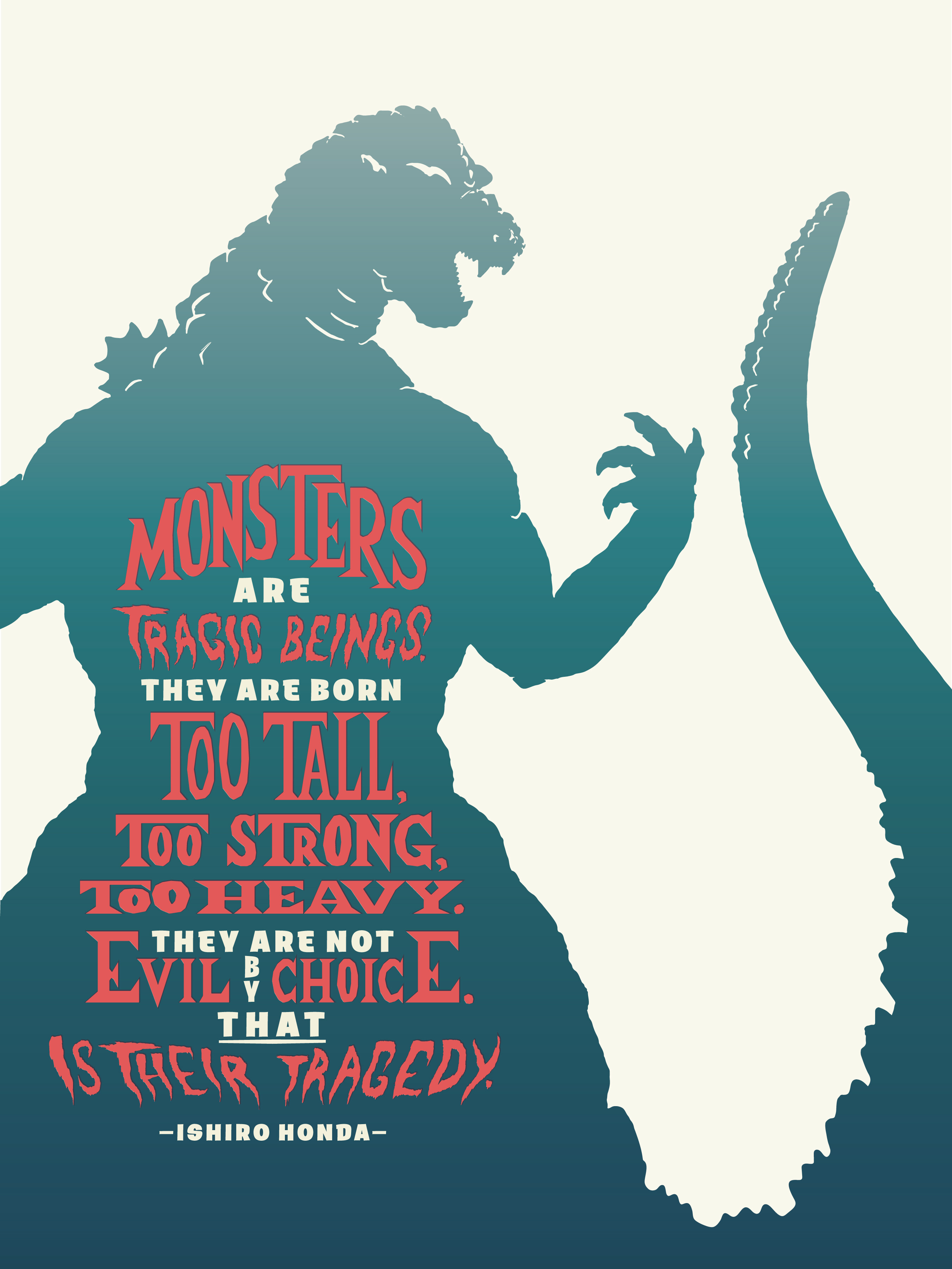
Fun idea to make these for friends!
I agree that all the white background makes it feel flat and out of place. I looked up 60s era monster posters and then Godzilla ones specifically… many times Godzilla is never the primary focal point in the poster. Godzilla is usually somewhat mysterious and of similar dark color tones as the background. It’s usually Godzilla’s attack (whatever the beam of light is that shoots out of its mouth), vibrant text, or maybe the enemy that are the focal points. So you could totally move forward with the text as your main focal point but I would add a scene to the background with similar colors to your current Godzilla.
Oh also keep in mind these posters are usually full of high contrast in color and brightness and show a LOT of action.
I hope you share your final product with us!
