I’ve been working on a passion project that I intend to produce as a linocut print. This is just for fun, so there’s no real brief or mission here. I’d like to print them at 18x24.
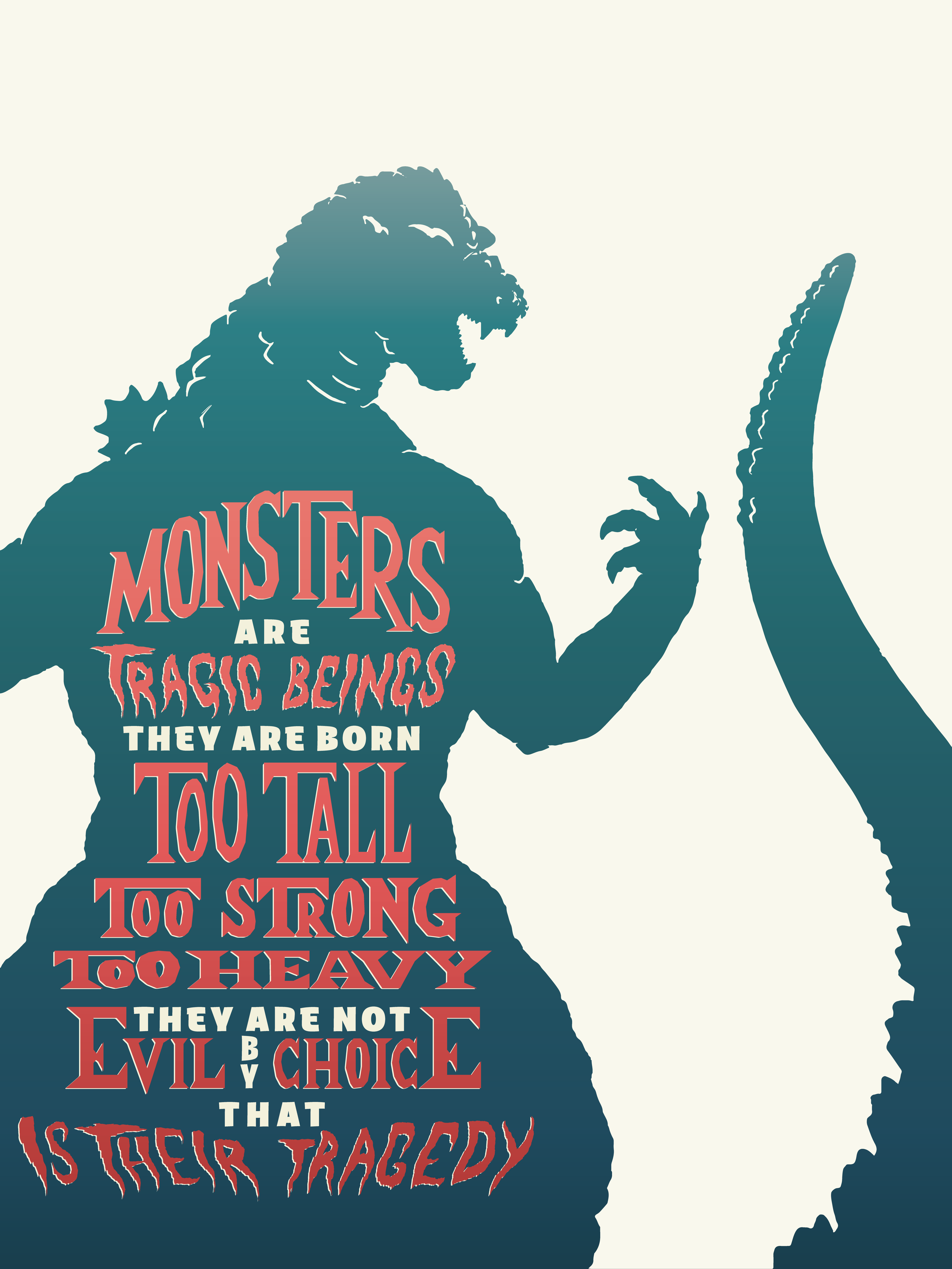
I’m a huge Godzilla fan, so I took a quote by Ishiro Honda and hand-lettered it against an illustration of the Big G himself. I plan to make others in the same vein with Mothra, Rodan, etc. The typography is inspired by 60s era monster movie posters. Hand-lettering isn’t my strong suit, so I’d love feedback and advice on the letterforms, spacing, proportions, etc.
I’m sure you’ve checked into the ownership rights on all of your movie monsters? UPA owns all the old films and Sony owns all the post 90s. The copyrights were renewed in a timely manner and will not be Public Domain for another 20 years or more. (according to a quick search.)
Good luck if you plan to sell these…
I want to like this a lot more than I actually do. The quote is great, the subject matter is great, but I feel like the execution is lacking something that would move it from “okay” to “really cool.”
I hate to say it, but I think it’s the overall layout. White space and negative space are great, but, as used here, just have a flat feeling. Maybe it’s that the type and the Godzilla drawing are competing visually. What’s the star of the show: the type or Godzilla?
I’m also a little uneasy with the, presumably, tail. As it stands, it looks like two separate elements. You have Godzilla’s body on the left and then the tail, completely separated, on the right. For all we know, that could be a tentacle of some other monster attacking Godzilla.
The type is solid, but I do think it would benefit from having the punctuation added. If your target market knows who Ishiro Honda is, it’s probably best to attribute the quote. Probably best to attribute anyway.
Bottom line, I think you’re on to something, but I don’t think you’ve arrived.
I hope there’s something there that will help you.
I like the typography and concept, but I agree with @Steve_O about the overall layout and composition. The separated tail, the awkward relationship between the positive and negative shapes, etc., need some work. The entire composition comes across as a no-so-good cropping instead of a cohesive design.
In addition to Steve_O’s and Just-B’s great comments, I suggest that the while offset line around the red letters should either be thicker, or dropped all together (as it is, it looks like a huge registration mistake in the print process.) And pay very close attention to the copyright issue PrintDriver mentioned, especially if you are attempting to sell the posters.
I think the tail should be connected to Godzilla’s body for a more clear relationship. I also agree about the punctuation. Without it, it reads too quickly and loses some drama. I was just afraid that periods would look awkward and bring the quote to too many stops, but that is the purpose of punctuation after all.
Do you think you could expand on the layout of the type? How do you think I could prevent the quote and illustration from competing so much?
First of all, you asked if about the “layout of the type.” Overall, I don’t have a problem with the layout of the actual type. There are some adjustments I’d personally make that I think would make it stronger, but the layout of the type itself isn’t something that I have a big problem with. Just want to make sure we’re straight on that. We can talk about the type once the overall layout is in better shape since the latter is what I think it holding you back.
With regards to the overall layout, this gets a little nuanced, but let me try to explain. The issues have to do with the framing, the white space / negative space, proportion of type to monster, the relative size of each in the frame, and what our eye is drawn to.
Right now, you have two things being framed: the monster is framed by all of the white space and negative space, so you’re telling the viewer to look at the monster. The type is framed by the monster which is telling the viewer to look at the type. Hence, they’re competing.
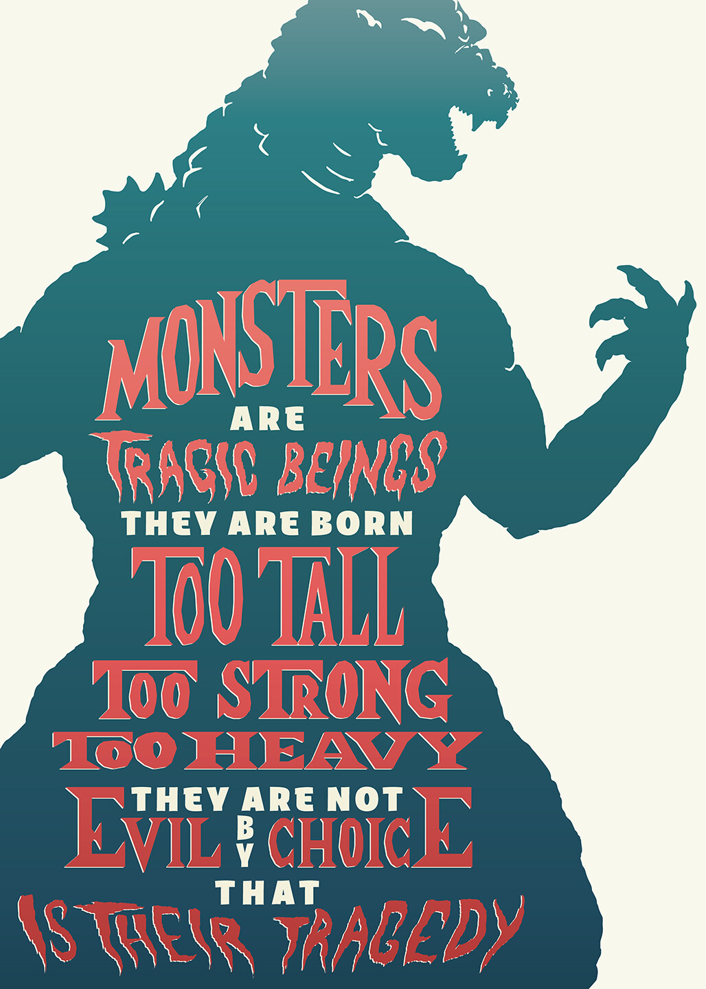
By cropping much tighter and removing the tail, some of the visual demand is taken off the monster — it becomes a background object or frame for the text — which lets the type stand out more. I’m not saying this is necessarily the only viable solution, I’m just doing this to give you a visual of what I’m talking about.
I knew a designer in San Francisco who was commissioned to design a screen-printed promotional poster. He purposely built the artwork to look out of register to achieve a handmade appearance. When it came back from the screen printer, everything was in register. He contacted the printer who said they’d meticulously fixed everything and assumed that he had just done a sloppy job building it.
It’s a personal stylistic choice. I like the imperfect, hand-made look of a slight registration error. Since the goal is to hand carve and print this, there will be errors in the process, so I figured I would “mock up” those errors in the digital version.
I think that’s the type of thing where you need to go big or go home to really emphasize the effect, especially if it’s being mechanically/professionally printed.
I miss the tail now.
The word “That” should maybe be bolder than the white type. It would mean re-lining everything but that word “THAT” describes all of the above and implies an emphasis. That whole section is a bit awkward cuz eyes want to read the white all together and lose the sentence tracking, as well as your point.
Just-B wrote “ He purposely built the artwork to look out of register to achieve a handmade appearance”
I really do get it, but none of the other elements in the piece look “edgy.” If other elements were edgy as well it would make sense, but it just doesn’t to me as it currently stands. Just one man’s opinion.
Agreed. I think I need to roughen up the serif type a little for a more handmade feel. It will all be more edgy and rough when I actually carve the linocut blocks.