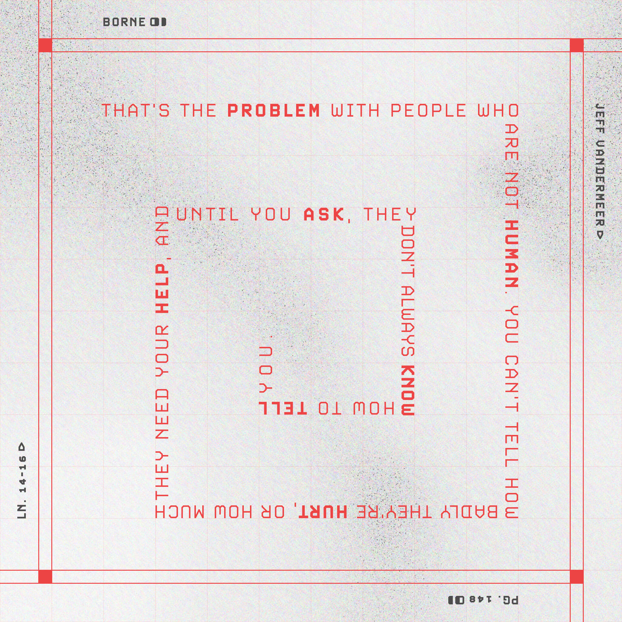
I’ve been pushing myself to create more often, even if it’s just a small illustration or poster. I was reading Borne by Jeff Vandermeer and found a quote that I just needed to design. This was posted to Instagram, so it’s not really a poster that would be printed but you get the idea.
I’d love some feedback on the typography, look, and feel. I was going for a stark, almost dystopian sci-fi feel to match the novel.
Without your description, I’d have no idea this was a book. It’s a unique concept but I’d bring together the book and author title on the same baseline. Its an interesting idea and its great you’re playing around!
A huge part of graphic design is legibility and while I can read it. I’m not as adept at reading words backward. Being that it was posted to Instagram a user may just scroll by when they reach a hiccup during reading.
In continuation on the subject of type the typeface looks like it wants to be futuristic/1984 but looks as if it was something in the early 2000s movie/webpage around 1998.
I hope some of this helps when you make future designs.
I think there’s room for this kind of experimentation. It might not be commercially practical in all but the rarest of situations, but exercising one’s creativity keeps helps avoid the pitfalls of tunnel vision.