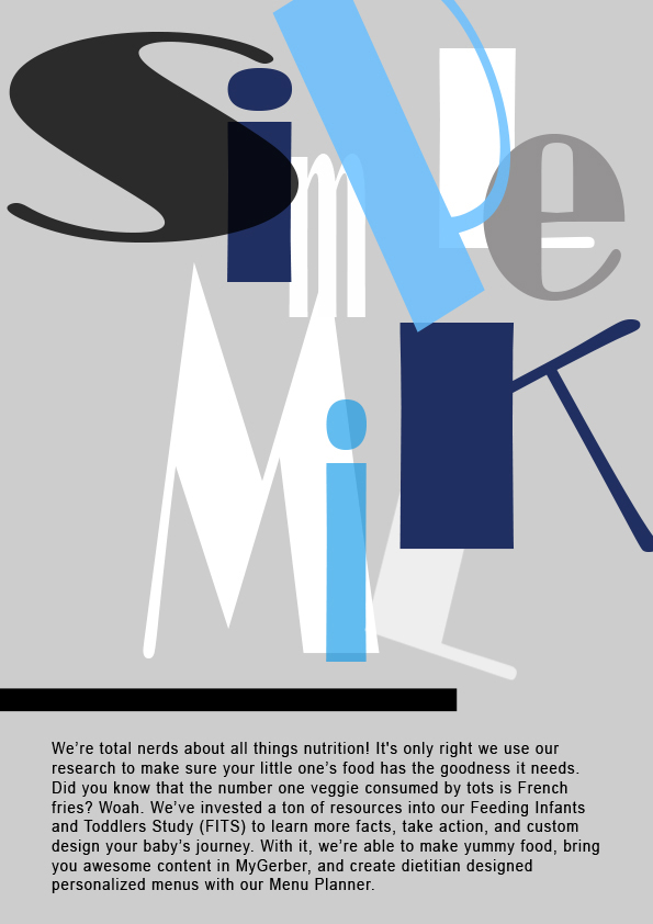
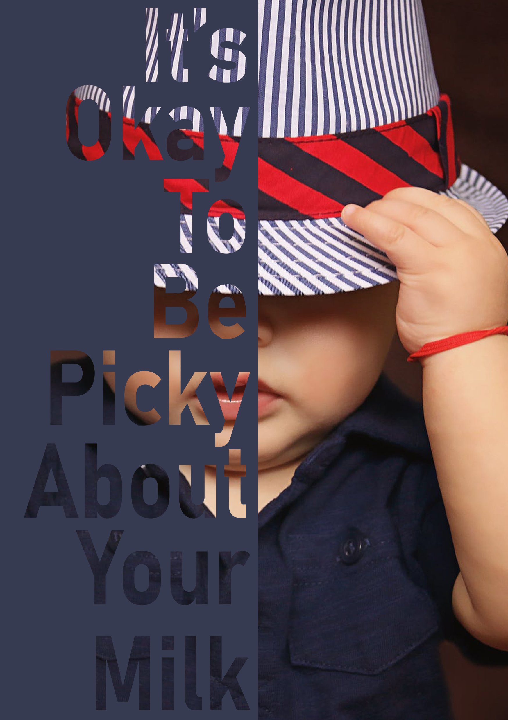
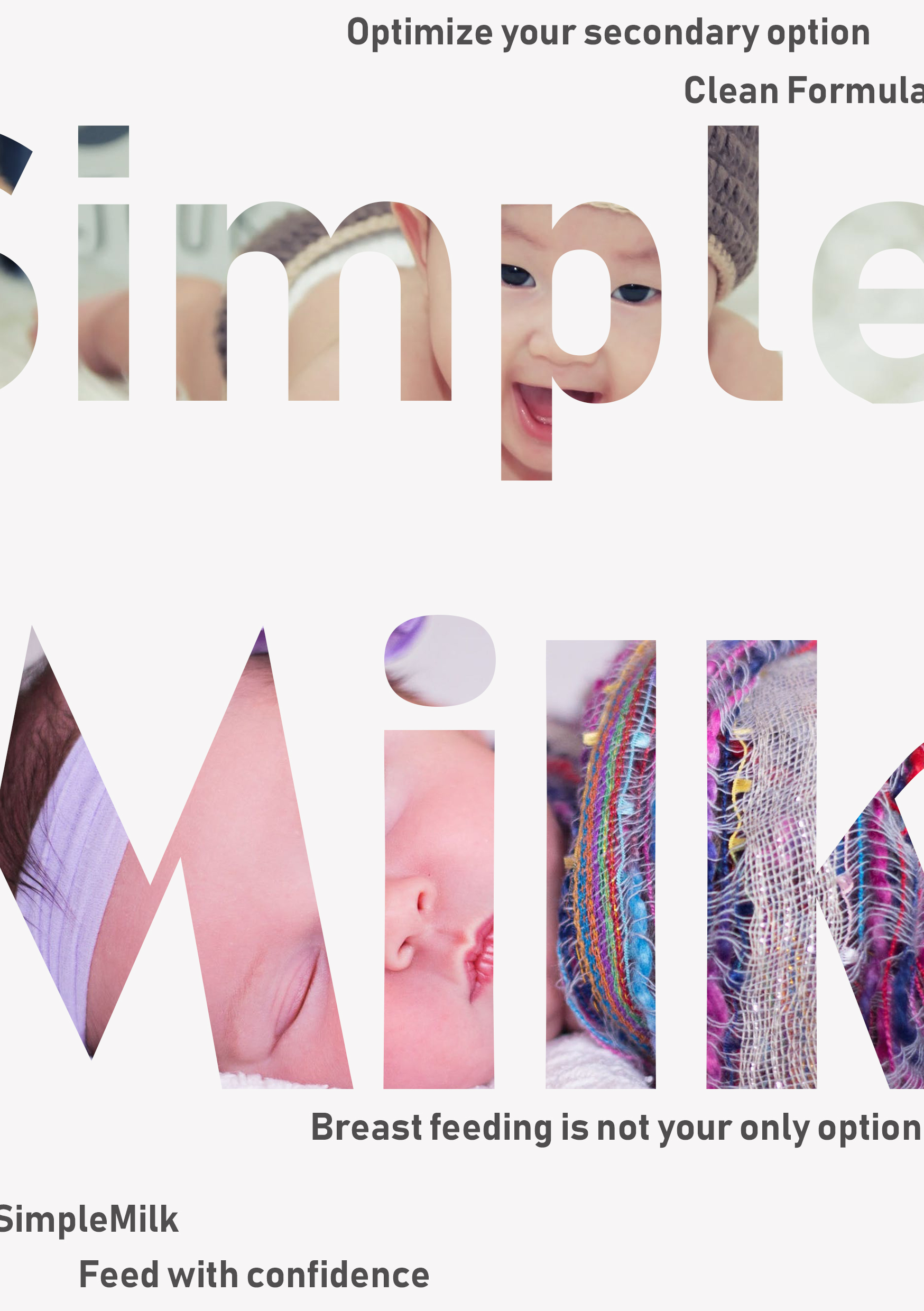
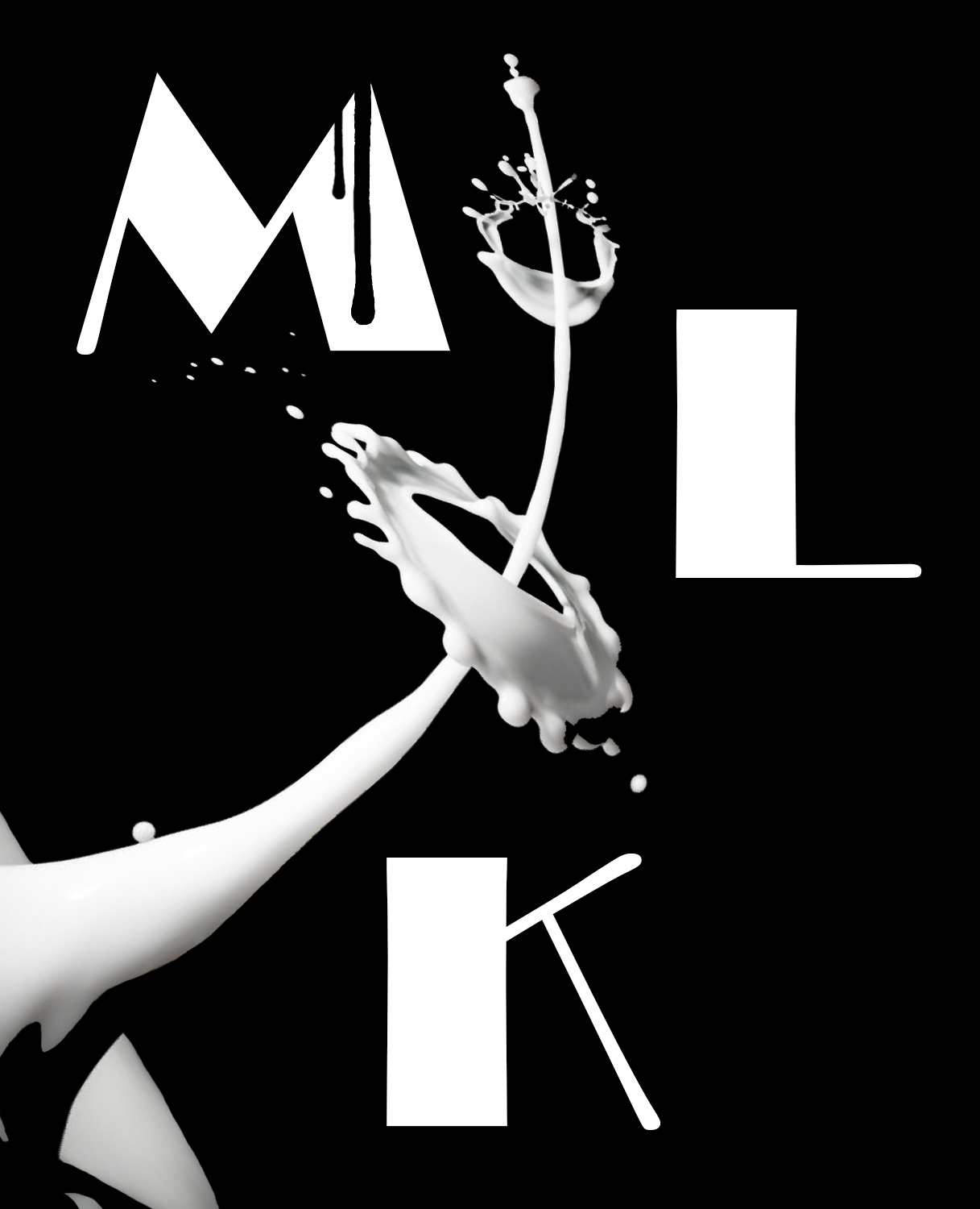
I was asked to do a brand for a company that ended up changing its name, so I went ahead with practicing different styles utilizing typography and playing around with it. I would like your feedback on the styles. Which do you think is the best? Which needs more work? Thanks in advance!
I like them all. Creative layouts.
1 Like
If these kinds of projects depended only on stylish good looks, this profession would be all kinds of fun and a lot easier.
However, this company has a target audience that appears to be mothers with babies and toddlers. Warmth and nurturing come to mind, but you’ve chosen a more edgy look.
I’m not saying it’s wrong, but connecting with new moms in a way that taps into the emotional bond between mother and child (if that’s an objective) might be a bit more difficult on the path you’ve taken.
Since you’ve chosen a somewhat counterintuitive direction, I assume you have reasons. Can you articulate them?
You make some good points. I was honestly just practicing different styles without much thought to the audience or brand, so it’s nice that you pointed that out. I do think these styles don’t match the overall concept, I guess what I’m looking for is layout critique, if that makes sense.