I still think the typography I use is correct, but it still doesn’t feel right after I observe it again
Is there a way to make my typography abilities improve, I think this is my most basic weakness in designing
I still think the typography I use is correct, but it still doesn’t feel right after I observe it again
Is there a way to make my typography abilities improve, I think this is my most basic weakness in designing
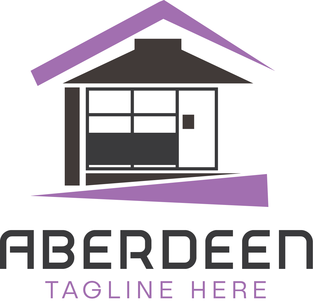
Either the AB is kerned too tightly or the rest needs just a bit more tightening to be consistent with the AB.
Either way, the RD pair will need special attention to look right with the rest of it.
I like the way this font works with the shape of the word. Good choice.
“TAGLINE HERE” wouldn’t matter until it’s an actual tagline, and then you’ll want to consider sentence or title case rather than all caps. But about taglines; I understand the spirit of your including a placeholder for one, but taglines are just about always troublesome in one way or another. Include it in the logo or don’t, will it change and how soon, is it too long or too cryptic, is it a grammatical trip hazard, etc. The point I’m probably trying to make is that a tagline is something to be avoided, if possible, as opposed to assumed. So I guess the fact that by setting a placeholder, you’re assuming there will be one where there currently isn’t is something I’d advise against. When it comes to taglines, I’ve always pushed back until the client insists on including one, and then I insist on their long-term commitment to it, as well as an exhaustive exercise in making it as good as it can be. Clients rarely come up with a truly good one on their own.
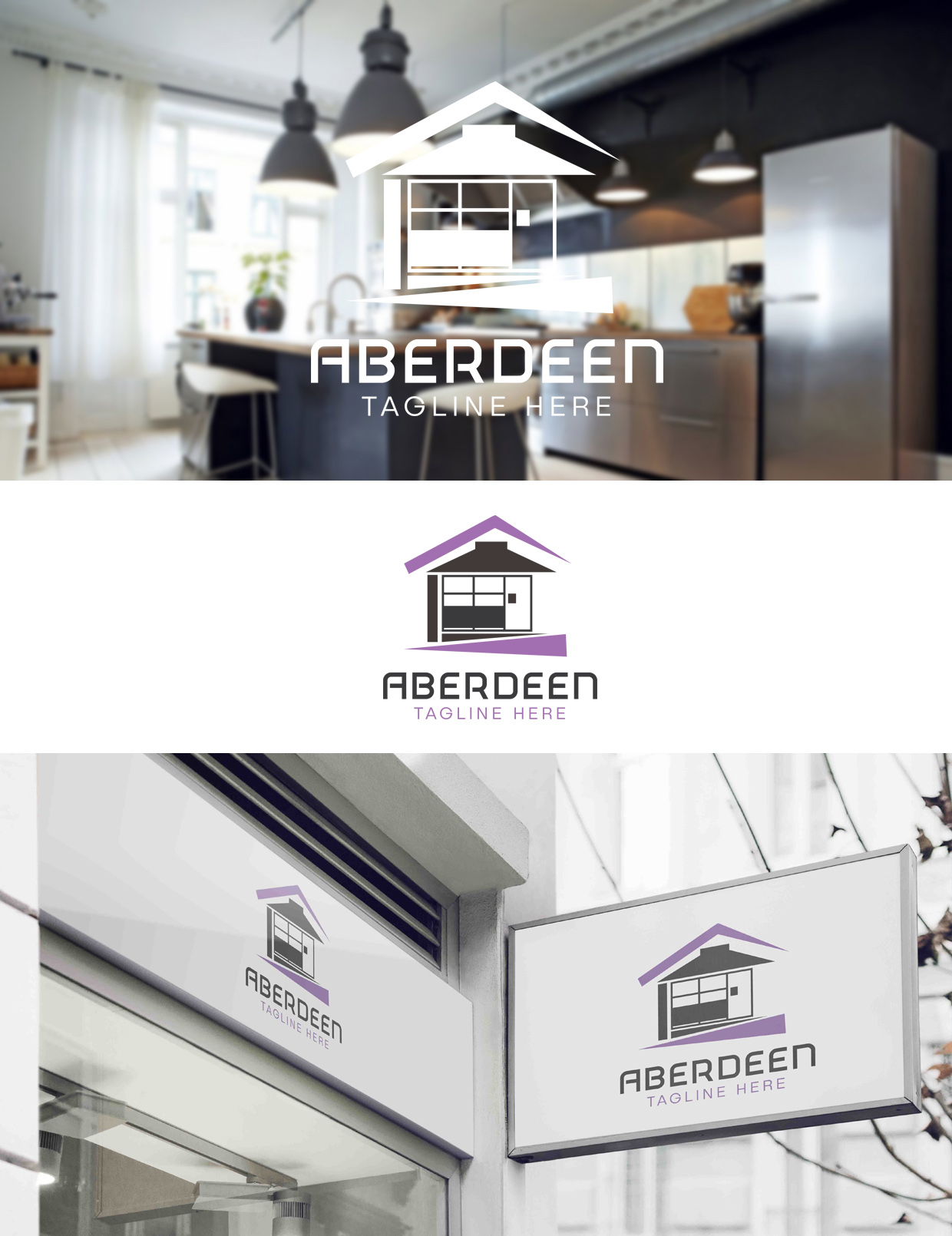
Can’t say if the type is right, until we know what it’s for and who it’s aimed at. Is it a kitchen supplies shop? An estate agent? Etc?
Kitchen Furnishing
I don’t know that the type is bad so much as it is the personality of the typeface you’ve chosen is adding additional complexity to an already complex logo. If it were up to me, I’m not sure I’d abandon that typeface, but I’d probably alter it and simplify some of its quirkiness.
You can only tell that it is kitchens from the image the logo is sat on. The logo doesn’t tell this story at all. If nothing else, your straplinevshould qualify this.
The font you have used, to my mind, does not tell the right story. It more says, out-of-town electrical supplies warehouse, or low-end tech, than it does kitchens.
For me, the more pertinent issue is the logo icon. i can see now what you have tried to do, using elements of kitchen furniture to build a house.
Why? What are you trying to say by doing that?
It is over-complicated. You are trying to be clever in a fairly predictable, first idea off the blocks, kind of way. If you are going to be smart, come up with a smart, original idea, but only if there is a reason to do so. If there isn’t, don’t.
If you produce something that looks like it is trying to be too clever, without a reason, what I would read from that is that the company takes a bit of a ‘wide-boy’, used phone salesman approach, not one that cares about giving their customer what they are looking for.
It is also too generic.Your job is to distill what your client wants, but not just with a logo, but with the brand as a whole. Your first port of call should be the client. Find out what they want to achieve; what makes them different; why they got into that business; where they want to go; who is their ideal customer. Essentially, you have to be clear in your head what differentiates them in their marketplace. Then, combining this approach with their target customer expectations for that sector, visually communicate your client’s unique brand. As I touched upon, the logo is only a small part of this – a visual mnemonic, or touchstone to evoke all the emotions that the brand builds over time.
This is why I am never a fan of logo design in isolation. It will never work. It is only a representation of the emotional capital and brand identity of a company.
This one needs to back to the drawing board, I’m afraid. Speak some more to your client, find out what makes them tick and then visually communicate this to their target audience.
This latter part is the part that takes both knowledge and experience on your part. You need to know, visually and psychologically what a given demographic is more likely respond to.
If, for instance, your client is more selling kitchens into trendy city loft apartments owned by 20-30-something single professionals, then that will have a very different feel to it than if their target was retired teachers with Victorian tastes in affluent, leafy suburbs.
You need to know how to produce something that those two (albeit, extreme cliché) examples will respond to. In reality, it will be far more subtle than that.
In addition, are their kitchens high quality, high price tag and bespoke, or affordable, off-the-shelf kitchens. This, too, needs to affect your solution.
Bet you’re sorry you asked now!
Seriously though, can you see what I am getting at. If I have to ask what the company does, let alone who it’s aimed at, what hope have you got of getting their target audience interested in their product or service.
Don’t get me wrong, it is not awful. I’ve seen a lot worse out there in the wild. It just feels to generic, not about your customer and a bit forgettable as soon as you have walked past the shop.
Hope this helps.
I agree with Sprout on this, and his articulate explanation went into detail that my two-sentence post immediately before it only hinted at. That said, I don’t want to suggest that what you’ve done is terrible, but it does tend to fall apart when subjected to a close analysis that might not be immediately obvious at first glance.
If I were walking down the street and saw the sign on your mockup, I’d probably think it looked modern and sort of classy — that is until I began looking at it closely and wondering what the purple angled things were meant to be and why the house was so unusual and what relevance that house had to what was being promoted.
Whether an average person would pick it apart like that — either deliberately or subconsciously — I’m not sure. I would, however, be inclined to address those issues by targeting the intended audience more deliberately with more focused imagery that was simultaneously less generic, less complex and a bit more abstract instead of representational. Those objectives might seem self-contradictory, but that’s part of the challenge.
Sorry, I’d started writing that tome before you posted, then realised you’d got in there before me once I’d posted. One day I’ll learn to be asleep at 4am, rather than replying to posts!