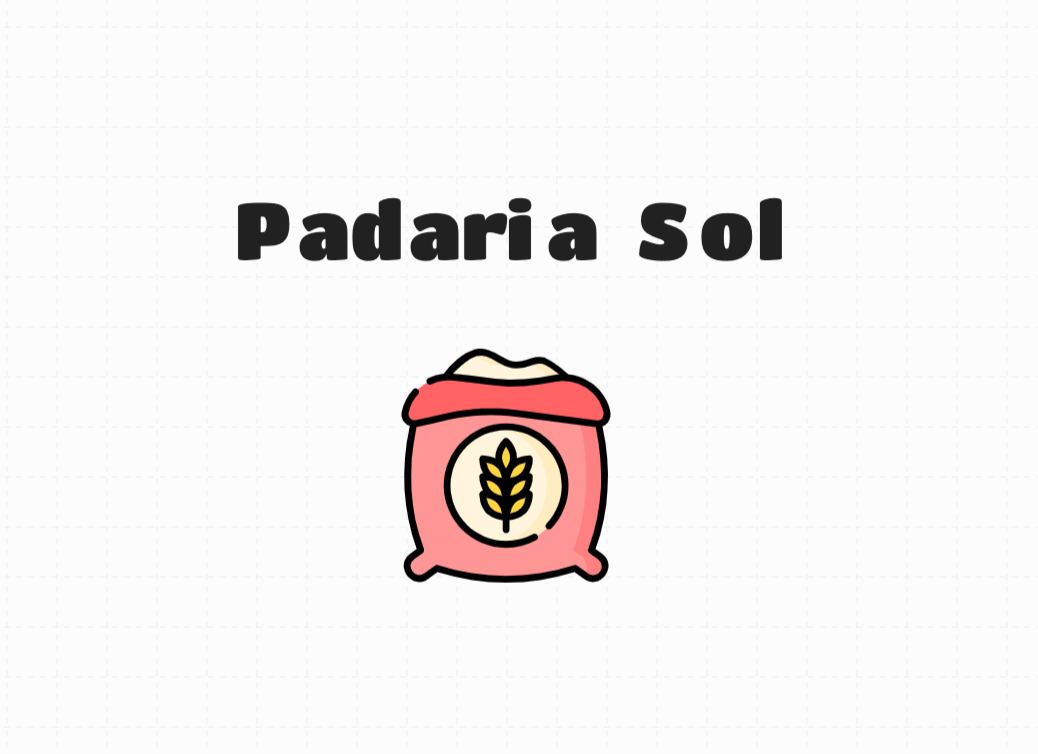
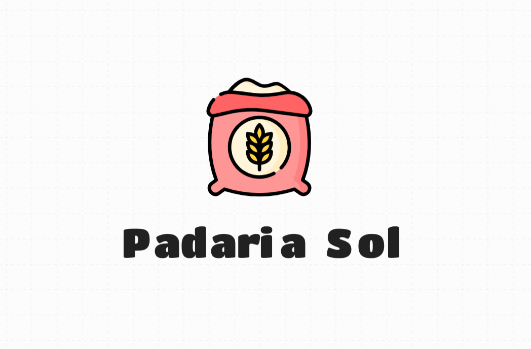
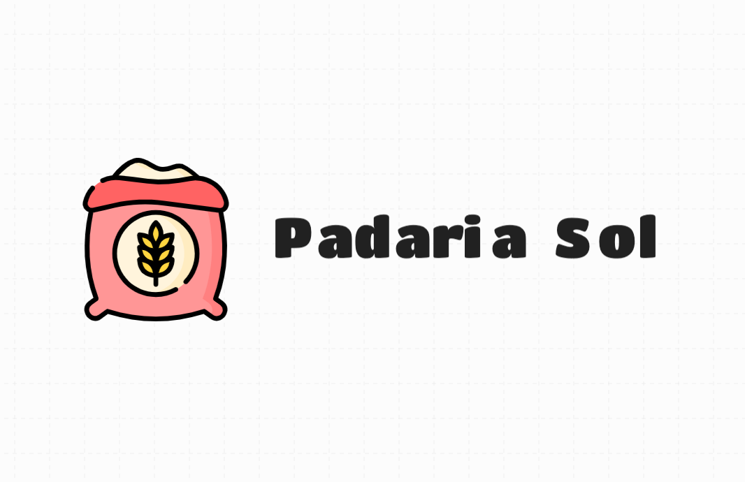
I’m using an online logo maker from a friends company called Logo Bot and it only has the options to put it on top, below, right or left of the text and I thought these were the ones that looked the best but honestly, I’m wondering if it makes any difference where it gets positioned?
Bottom one looks better. But the kerning stinks. You get what you get with any online logo maker. This one looks like crap.
The other question you need to ask yourself with any online drag-and-drop software is, “how many other people are using the same elements to create their logos too?” A logo is unique to the company it represents. To use clip art or stock logos is unprofessional to start, could cost you money in the long run, and does the client a serious disservice.
The problems with this design go far beyond the positioning. But since that was the question you asked, I’d say text below the graphic works best, mechanically speaking, and IMO, would prove the most versatile in the end for signage, packaging, uniforms, etc.
Completely understand what you mean but trying to convince your uncle that logo design is important is really hard… the font is not supposed to be that one and I have to agree that the kerning is terrible. I’m trying to be the most resourceful I can without spending much money or using any design tools as I’m not a designer myself! Let’s hope for the best
If it isn’t the font you want your uncle uses then how would people recognize that the logo represents his bakery?
A good solid logo and accompanying symbols, fonts, and layout can be the different between something that seems professional and given effort; or the exact opposite where no effort is put into the company.
If these are your criteria, I think your mission is accomplished. A professional grapher, however, will not be content with just stopping at this stage. Nevertheless I can see the position you find yourself in, in which case if you want to call it a day, I understand.
Ignoring the type’s terrible letter spacing (which requires gritting my teeth and averting my eyes), I’ll say that I like the first one’s positioning the least.
Where to position the type next to a logo has generally come to be known as a lockup. Designers often put together a couple of different lockups for clients to use depending on the situations where one or the other might be a more suitable choice. In other words, it doesn’t have to be an either-or decision — you can make one with the type beneath the logo and another out to the side.
By the way, I do like the choice of the typeface for this particular logo, which you apparently do not. They complement each other nicely in my opinion.