@Just-B Sorry, I originally posted a reply to yours, a day or so ago. Then wanted to edit my post because today I just got some info regarding the flyer they want to go with. So I wanted to include that in my reply to you but had to delete the previous comment and add content because it doesn’t let me edit posts.
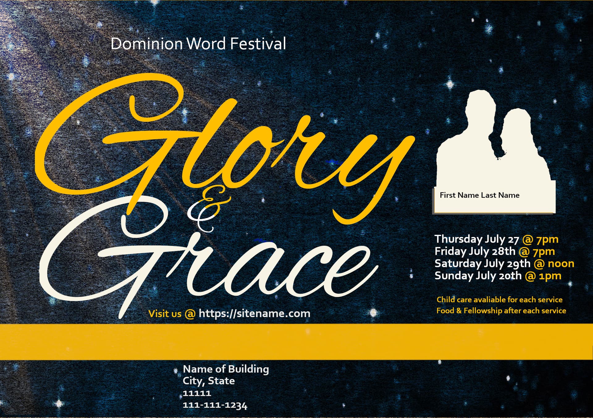
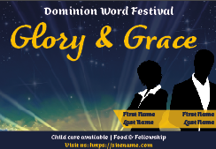
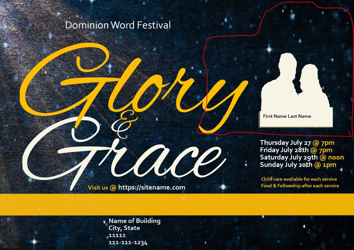
Today, they said they want to go w/the 3rd flyer (the most recent one w/the gold line towards the bottom of the flyer). That being said, specifically, they requested: The picture should be larger and blend into the flyer.
Okay, so i’ll make the picture of the people larger but I don’t understand how they mean blend into the flyer. This flyer is as flat and boring as it can be (unfortunately) I don’t know how they want it to blend into it. What comes to mind is like maybe they faded out (like a ghost or making it fade out into the distance/background but i would think that would be the opposite of what they want if they want the picture to be bigger you wouldn’t want to make it ‘fade away’/disappear type thing). This brings to mind one thing, I feel like if i make the picture bigger (i’ll make it slightly bigger) but it seems like the picture is fighting the theme as far as big and whats more important. If that makes sense.
I was curious after I got that request if you had any idea on what they were talking about.
Below is my original response, to you before the updated/edited info. above.
Thank you for your reply. I looked at the site you shared and the questions you asked and I always look at the info you provide usually 3-4 times when I work on this. The detail and advice you put into all of the replies is greatly appreciated. I do agree with you. You hit the nail on the head of not knowing quite what to do or where to go to make them more visually compelling.
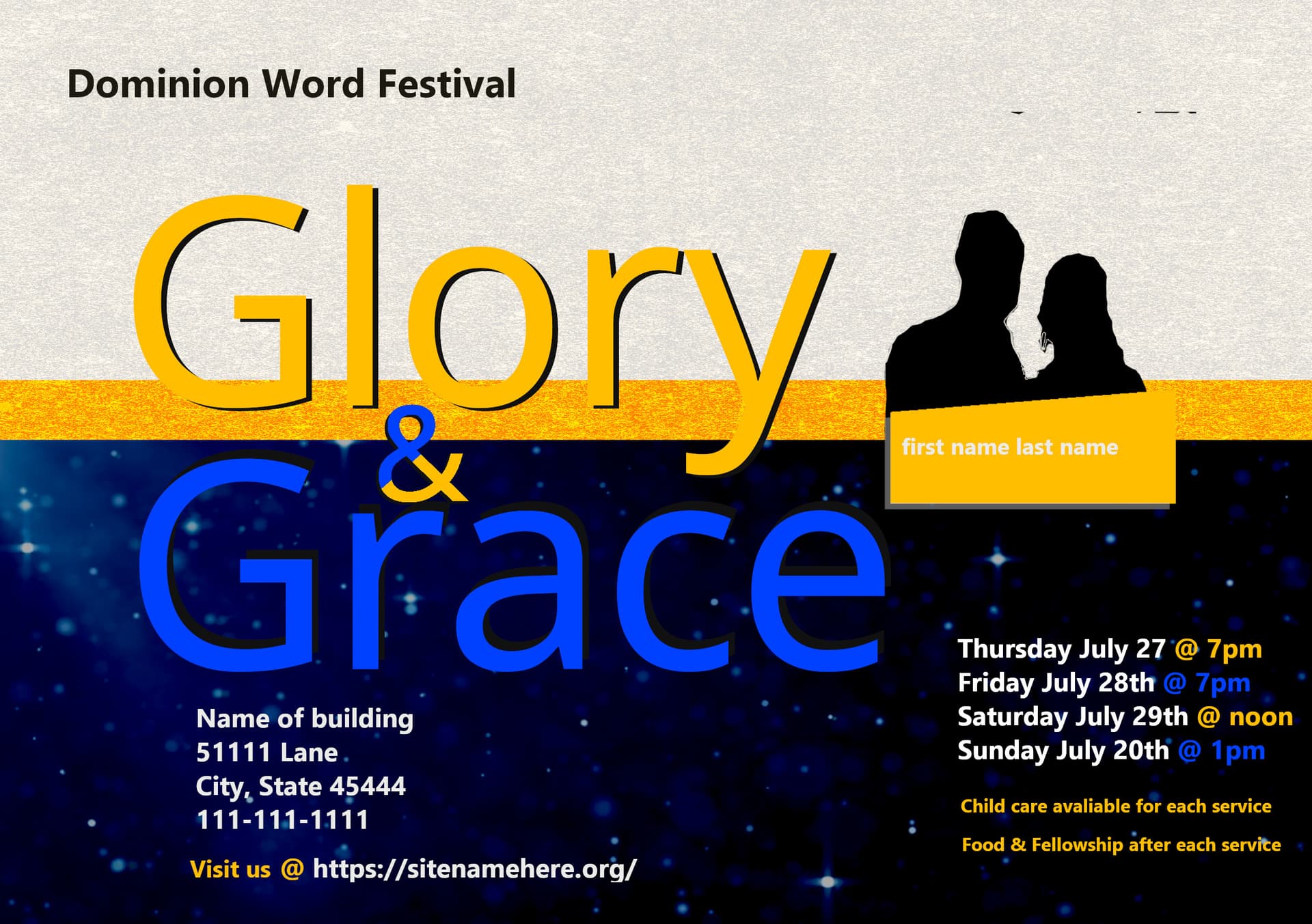
My critique for this theme Grace & Glory is below.
The first thought, when I took this one on, was, okay; what is related or tied to these 2 words since that is the theme?
And what do we want to get to draw people to this Dominion Word Festival?
I try to always see if there is a color or symbol tied to the theme to give me something to include on the flyer. This time, I first looked up the word Glory to see if a color or symbol was tied to it. Same with Grace. Amber is the color associated w/Glory in the Bible so I found a color I liked (from the Canva color wheel) that I wanted to incorporate. Grace didn’t seem to have a color tied to it. Then I start to look up designs that have those words included in it for inspiration. That is when I start to get stuck. I don’t know how/what to do to make it visually compelling.
The other part of being stuck with that is, if I saw something cool online say a star or a beam of light, (something that might not be mirrored by a brush), what is the line of, I can use that but I have to alter it in some way (add color, add a filter, incorporate it w/another design or background), so it’s not considered illegal where you could get in trouble for it.
In one of the videos you shared, the guy seemed to use a beam of light and I know he was just using it as an example for everyone but it made me think, I know you can’t just take pictures off the internet and use them willy nilly on designs unless it’s altered to some extent where they couldn’t tell yep that’s exactly my drawing or my star. I even though of using Canva personal free account for part of a design but then I thought, no because if its for a non-profit, then i have to have them sign up for a non-profit account and could maybe use that then but if Im being honest, I feel like using Canva to create stuff while cool is, in a sense cheating. Its not something you really created on your own, you just used someone elses design for it. That might seem silly but thats just my opinion.
In regard to effectively communicating the message to the audience, I think okay, what is the call to action (maybe im using that phrase wrong in this sentence), why would people want to come to this event what is going to draw them…then I just get stuck because its not like I can put an explosion or fire or something on there to draw people because that has nothing to do w/the theme. I feel like that kind of ties into me being stuck on how to draw them in/visually compelling.
I don’t like the fact that we have to have a picture of the speaker for every flyer, I feel like that makes it harder to design around at times, but that could just be me. I do think some of the info we have on there makes it cluttered but it’s required to be on there as well as a picture of the speaker.
I think the only thing I have down is the hierarchy. Though I got bored with it because, in every flyer I do, the info is relatively always in the same spot. It all needs to be there though, so I either keep moving it to different spots or keep it all the same but it still needs to look good hierarchy-wise and flow, not have random info scattered throughout.
When I look at the flyer, I think okay, the first thing I want people to know is the name of the festival, so I would think that should go at the top, then next would be the theme of the festival. At least, in my opinion, I would think that would make sense, but maybe the first thing could be the theme of the festival, then the name of the festival, or am I correct in my thinking about the name of the festival first?
As I am writing this, I think I could do the theme and then put the festival part smaller underneath the theme somewhere, but that’s just moving one small piece down a way, which is not much of a huge change.
I really do appreciate the questions you asked me about my own critique and that you are willing to have an actual discussion about it. Its nice to converse about it, it helps. This is the spot where I can talk/discuss the progress or lack there of which I am so grateful for and need because I don’t have that outside of this forum.
I did look at actual classes at a community college or university and everything is signed up already for the semesters, i’ll take a peek back again towards the fall and see.