Hey guys! 
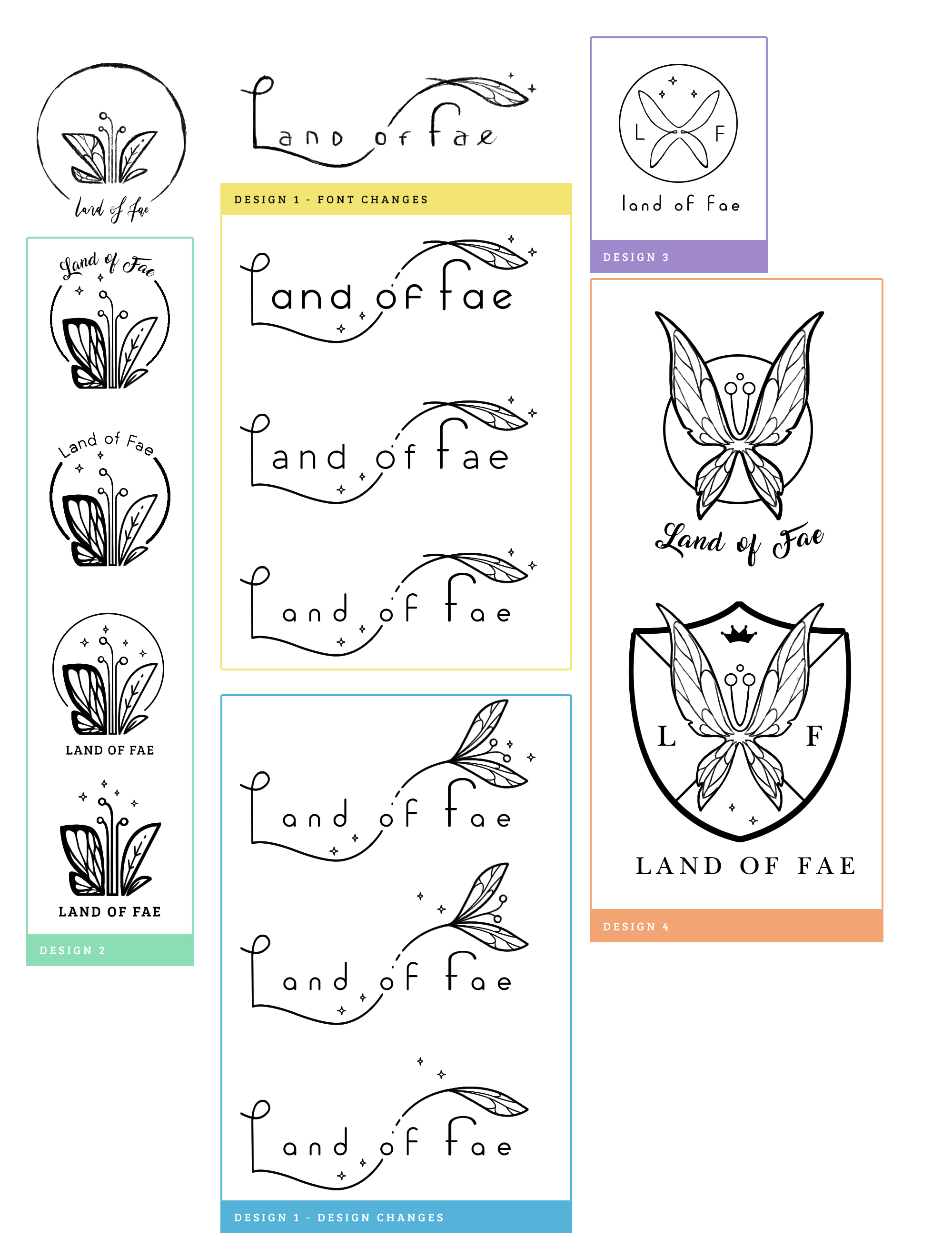
Here’s some designs I came up with for my own username as a warm up. I know that when dealing with clients, it’s better to show only 3 designs, though I wanted to show how many I got.
I started by looking up several existing logo styles that I like, references and from there on began sketching.
After about an hour, scanned the sketches that I liked and worked on them in PS. Then searched around for a fitting font. Some ideas I found worth to experiment with, some I decided to ditch, such as design 3 because it isn’t my cup of tea. Though I like the thin lines. Same for design 4; it seemed a bit outdated.
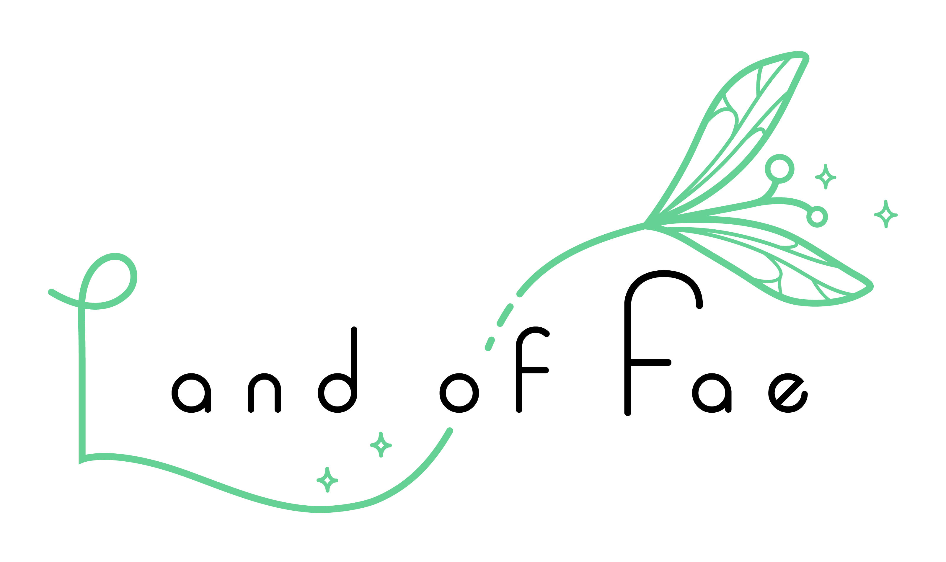
I asked my bf’s opinion, he preferred the first of design 1 since the stars/magic appeared to be coming from the flower. I agreed with him on that. Eventually finished it up in AI and played a bit around to keep some nice balance/spacing. I rotated the E a little and added some color variations.
My personal thoughts on the finished version: I still think something could be done better about the balance of the overall logo. Doing it a second time I might have extended the flower’s stem a little and gone half circle around to make the flower appear to be hanging. I also could do a little more research on colors because I find them very hard to choose with this one. Also the stripe of the small F is probably sticking out too much.
Any thoughts and feedback on improvement on the process? Things I missed/should add? 
Design 2 looks good. How about making the background circle into the moon? just spitballing.
But the font on design 2 (#3 +4), no. no. no. “smacking on the nose with a newspaper”. If you want to go bold, then maybe runic, but I think the top script is a lot better. If it’s “The Land of the Beautiful”, then the font needs to say that with its character. that, imo, is a light and airy feeling (like the design). The all caps is exactly opposite of that.
Someone with better font experience may be able to suggest a good one. few choices.
1 Like
Design 4 is interesting but I’d change the coat of arms on the shield. the X graphic is a big negative these days. It’s overused and is associated with tragedy by millions of people.*
Google image search “coat of arms”, “medieval shields or banners”. Then take the patterns they use and apply your clients color palette. For example if you look at Bavarian coats of arms you’ll see a blue and white checkerboard. You can change the checkerboard into other shapes from your clients “universe” (deer/satyrs/centaurs, whatever…) in their colors.
*After Katrina, Charlie, Puerto Rico… what was left of the houses were spray painted with this symbol. Those numbers inform FEMA how many dead bodies are still inside. People really need to stop using it. It has huge negative connotations to millions of people. People = customers. Don’t cut out people from the customer base with a logo.
1 Like
The X: Hmm so more research on the topic is definately important. Now this is an idea that I’ve dropped, it’s not like I actually digged into the coat of arms. Which I maybe should’ve done. I probably haven’t taken the other designs that seriously compared to design 1. You’re right, I don’t want to scare clients away by being lazy doing research. Very important stuff.
About the fonts. Good points. I wanted to go for a more modern look, so I decided to go with this font instead of the script. I do like scripted fonts, but they’re really overused these days. I agree that all caps and sturdy fonts doesn’t convince anyone of the message.
About design 2: it was actually supposed to represent a full moon  but it’s too subtle.
Thank you so much for taking the time! I’m definately keeping this in mind. 
Good answers but let me continue. This is a critique, not criticism. Nothing is personal.
-
Yes, always. This is the design equivalent of “measure twice, cut once”. Research should only be limited by how much time you have to finish.
-
The coat of arms is a bit generic. that’s why I mention if you do use something like that, make it really good because it’s been done for centuries, literally.
-
That said, if you weren’t really “into it” then don’t include it on your proofs to the customer.
-
Most people don’t know where the X graphic is from. It is just a cool looking graphic.
-
FONTS: Don’t go modern. It’s “The Land of Fae” right? The land of the fair, city of the beautiful… it’s magical, traditional, festive - I think of elves and fairies getting drunk on mead myself lol.
The name of the client, seemingly based on Fairy Tails, is the opposite of modern. It’s pre-printing press and otherworldly. So don’t use something that looks machined or static. That is not to say you can’t use a “new” font, but try to find something that seamlessly associates itself with the “idea” of the fairy tail. (If I’m reading your client correctly).
- Design 2: Yeah. I got that it was going in that direction, so that’s awesome you hit that feel. Maybe hint in the traditional moon guy profile?
No worries. I try to help when I have time. There are a lot of really good people here that will take time. The group here has experience and diverse opinions, technicians and artists.
I’m relatively new here but the idea behind this site seems to be to “Pay it Forward”.
When you’re rich and famous, come back and use your knowledge to help others too.
1 Like