Could you provide more context to what this is, what the brand does, and what you are trying to communicate. Otherwise we cant properly critique.
Going off just looking at it you have a stroke around one triangle and not the other and the same goes for the gradient. What are the functions of these designer choices? How does the sharp shapes realate to the rounded type?
Welcome, alfathussurur!
You posted an image with no explanation to the news section. It would be helpful if you included a description as to why this is news worthy.
I’m not even sure they want a critique. It’s posted in the News section, which could quite possibly make it Spam.
That’s a bandalicious gradient, for sure!
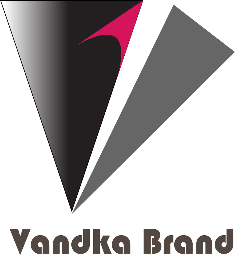
What does “Vandka Brand” mean? … as in Apple brand, Nike brand, Boeing brand, Johnnie Walker brand and so on? … or as in Oscar Brand, Neville Brand, etc.?
I’ve moved this to the Crit Pit, which is probably a better spot than in the News category.
As others have said, you’ve supplied no information about what this is, so there’s no way to critique its suitability for the purpose for which it was designed. Maybe there’s a language issue since your IP address points to Indonesia. I’m guessing it’s supposed to be a logo, though.
However, there are other problems.
The typeface you used is straight out of the 1970s. Whether that’s appropriate or not, I don’t know. Also, the V is too far away from the a.
The logo has an outline around it, which will become way too thin to be useful when reduced down to the sizes logos normally are used.
Gradients are generally a bad idea in logo since they cause printing problems.
How would this logo look in black and white (no grays, just black and white)?
What is the pink object? For that matter, what is any of it and how does it pertain to the company for which it’s designed?