I’m designing a 5x7 card that needs to look kind of high end. I originally wanted to do a clear varnish of the logo on white matte stock. I think it’s a little risky because it may not show up as well as I’m expecting. So, I was thinking of doing clear thermography on a white matte stock. Does anyone have an opinion or input on either process? I’m fine with the logo being a little raised. I guess I’m looking for the best way to ensure that it’s going to show up.
Well, I’d need to see it to say for sure.
Thermography, when done right, can have sort of a cool, funky look with it’s rubbery texture, but I’ve never really thought of it as looking high-end. As often as not, it’s used to simulate engraving, which, to me, is sort of like Formica simulating wood. Others, I’'m sure, will see it differently.
If it were me, I’d be more inclined to go with the varnish.
I’ve seen both types and I like both types .. but Varnish always seems a bit classier. I really think it comes down to personal taste.
whenever i see thermography, I think of business cards of yesteryear.
high-end can be lots of different styles, depending on the look of it all. sometimes foil can be high-end, sometimes gaudy. it depends on the look of the piece and desire.
Depending on the logo and the design, have you thought about or have budget/time for a letterpress treatment … or even possibly an emboss.
I think thermography can look really nice. It used to be used for more blue collar type business cards but I’ve seen some nice pieces using thermography.
I can’t do embossing, die cutting or letterpress cause there will be text on the opposite side. Of course, it’s also a rush job. The original plan was to have a custom pop-up card made but communicating with the company seems to be an issue and now I’m pressed for time. For this piece, I don’t think foil stamping would look that good. Our colors are red, white and black. I don’t want to foil stamp those colors or do it in just black. I can’t do gold so that leaves silver. The logo is a fleur-de-lis. I’m pretty sure I’m going to go with the varnish.
1 Like
Spot UV looks high end. That would be my pick.
How about a metallic.
A metallic would certainly show up better than spot varnish on white. It could go really wrong, though and it won’t be cheap. Most Litho printers will be able to do spot varnish or metallic.
If you worry about the clear varnish showing up, it may be better on an off-white card (see what your printer has in stock).
If you want to go the other way and be MORE subtle, how about reversing out in Matt varnish on a silk card?
I’m not too into metallic or foil stamping on this project. It’s a little too gaudy for this. I’m more going for an understated classic look. The fonts are Brandon Grotesque and Mrs. Eaves - classic but unique in my opinion.
I’m going to go with a soft suede-ish lamination and a raised uv. Because it’s white on white, I may put a super light gray under the logo just to be positive it will show up. The suede and raised uv will be pricier but I don’t see any point in doing the project at all if there’s a risk it won’t look the way I intend. I’m still way under budget than what the pop-up cards would have been so I shouldn’t have to wrestle and wrangle over cost too much.
Take a photo when it’s done. Would like to see the printed piece.
1 Like
I created a two tier thermography with spot gloss on the thermography and all on matte paper with a uv coating = beautiful. I think a couple tiers of slog gloss on your thermography would help quite a bit. Sound slick.
I’d never heard of printing on top of thermography. I wouldn’t even have thought it practical because of thermography’s somewhat irregular raised surface. What kind of gloss coating did you use: varnish, spot UV?
Spot gloss. Am allowed to show you a photograph? I’m not sure I completely understand what is and what is not allowed.
Yes, absolutely you can!
Just for future reference, here’s a link to the forum rules: https://www.graphicdesignforum.org/t/forum-rules/852/3
As long as you keep the basic forum rules in mind, which are mostly just common sense sorts of things, you’ll be fine. We’re all actually pretty nice here. ![]()
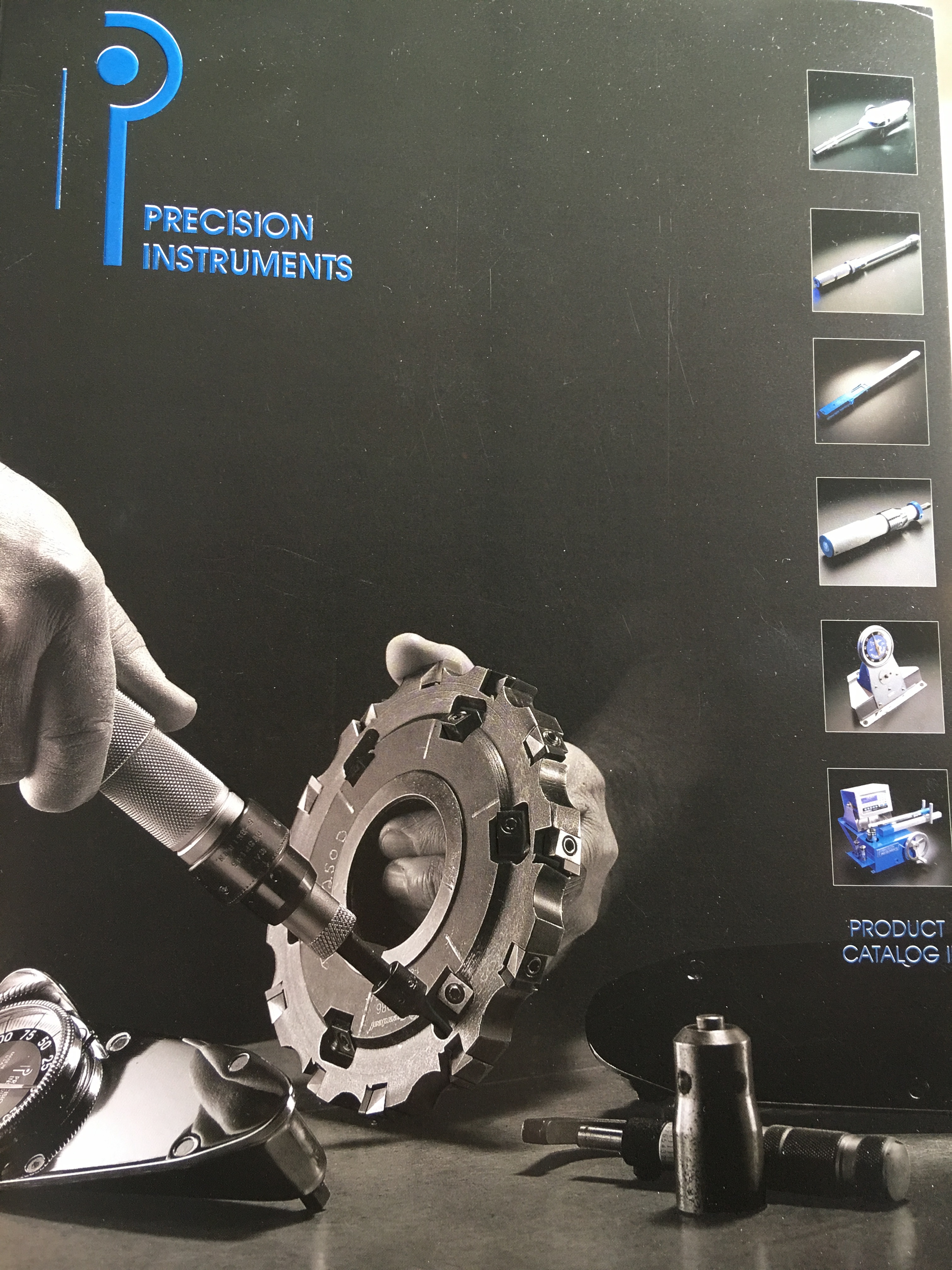
![]() It certainly seems like it, I just want to respect that. Thanks for the link. So here’s the image. It’s the cover of a catalog that create huge, high end wrenches for companies like Boeing and also every day mechanics. They are a family-owned company and have a firm belief in their craft so something that users could “feel” felt like a natural solution.
It certainly seems like it, I just want to respect that. Thanks for the link. So here’s the image. It’s the cover of a catalog that create huge, high end wrenches for companies like Boeing and also every day mechanics. They are a family-owned company and have a firm belief in their craft so something that users could “feel” felt like a natural solution.
I took a couple of shots but it’s difficult to show the levels with my iPhone. I hope you can see the level changes.
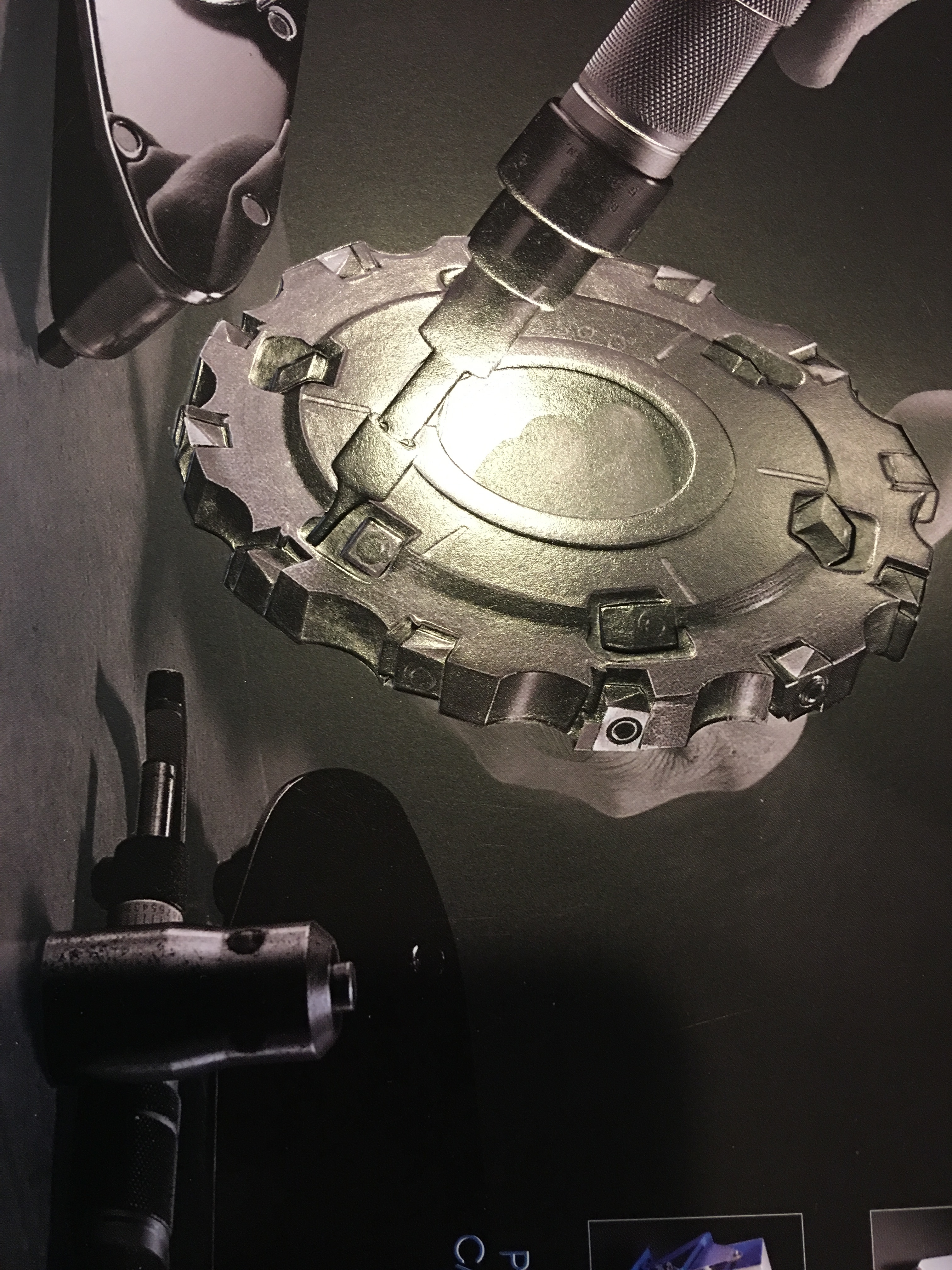
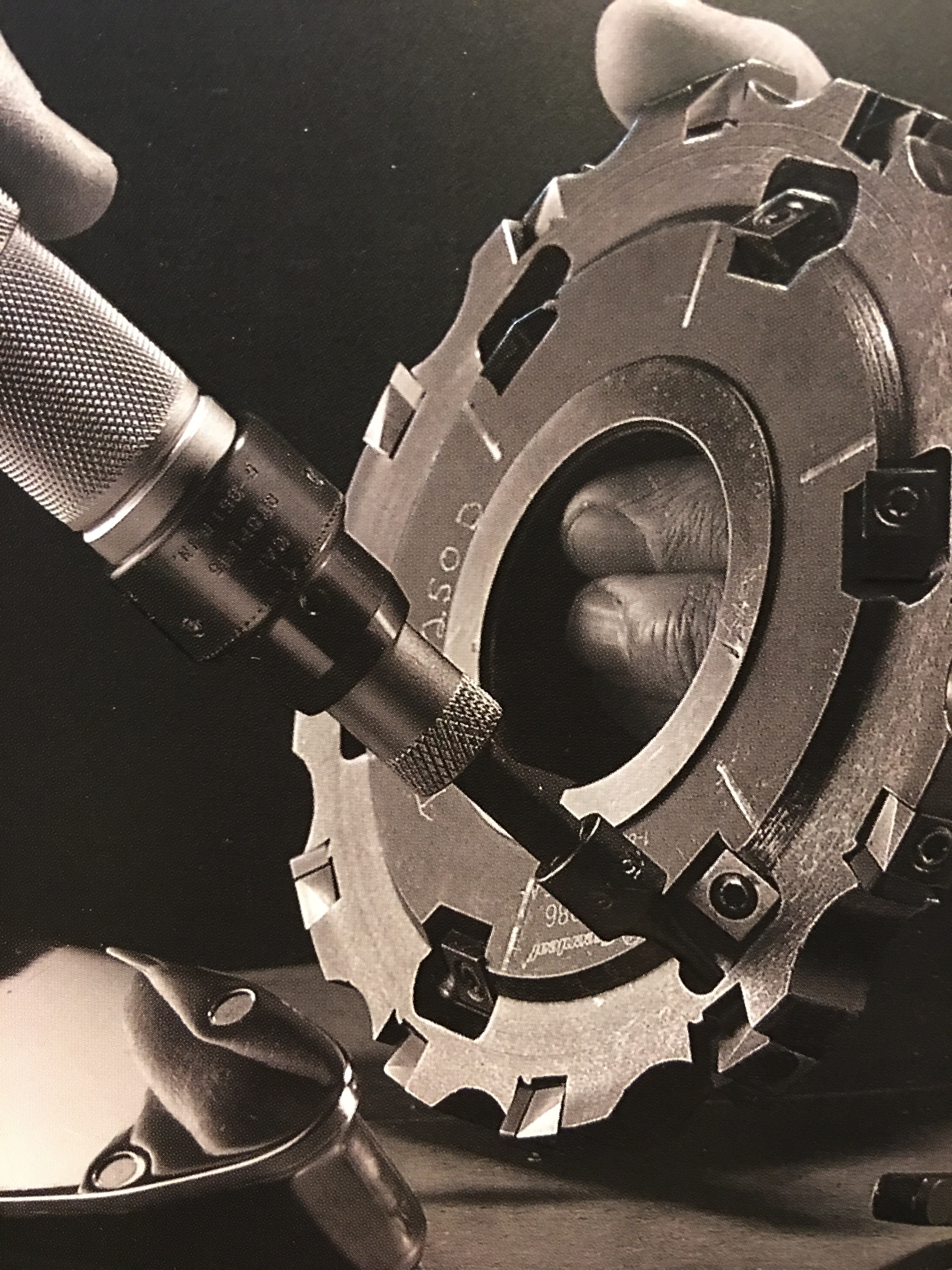
It’s a little bit difficult to tell what’s going on in the images. Is the thermography and spot gloss covering all the foreground items? Is that what’s causing the reflection on the middle image? This could be kind of cool in that it would give the foreground images a kind of dimensional effect — both visually and through tactile texture.
Thanks for the pic US_IDeaS. That’s very much what I’m going for. Also glad to see a nice use of thermography. That looks great!
I’m a little concerned about it being white on white but I think it’ll work out with the very light gray under it and the suede laminate. I’ll post a pic when it comes in.
It is a little difficult to see but to answer your questions: not everything is covered, of the inset picture: only the large cylinder and the screwdriver looking thing in the opposite hand are thermography and then all of the tools except the inside of the cyclinder (only the outside) are spotglossed and also other small exceptions of divets within the cylinder. The spotgloss helped achieve additional texture. — yes exactly what we were after. The reflection you’re seeing is coming from my phone…oops!
@cornfed, you’re welcome! (Thank you!) I hope it’s helpful so (sort of) see how your project will look. I think your project sounds beautiful. I think your grey is a good idea and will help a lot. I haven’t seen a lot of varnishes show up or provide great contrast so the spot gloss with your matte background might give you better luck. I would love to see what you decide on! Talk with your printer too, this is a piece they’ll want to show off to potential clients so they’ll certainly want to help you achieve what will look the best.
1 Like