Well, you could choose a quote that means something to a reader thumbing through the magazine. Pull quotes serve as entry points to grab people’s attention while enticing them to read more. This pull quote wouldn’t entice anyone to read the story. Then again, a story about death, suffering, misery, depression, grief, disease and mourning is one I’d be in a hurry to skip anyway. What was your instructor thinking when he or she assigned you such a miserable and morbid story to work with?
As for its visual appearance, it would be nice if the quote aligned with the other elements on the page instead of being skewed off to the left. It would also be nice if it were longer and didn’t interrupt two separate columns by breaking them into four separate pieces. If you could do this while making it look more like a pull quote, it would be even better — for example, making the quotation marks more prominent as stylistic elements rather than simply typed from the font.
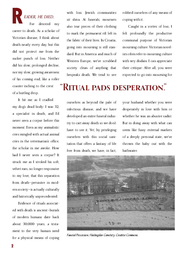
On a broader note, you can’t have cutlines (captions) randomly placed above some of the photos. Like the pull quotes; they actually need to look like what they are and contain compelling information that explains the photo and entices people to read the article. Cutlines are also different from credit lines, but you have combined the two on the cemetery photo.
The story abruptly ends two thirds of the way down the bottom of the last page. Despite the story only being so long, it needs to fit. This is commonly done by sizing and cropping the photos in ways that cause the story to end on the last line and not before.
Your columns are of unequal width. It appears to just be sloppiness, but it’ll lower your grade. There’s no room for lack of precision in magazine layouts unless it’s deliberate done for aesthetic reasons. There’s also way too much leading between the lines for easy reading. The space between the columns is also too wide. Really narrow justified columns of type (rather than ragged right) can impede readability as well — besides, they require too much hyphenation.
Your initial drop cap is just sort of stuck there, like the pull quote, not really aligning with anything.
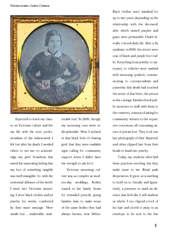
Why are some of your photos grayscale, but the oldest photo of the bunch, is in color?
Bottom line suggestion: head to your local book store and spend an hour or so looking through all the magazines and really paying attention to how they’re designed and laid out.