I assisted in implementing a clients ‘vision’
There are a ton of things we couldn’t work around as implementing these designs were critical for job completion. Earlier layouts were cleaner, more modern, organized. This is what the final result is.
After submitting the original designs, we were told we had got everything wrong, and the client demanded a rework toward the guidelines established and wanted the site to represent a brochure we were given.
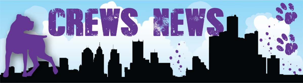
More grunge, more abandoned houses, push for more donations, more pictures, more graffiti, show the city in a negative light. We absolutely had to keep the video on the homepage. The paw print dividers are required and the shop page was reworked recently. The original design they wanted to use is still visible if the store link is visited. We couldn’t touch the logo as well. Its embarrassing to have worked on this, and I dont display it in my portfolio. Feedback welcome, critics have at it.
I love that guy who is wearing a penny loafer shoe on the right, and work boot on the left!
did he not know what type of work he was doing before he left his house?
Sometimes when I visit websites, I wonder what went on behind the scenes. This would have been one of them.
With this site, it’s obvious someone knew what they were doing. After skimming through a few pages, it’s also obvious that someone didn’t know what they were doing.
There’s just way too much going on with various effects, photos, run-on content, little do-dads here and there, auto-load background videos, etc. It’s sort of a junk drawer of stuff where everything got mixed up and scattered about. On the other hand, despite the messiness of it all, somebody knew how to cram all this stuff into a functional website.
I don’t know whether to congratulate you or say I’m sorry.
The website has a slight edge on the newsletter. In terms of typography it uses Papyrus, Comic Sans, Times New Roman (2 weights), and Arial, and uses many different graphic elements with as many drop shadows and bevels you can cram into a vector.
I’m something of a dog lover myself, and have never been without a dog. In other words, I have some empathy for this sort of thing, which makes me wonder about their approach.
I know Detroit has some serious inner city problems, but why do they want to carry over that battered, apocalyptic look to their pet adoption website? People, as a general rule, want to adopt lovable, friendly dogs in need of a family — not dogs that look like they’re disturbed, neurotic fighters from a war zone that would rip off someone’s face. Maybe these are the kinds of dogs they have, so maybe it’s truth in advertising, but I’d sure have my reservations about adopting one of these dogs.