Hey guys, I just started web design and I want to improve on my skills. Please give me some feedback. Thank you and have a nice day.
Looks like every other site out there. The clipping path/mask on the image is terrible. It’s not very clear what components you want reviewed.
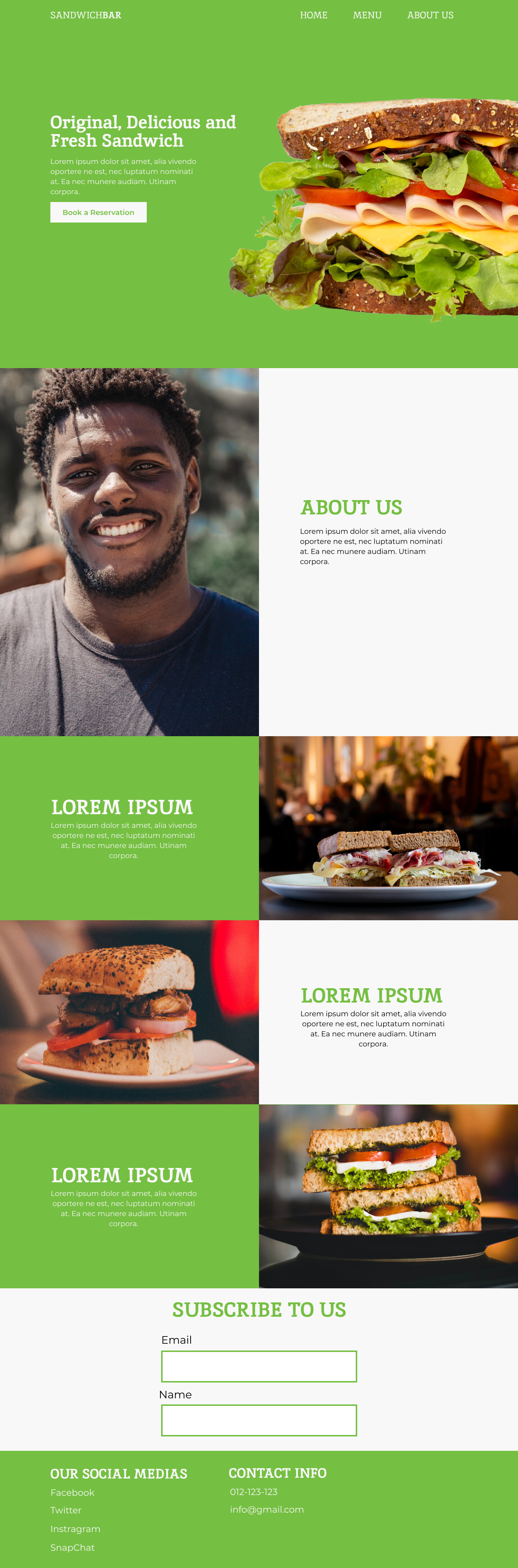
But essentially it’s just a sandwich of a few slides. I always ask myself if I am inspired, and on this occasion, I am not.
It’ up to you to be clear and concise and what you did, what you want reviewed, and what you actually did.
For instance, I have now idea of the UX of this site, will it scroll down, will it jump to each section. Will it scroll sideways. Will it compress into a sambo as you scroll???
It’s just a giant poster, nothing to critique, except the bad photoshop of a delicious sandwich.
Hey Smurf2 thanks for the honest critique. Would people prefer it if it were a clickable website instead? Also how would you come up with original layouts? Most of the inspiration I find follow very similar design patterns.
Another tip for you.
Always ask yourself; “Is this the best I can do?”
It’s one thing doing things as a mock designer. Mocking up things is easy.
Try being the mock client. This is the thing with mock work. The only person you have to satisfy is yourself.
Ask yourself important questions if you’re a customer.
What’s the range of sandwiches?
What drink can I get with that?
Any allergies?
Can I make my own sandwich?
C’mon man.
In every single design, there’s 3 points of view: Client (who hired you)- Customer (someone buying the product) - Outsider (you and everyone else you’re trying to attract to the shop).
You have to be all 3.
Ask yourself. Have you done enough to satisfy all 3?
It’s not the design.
I’ve seen brilliant websites with awful design. It’s because the content was great.
I’ve seen brilliant website designs, but awful content.
So here we are talking about yours, and yours is neither brilliant design nor brilliant content.
The best websites hit all 3. I know I only listed 2.
What do you think the 3rd one is?
I’m actually not too sure…What is it?
Glad you took 8 minutes to think about it.
Not trying to be harsh. It’s 6.51am where I am. I am on my 3rd coffee and operating on little sleep.
Take more than 8 minutes and for your own sake and career do so some serious research.
Look up sandwich sites, or even take away websites.
Honestly, we are here to help.
I was once like you. Really I was awful. I cried one night and swore I’d never go back to this career. I couldn’t do it. I stayed up all night, until the Sun came up, then it dawned on me ba doom dish
Honestly, the best thing you can do for yourself is to research research research.
It’s not the answer to the question I posed to you.
But I want you to go and learn. I can critique. Heck I can teach you, but I’m not here as a teacher. Nobody here should be teaching you.
You are your own teacher. Teach yourself. That’s key.
And still not the answer to the question I posed to you.
Go look around other sites that offer sandwiches.
Here’s a partial answer to the question I posed.
Delivery? Can I order by app? Any discounts?
That should be a huge clue. I want you to think. Thinking is critical to being a designer.
Hey smurf2, thanks for being super real with me. I am trying what I can to learn new things about graphic design. I will definitely think about what you said in more depth.
Here’s something to think about - and I want you to think. This will be great benefit to you as a designer.
In my village, (yes I live in a village, it’s remote and quaint and love it), there are 2 Chinese restaurants, both offer similar menus. Both offer sit in or takeaway.
There are 3 chippers (what we call take out burgers, chips (fries) etc. They all offer same menus, same food.
But I only order from the same Chinese place, and the one chipper, I don’t order from the others.
Now, others might order from the other places. Maybe it’s depending on placement in the village.
But both my Chinese and my Chipper offer something the others don’t. And that’s why I use them.
I’ve never once done any business with any of them except buy a thai green curry with duck and rice (for me) and chicken satay and chips (for my wife).
I sat down one night with my wife and I thought out loud, why do we only order from these.
Then I got a ‘WOW’ moment. The history of the ‘WOW’ moment is fascinating by the way - a side note to takeaway from this (there I go again being punny). Anyway - here’s the history of the ‘WOW’ moment I believe - Wow! signal explained after 40 years? | Space | EarthSky
Aside from that. I had a critical thinking moment and a 4 hour chat with my wife. And we realised that all the takeaway restaurants area in our village were doing it wrong.
I fixed it for them. I approached each them and sold them a marketing plan. And I grew their sales.
And I did it with critical design thinking. And a lot of help from my wife.
My wife being the end user and not a designer was critical to me understanding what the user needs.
It doesn’t matter what the product is. Critical design is important.
And people talk about critical design as being specuculative design - and I’m not talking about that.
Critical design for me is finding the cracks in what’s there and offering solutions. Critical thinking.
I have a client at the moment moving premises. And usually they have their address on all their material, pull up banners, flyers, brochures, websites, social media. Proud of his address, he has fitness clients so it’s important they know where he is.
He’s moving premises. He wanted new material to announce his move.
I removed his address as I felt it would confuse people. He was delighted I did, as it would have caused havoc. The only thing on it is his social media icons, phone number and email address.
When we talk about critical design - we’re talking about - what’s missing, what didn’t the client tell me, what do I want from this, what would my wife want, what would my dog want, what would my child want, what would my mam and dad want?
Reality is important. We are here to help.
Keep going - you can do it!
I will say - I like the website. It’s clean, easy to use, and a nice design. The colour is a little insipid, think freshness, you’d want vibrant, not dull.
Good effort, and a nice start. But I know you can do better.
A lot of good feedback was already given here, but I would want to emphasize the “Why”. Why are people going to visit this website? Which visitor intentions are the most common, and therefore most important to prioritize? If you can nail that down, it will give you a whole lot of guidance for the website design. So go ahead and make a list:
- 35% of visitors come to the website to check out the menu
- 30% of visitors came to you after they where googling nearby restaurants
- 15% want to order food delivery
- 10% just want to check if you are open right now
- 5% want to get directions (e.g. Google Maps integration)
- …
If you have an existing website, look at your website traffic statistics such as Google Analytics for the above - if you don’t, or can’t make sense of the stats, just think logically.
Then, after you’ve gone through this exercise, think about the direction of the company, and what they would want to emphasize and promote, be it a new sandwich or strategic items of their business model, e.g. delivery service.
Once you got all that, all your Lorem Ipsum is gone and we can discuss the design decisions you’ll make to communicate all that!
1 Like
Thanks for the feedback OVOAO, will keep this in mind.