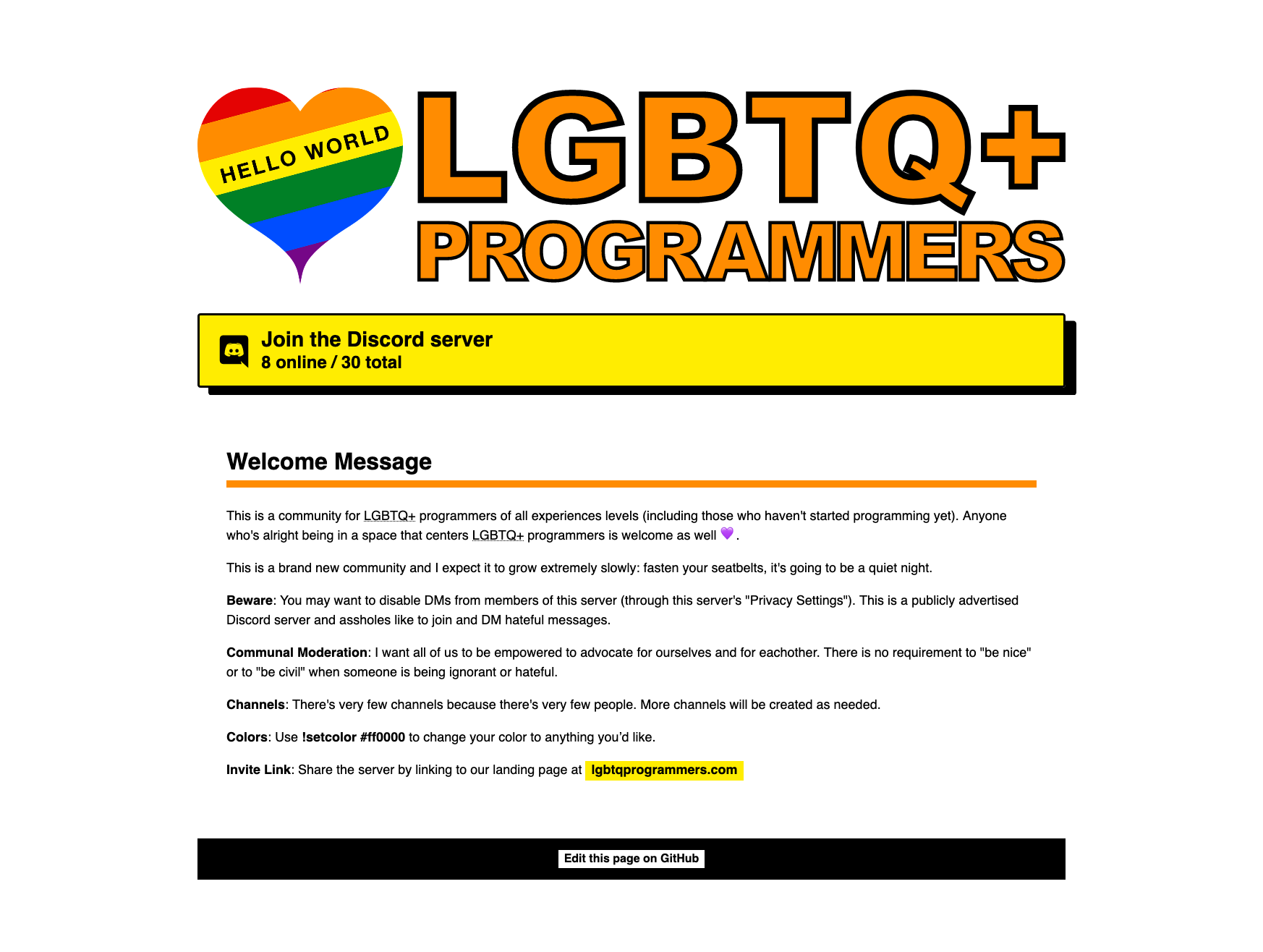
I made a landing page for a small Discord community I started so that search engines can find that community (Discord communities are not normally indexed by any search engines).
I’m a self-taught amateur designer and most of my experience is in programming.
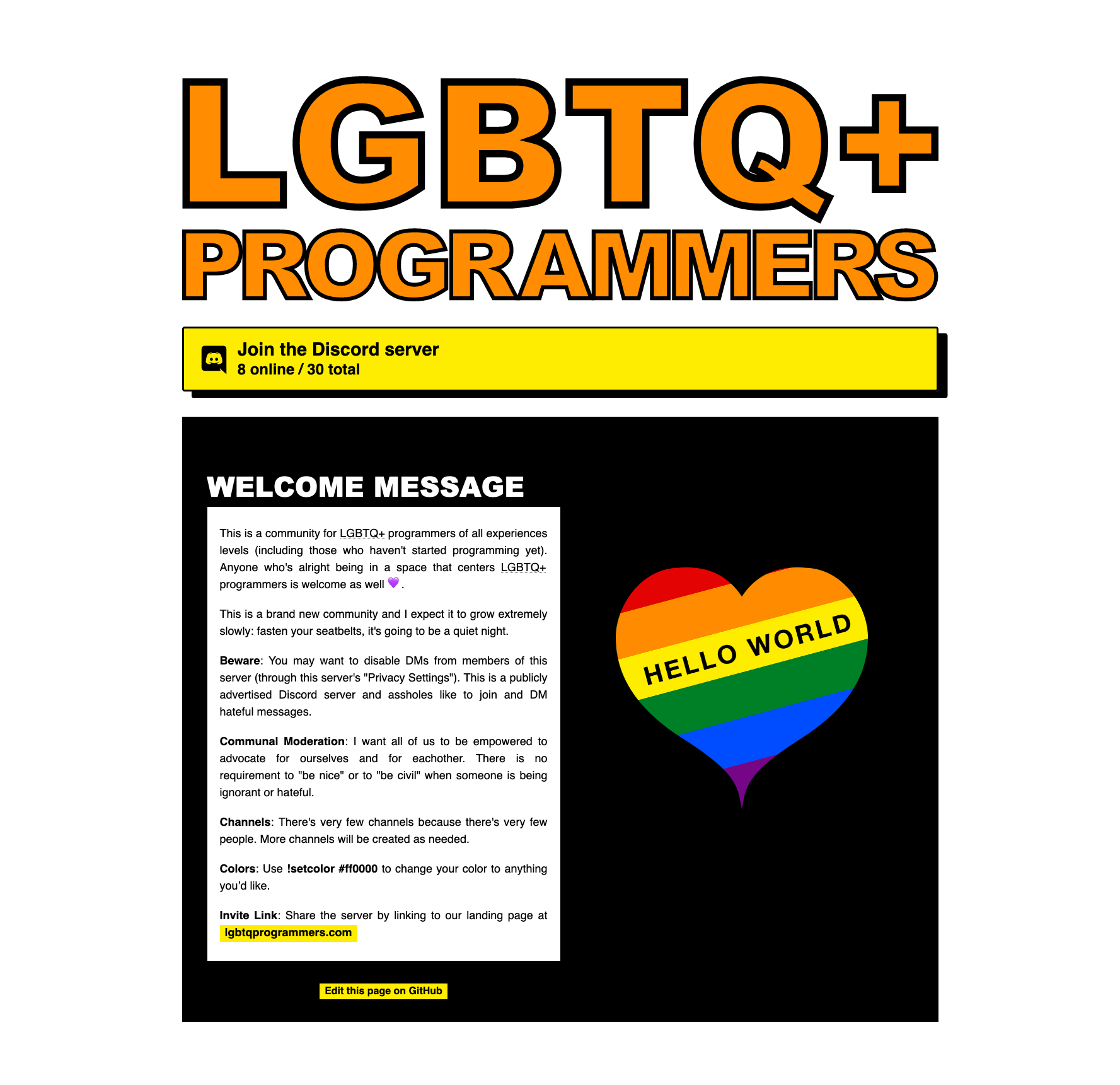
My designs are always pretty tame and quiet but I wanted to try and make something “as loud and bold as I dare.” So consider this a self-directed project with the goal of getting practice making bolder designs.
I’m particularly interested in ideas or direction around how the design could be bolder, louder, or just more visually interesting. I feel like I sorta tiptoed in that direction but it still feels kinda standard-fair: just bigger and with maybe-brighter-colors than usual.
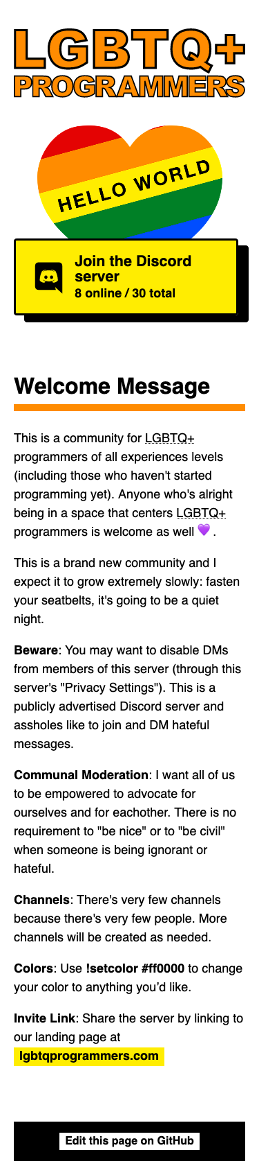
Note that the page is quite different depending on whether you’re looking on a thin screen (likely-mobile) or wide screen (likely desktop or tablet). If you can’t see both, lemme know which version you’re looking at.
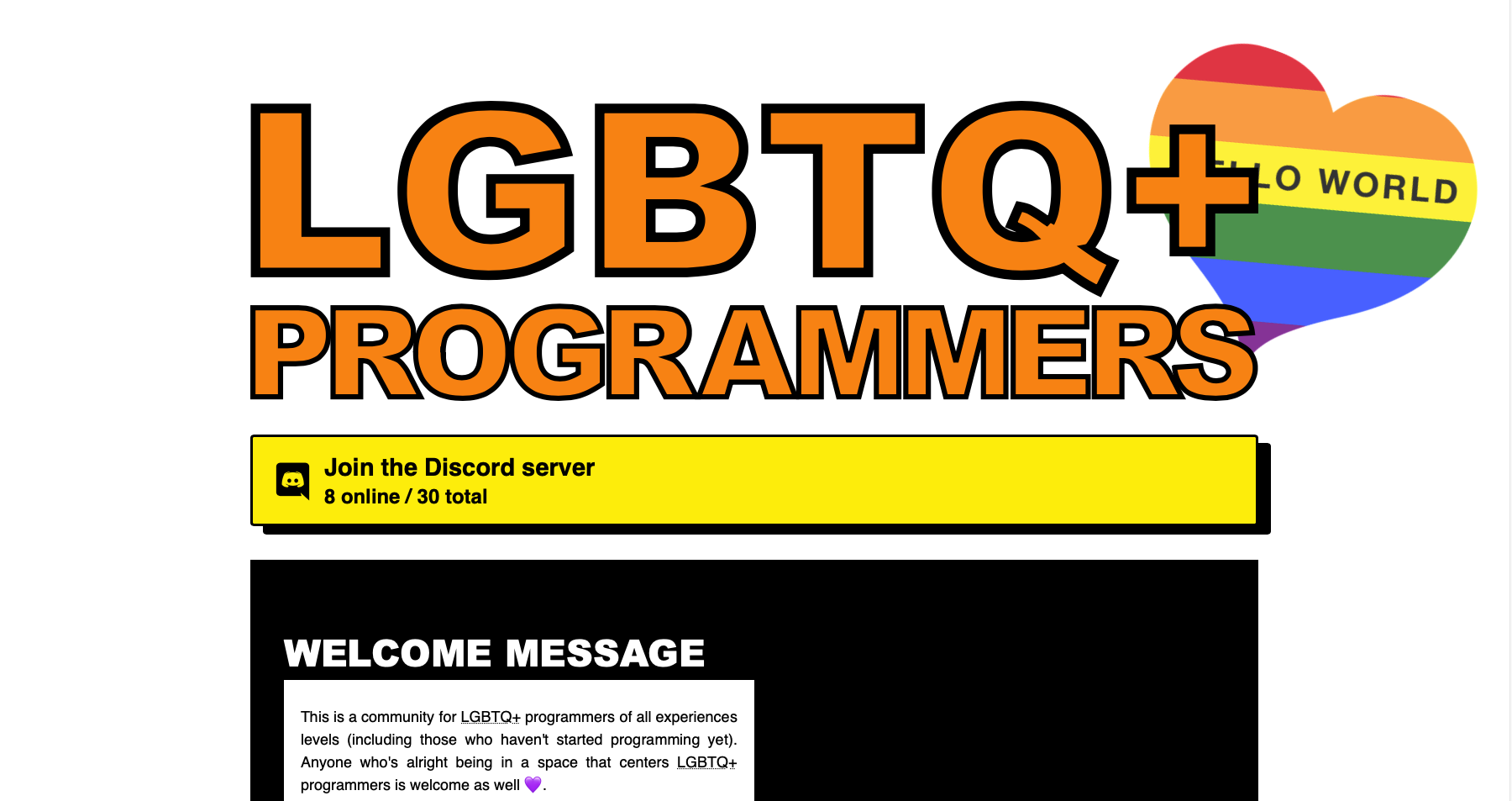
Had an interesting idea after writing out all the above… not sure how well it would translate to mobile. Probably shows where my head’s been at though:
It’s awesome that you’re exploring design, what kind area of design do you think you’d like to do?
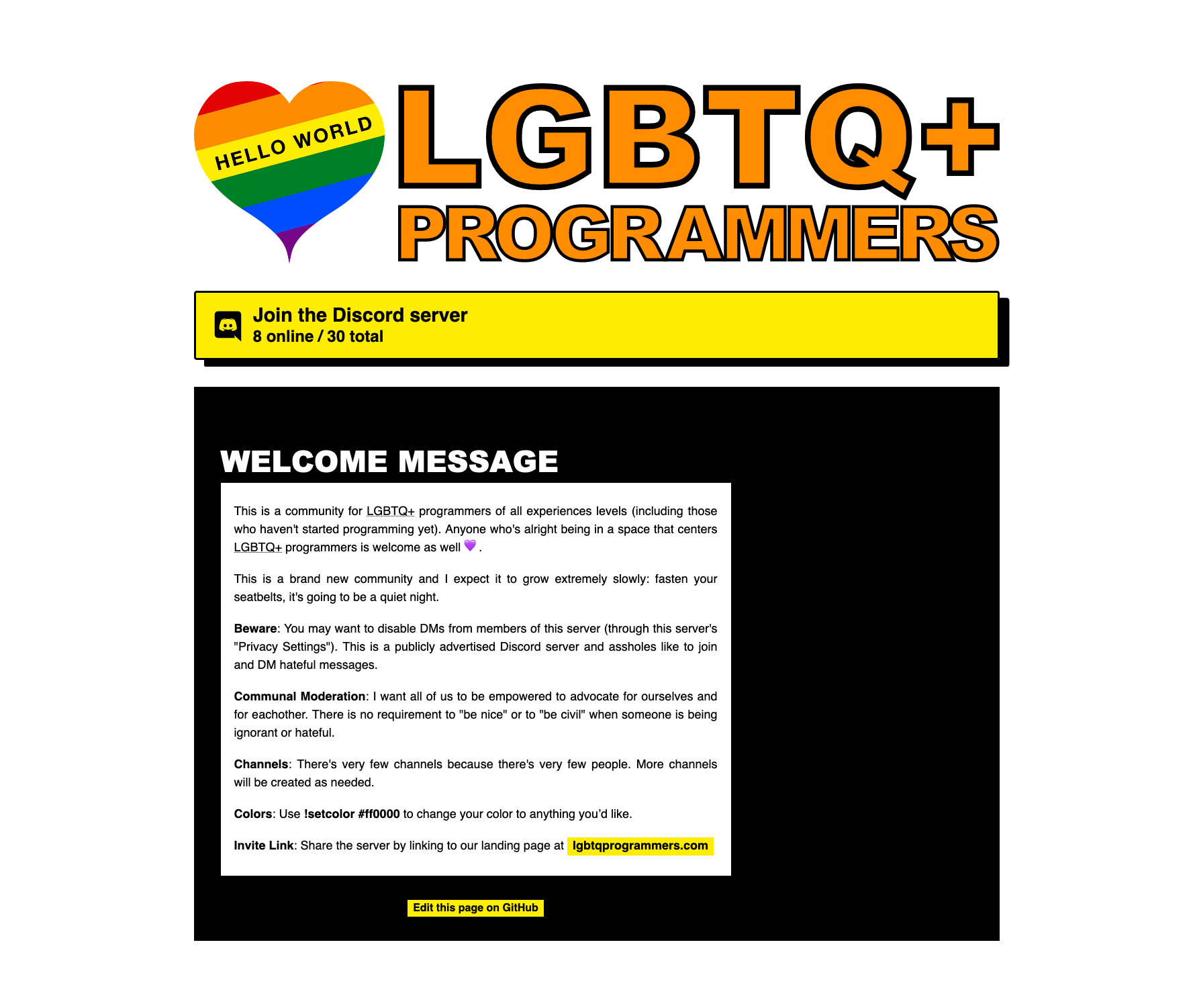
Regarding the critique: I’m loving the colourful nature of the design, however something feels a bit off. If feels like there’s a bit too much going on. I think there’s a couple of things that are a little bit overdone:
Regarding the heart mark and title in conjunction, it feels like these two elements are competing to be king of the page . I would recomend picking one to be the king and use the other to reinforce the other by toning in back.
Regarding the mark, I think it’s cool what you’re trying to do by combining the classic coding “Hello World” thing and the heart, however I think it’s bit too much detail for the heart which already has the rainbow going on.
Regarding the title, I would choose a mono-spaced typeface such as Letter Gothic (mono-spaced fonts will reinforce the fact that it’s tech/programing-focused). I would also drop the orange/black colours and go with either fully black or a dark enough colour that will contrast with the background.
Thank you for the thoughts. I’ll play around with those ideas.
I’m mostly interested in web and other UI design, since that’s most-related to my work. I’ve always been fascinated by print design, and I might dabble in it at some point if I get the opportunity (especially since I’ve been working on a solo-product and could feasibly go table at cons at some point), but we’ll see.
I see what you mean when I take away or move the heart. The text seems to feel a bit better when it gets the full width of the column. Removing it does change the feel of the page more than I’d like, since it’s such an incredible source of color, so I think I’ll play around with different ways to bring it into the page.
The copy is pretty slapdash . Initially I had just a short blurb here, but google thought that the page was just a simple 302 redirect when I did, and refused to index it. (It is basically a redirect, but not quite so literally). So I chucked the whole welcome message up. I’m not too worried about it at the moment, but I’ll turn my eye to the copy at some point I’m sure.
I don’t know the distinction you’re trying to make. Could you elaborate?
Well, it could be both, but I’m not sure why gender preference would be a thing on a tech forum, whereas a support forum could be for those who face harassment or are transitioning on the job etc. A tech forum, like this forum here, doesn’t really care what your pronouns are (though please do tell us!)
We take in everyone.
But the reason for the discord server’s existence would/should influence your layout and color scheme. Is it more technical or is it more social? What I get from what you have here is more social.
I am trying to go for a very loud and bold feel and I chose the pure black and white (and highlighter yellow for that matter) to get the most contrast I could squeeze out of it.
So some harshness seems in line with my design goals. What the “maximum acceptable level of harshness” would be is kinda elusive to me though. I feel like a landing page maybe has a higher “acceptable level of harshness” than a larger website (since you won’t be looking at a landing page for very long).
I’ll try out some darker grays and see how they feel. Play around with how I want to balance my desire for contrast and my desire to not actually overwhelm.
You’ll have to take my word that the existence of this community is desirable: but it’s a tech forum. Like any other tech forum it’s also a social space though.
I’m not doubting your word.
I hang out in an art discord that I would guess is at least 70% NB and trans. They are a very supportive community and the mods and owners are ruthless in protecting it and enforcing the rules.
I’m not in the target group but I’m getting a nice retro vibe from the design - as in “back when the Macintosh still had a rainbow” kinda retro. If that’s what you are going for, you could make it a bit more “8-bit” with a different font choice and/or heart shape. Oh, and I like how you turned “Hello World” into a coming-out message!
There was no symbology or relation-to-its-content baked into this design, definitely just “oh that looks nice” .
That’s an interesting idea for where to take this though. I suspect it might turn out very gamery-looking rather than programmer feeling at the end of that road though.