G’day Dan 
There’s a lot to unpack here, so I’ll try to be as concise as possible:
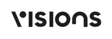
Regarding the branding I’m loving the idea for “V” mark you came up with, however it feels a bit odd to me when paired with the type you’ve chosen. Even though there’s no visible serifs, I think the circle imply’s a serif. Have you considered keeping the mark seperate from the type?
Also why did you make the “n” different? It feels like this competes with the “v” and the rest of the type. It looks to me like a retro display typeface, while the rest of the type appears to be a geometric san serif?
There’s so much going on, I think it actually affects the legibility of the word “visions”. If I were you, I’d just let the “v” be your hero  .
.
Regarding your brands attributes: BOLD, UNQUIE, CREATIVE - how did you arrive at these attributes and why did you choose them?
Regarding the website, I like the use of technology to include the videos, but it feels a bit overpowering. I think I feel similar to @RedKittieKat: there’s way too much flashing and movement going on, the black and white create maximum contrast, and if I’m completely honest I really struggle to sit through the header video, it’s hard on the eyes - is this the experience you want you prospective clients to have?
The further down the page you go everything is moving and changing, it feels very chaotic. I like the changing photo’s but maybe make it an effect that occurs on hover, rather than all of the time?
It’s hard to spot the elements which you’ve designed in the videos and photograohy you’re displaying. This makes your photos and videos seem a bit generic and unrelated to anything.
I think your case studies look awesome, why don’t you just pick your best 1 or 2 to display on your landing page and talk about the impact your works made on their business with some testimonials etc..?
Hope this helps, good luck with your business