I made this super clean monogram to use it as personal logo. I’m a motion designer and I’m gonna use it as logo in my website and social media.
It’s not my “official” logo cause I’m a freelancer and I don’t have one.
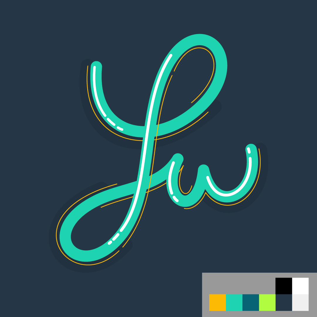
What I like is the use of just a simple line to write the letters, emulating the handwriting signature.
I didn’t start from an existing font, I did write it by hand and then fixed the weights in illustrator.
I like the “line” cause I’m able to do some nice animation that I can use as animated logo in my website.
It pretty much is what it is. If you like it, great.
I don’t hate it, except for that awkward jiggle of the lower protuberance in the animation.
As for it not being your “official logo,” if you are a freelancer, and you are using this as a logo on your website and social media, you do indeed have a logo as a freelancer. If this is not the logo you want associated with your freelance business, rethink that strategy.
Yeah, I meant it’s not a “registred” logo but yes, it’s the logo I want associated with my freelance business, anyway that is not the important part. I’d like to know more what you feel when you look at it, if you see some weight off, if it’s nice to look at..desginer stuff
About the animation, it’s still a work in progress and probably you’re right about the jiggle..
Thanks for the feedback.
Assuming it’s supposed to read L W, I like it. If it is not supposed to read L W, it could use some work. I don’t care for the middle version with the added highlights and strokes – they aren’t needed.
You seem to be asking us how nice it looks rather than how it might function as a logo.
If so, I like the looks and how it lends itself to being animated. The blinged-out version could also work well as a frame in a more extensive animation.
However, I know nothing about your freelance business or whether it’s appropriate. You’ve used cursive script, where a lowercase w follows an uppercase L. I’m having trouble thinking of an instance where Lw is a logical sequence of letters. Then again, you haven’t told us why you used those letters.
In addition, cursive writing isn’t taught in most U.S. public schools any longer, so I’m unsure how many people under a certain age would readily recognize it as an Lw.
Edit: It seems you posted a correction while I was writing my post. Even so, why Lu?
Seems to be their name? (click on avatar.)
As a sign guy, I sure as heck wouldn’t want to cut that skinny stroke in the blinged version out of vinyl for any reason.
My name is Luca.
I’m from Italy and here you can see some of my works if you want (and an old version of my animated logo)
Blinged out you mean the first version that seem Lw?
I prefer that but since Steve_O made me notice I keep reading Lw…
Sorry for the American slang. I meant the decorated version with the highlights and thin lines could be part of a nice animation but might be too decorative as a stand-alone logo.
Is Lu a nickname for Luca that’s common in Italy? If so, it makes much more sense to me now.
Meaning, if it’s not, then drop it and start over. If it is, then you might be on to something. However, in the U.S., Lu is more commonly recognized as slang for “Louis”
It suits the style of your work, so does it’s job. The colour also seems right for the job it is supposed to do. I don’t think it sets the world alight, but, as I say, it does what it’s supposed to do, quietly.
One small change I’d suggest though is that it might be an idea to lower the ‘u’ a little. As it stands, it could be seen as Ju. I know that confusion won’t exist in Italian, but in English-speaking countries, it may do.
Regarding the animation; that works fine, apart from – and this is just my personal preference – the jaunty little swing of the lower part of the L swash, to me, feels a little gratuitous and unnecessary.
Overall, it works. Complimenti (con qualche modificazioni piccoli – secondo me).
Yeah it’s kind the nickname that all my friends have given me since I was a child, so it represents me well and I like to use it as a logo.
The decorated version is just a still frame of an animation that I have in mind, it’s an intermediate step, I agree that it’s akward to use “blinged” lines in a logo.
Ok I’m gonna try to lower the u, or maybe move up the lower part of the L.. I’m afraid to loose some balance if I move the u too low..I’m gonna try and post the results.
Thanks guys for all the feedbacks, this website is pure knoledge treasure!
I thought the top read “LW” so the second version is much clearer if you’re going for “LU”.
I’m a student so this is far from a professional opinion, but the colors and style give relaxing vibes, making it seem like you would be enjoyable to work with, maybe down to earth and approachable vs. stuffy or stressful. At the same time, the design is professional and displays skills and creativity.